Rate my handwriting

✨ Upload a sample of your handwriting, and our 🤖 AI will give you
the scoop on
what's awesome
and what could use a
little improving.
It's just for fun - and totally free! Try now 🚀
(You can also check out today's 👑 Leaderboard 👇)
The Relaxed Wanderer
This handwriting conveys a relaxed, thoughtful personality with a hint of playfulness and a free spirit. Focusing on baseline consistency, slant, and letter size could elevate its already legible and charming style.
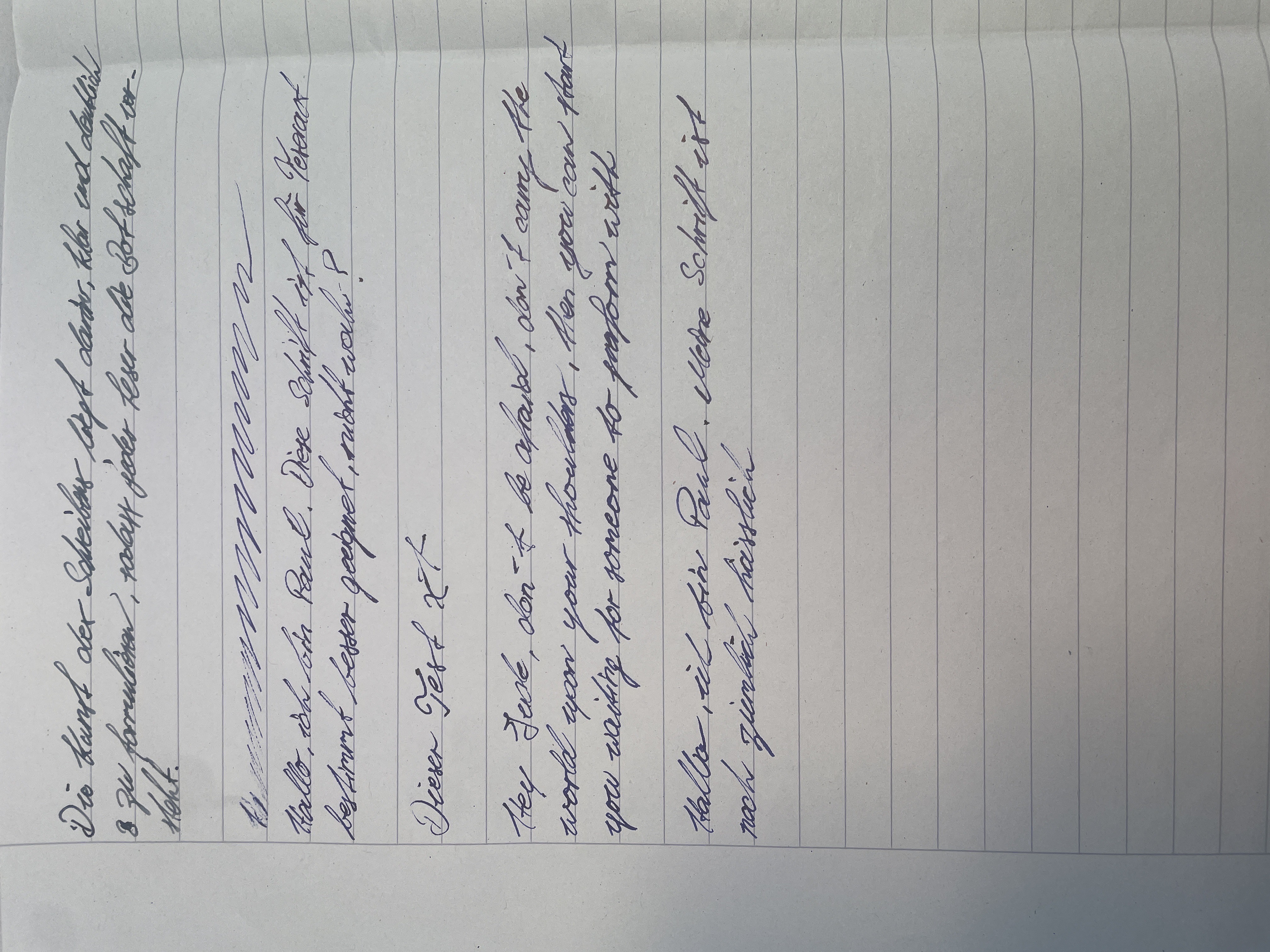
This handwriting, exemplified by phrases like "jeder Leser die Botschaft" and "besser geeignet", presents a relaxed and slightly uneven style. The letters are generally well-formed, though there's a charming inconsistency in their size and slant. The baseline wanders a little, giving the impression of someone strolling leisurely rather than marching rigidly. The connections between letters are smooth and flowing in places, then broken and hesitant in others, suggesting a mix of confidence and contemplation. While not perfectly neat, the handwriting is certainly legible, and its slightly irregular spacing adds to its casual charm.
This style suggests a personality that is both adaptable and thoughtful. The wandering baseline hints at a free spirit, someone not bound by strict rules or conventions. The fluctuating letter sizes and slants could indicate a playful nature, willing to experiment and embrace spontaneity. At the same time, the generally legible forms and the effort to connect letters suggest a desire to communicate effectively and a certain level of conscientiousness. This is not someone who rushes through life but rather takes the time to observe, reflect, and enjoy the journey.
While "ziemlich hässlich" might be a harsh self-assessment, a few tweaks could enhance this already pleasant handwriting. Focusing on maintaining a consistent baseline throughout the writing would improve its overall neatness and create a more grounded impression. Paying attention to the slant of letters, aiming for a more uniform angle, would also enhance legibility and add a touch of elegance. Finally, consistent letter sizes, especially within the same word, would give the writing a more polished and confident appearance.
Legibility
Expressiveness
Consistency
Overall
Leaderboard for Sunday, 02 November 2025
| 1 | The Budding Linguist |
72
|
| 2 | The Precise Constitutionalist |
72
|
| 3 | The Inquisitive Enquirer |
71
|
| 4 | The Architect's Hand |
69
|
| 5 | The Diplomat's Script |
68
|
| 6 | The Communal Calligrapher |
68
|
| 7 | The Serpentine Thinker |
68
|
| 8 | The Pragmatist's Script |
67
|
| 9 | Geometric Soul |
66
|
| 10 | The Methodical Muser |
66
|
| 11 | The Loopy Luminary |
65
|
| 12 | The Diligent Student |
65
|
| 13 | The Elementary Author |
65
|
| 14 | The Resilient Hand |
64
|
| 15 | The Civil Servant |
64
|
| 16 | The Diligent Student |
64
|
| 17 | The Deliberate Artificer |
61
|
| 18 | The Diplomat's Doodlings |
61
|
| 19 | The Maverick's Manifesto |
60
|
| 20 | The Analyst |
60
|
| 21 | The Optimistic Voyager |
59
|
| 22 | The Cosmographer's Quill |
59
|
| 23 | The Whimsical Wanderer |
58
|
| 24 | The Minimalist's Marker |
58
|
| 25 | The Loop-de-Looper |
58
|
| 26 | The Bold Dreamer |
58
|
| 27 | The Elegant Calligrapher |
57
|
| 28 | Optimistic Penman |
57
|
| 29 | The Diligent Student |
56
|
| 30 | The Elegant Minimalist |
56
|