Rate my handwriting

✨ Upload a sample of your handwriting, and our 🤖 AI will give you
the scoop on
what's awesome
and what could use a
little improving.
It's just for fun - and totally free! Try now 🚀
(You can also check out today's 👑 Leaderboard 👇)
The Running Writer
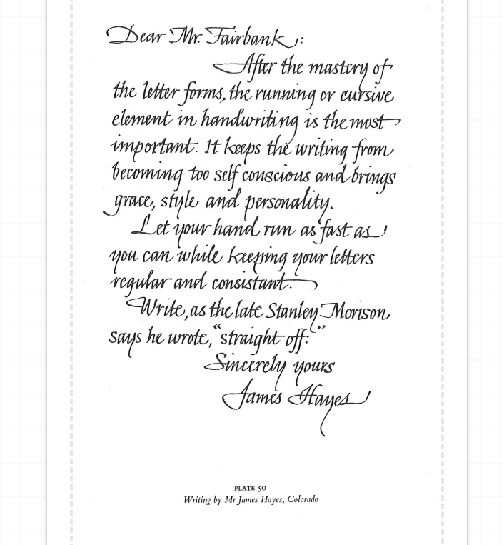
This fluid, graceful handwriting suggests a personality that values both efficiency and aesthetics, with a focus on organization and self-expression.
This handwriting sample is highly legible and consistent, exhibiting a smooth, flowing cursive style. The writer maintains uniform letterforms and spacing throughout, as seen in words like "handwriting" and "important." The slant is consistent, indicating balance and focus. The baseline is mostly straight, though some words like "personality" demonstrate a playful upward curve, suggesting optimism. The flowing connections between letters contribute to the impression of efficiency and grace, reflecting the content of the sample itself which advocates for cursive as a means of adding "grace, style, and personality."
The neatness and regularity of the script suggest a personality that is organized and detail-oriented. The emphasis on keeping letters "regular and consistent" in the sample further supports this interpretation. The writer's ability to maintain a consistent cursive flow while emphasizing the importance of speed hints at a person who values both productivity and precision. The slightly rightward slant of the script is commonly associated with a forward-thinking, expressive nature, suggesting that the writer is not afraid to communicate their thoughts and ideas. The graceful curves and flourishes, particularly in the signature, reveal a sense of refinement and pride in their penmanship.
While this handwriting is already quite polished, a minor area for improvement could be to pay attention to ascenders and descenders. Letters like "h" and "y" could be extended slightly more to enhance legibility further and add more visual interest to the overall composition. Experimenting with slightly varying the slant and baseline could also introduce more dynamism and expressiveness. Finally, although consistency is a strength, adding slight variations in letter size could create a more engaging visual rhythm.
Legibility
Expressiveness
Consistency
Overall
Leaderboard for Monday, 27 October 2025
| 1 | The Divine Calligrapher |
80
|
| 2 | The Humble Hand |
76
|
| 3 | The Analytical Mind |
74
|
| 4 | The Diligent Student |
71
|
| 5 | The Pristine Print |
71
|
| 6 | The Student's Script |
70
|
| 7 | The Coastal Bard |
69
|
| 8 | The Optimistic Poet |
68
|
| 9 | Sunrise Musings |
68
|
| 10 | The Cursive Cartographer |
68
|
| 11 | The River's Flow |
67
|
| 12 | The Diligent Penman |
67
|
| 13 | The Coastal Chronicler |
67
|
| 14 | The Diligent Note-Taker |
67
|
| 15 | The Coastal Dreamer |
67
|
| 16 | The Cursive Narrator |
67
|
| 17 | The Pragmatic Pen |
66
|
| 18 | The Eloquent Pen |
66
|
| 19 | The Scientific Hand |
65
|
| 20 | The Analytical Alchemist |
65
|
| 21 | The Deliberate Draftsman |
65
|
| 22 | The Aesthetic Typist |
65
|
| 23 | The Agile Leaper |
64
|
| 24 | The Script of Devotion |
64
|
| 25 | The Mathematical Muse |
64
|
| 26 | The Traditionalist's Script |
64
|
| 27 | The Diligent Note-Taker |
64
|
| 28 | The Typographer's Testament |
63
|
| 29 | The Elegant Academic |
63
|
| 30 | The Studious Note-Taker |
63
|