Rate my handwriting

✨ Upload a sample of your handwriting, and our 🤖 AI will give you
the scoop on
what's awesome
and what could use a
little improving.
It's just for fun - and totally free! Try now 🚀
(You can also check out today's 👑 Leaderboard 👇)
The Golden Fibre
This handwriting suggests a detail-oriented and adaptable individual, with room for improvement in consistency and spacing.
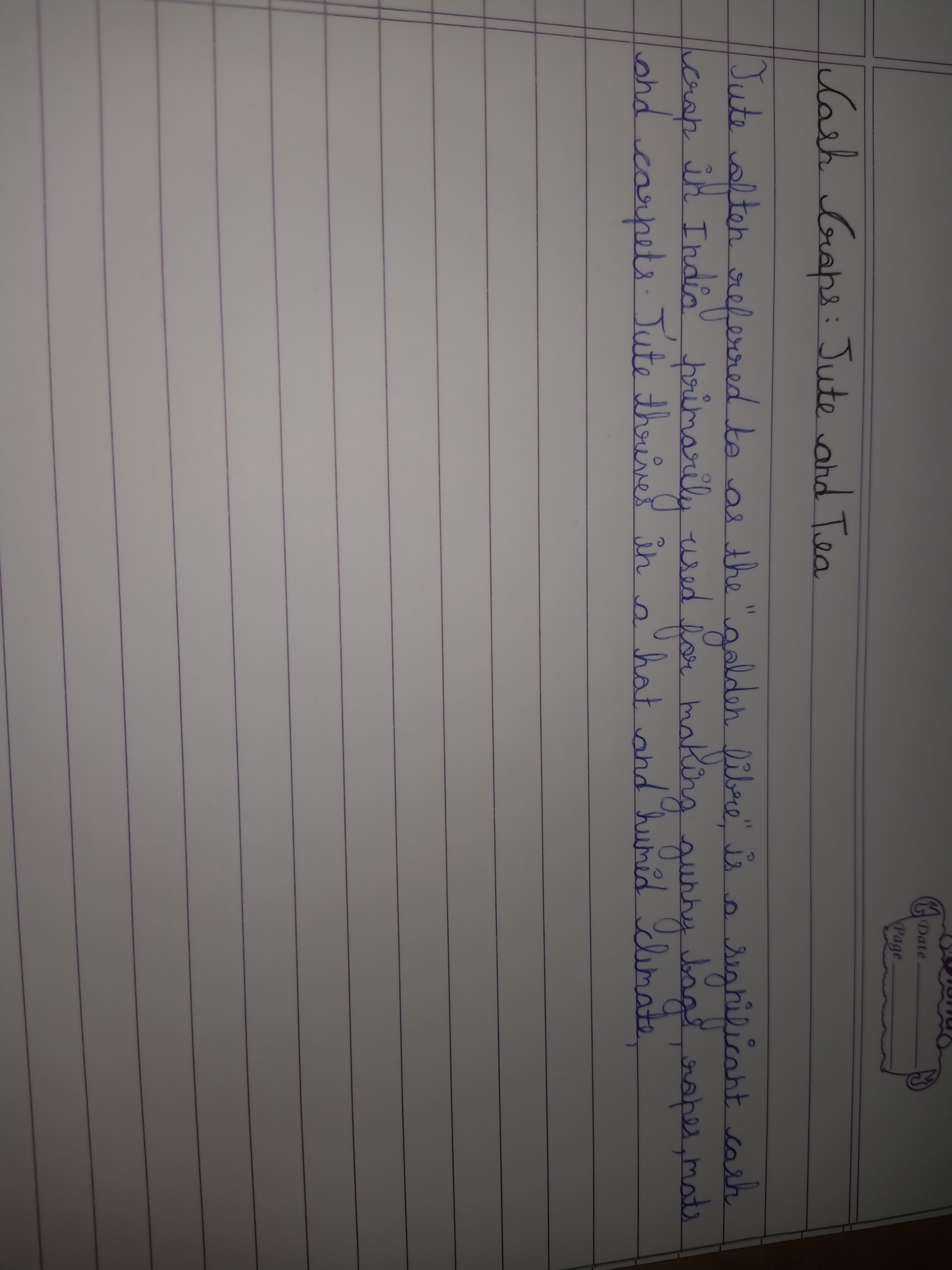
This handwriting sample presents a generally neat and legible style, although there are inconsistencies in letter size, slant, and spacing. The baseline is fairly straight, following the ruled lines of the paper. The letters themselves, for example, in words like "primarily" and "carpets," are formed with mostly consistent proportions, with rounded curves and occasional sharp angles. However, the spacing between letters and words varies, sometimes creating a slightly cramped appearance. The slant of the letters leans to the right, but the angle is not uniform throughout the sample, adding to the overall inconsistency. The letters are not overly embellished or stylized, and some connections between them are unclear. There is evidence of a mix of cursive and print writing styles. This handwriting style implies a person who is detail-oriented and strives for neatness and clarity, as seen in the careful formation of letters. The inconsistent slant suggests adaptability and a willingness to embrace change, but also a certain degree of impatience. The rounded curves may imply a gentle and approachable personality. Finally, the varied spacing suggests a fluctuating energy level and an independent spirit. To improve the legibility and neatness of your handwriting, focus on maintaining a consistent slant, size, and spacing of letters and words. Practice connecting letters smoothly within words while maintaining distinct spaces between words. Using guidelines will help improve baseline consistency and the vertical alignment of your writing. Ensure that each letter is formed clearly and legibly to reduce any ambiguity in reading.
Legibility
Expressiveness
Consistency
Overall
Leaderboard for Thursday, 30 October 2025
| 1 | The Economist's Italic Hand |
74
|
| 2 | The Poet's Quill |
71
|
| 3 | The Flourishing Font |
69
|
| 4 | The Scientific Hand |
68
|
| 5 | The Upright Student |
67
|
| 6 | The Digital Diarist |
67
|
| 7 | The Logical Chemist |
66
|
| 8 | The Prudent Pen |
66
|
| 9 | The Pensive Student |
65
|
| 10 | The Literary Cartographer |
65
|
| 11 | The Agile Quill |
65
|
| 12 | The Pragmatic Planner |
65
|
| 13 | The Bio Notes |
64
|
| 14 | The Civic Philosopher |
63
|
| 15 | The Studious Scholar |
63
|
| 16 | The Meticulous Planner |
63
|
| 17 | The Elusive Poet |
62
|
| 18 | The Calligrapher's Chronicle |
62
|
| 19 | Le Gribouillage Scientifique |
62
|
| 20 | The Deliberate Democrat |
62
|
| 21 | Le Calligraphe Studieux |
61
|
| 22 | Algorithmic Alchemist |
61
|
| 23 | The Cellular Biologist |
61
|
| 24 | The Atomic Pen |
60
|
| 25 | The Spirited Student |
60
|
| 26 | The Fluent Intellectual |
60
|
| 27 | The Global Trotter |
59
|
| 28 | The Forthright Fount |
59
|
| 29 | The Determined Hand |
58
|
| 30 | The Energetic Note-Taker |
58
|