Rate my handwriting

✨ Upload a sample of your handwriting, and our 🤖 AI will give you
the scoop on
what's awesome
and what could use a
little improving.
It's just for fun - and totally free! Try now 🚀
(You can also check out today's 👑 Leaderboard 👇)
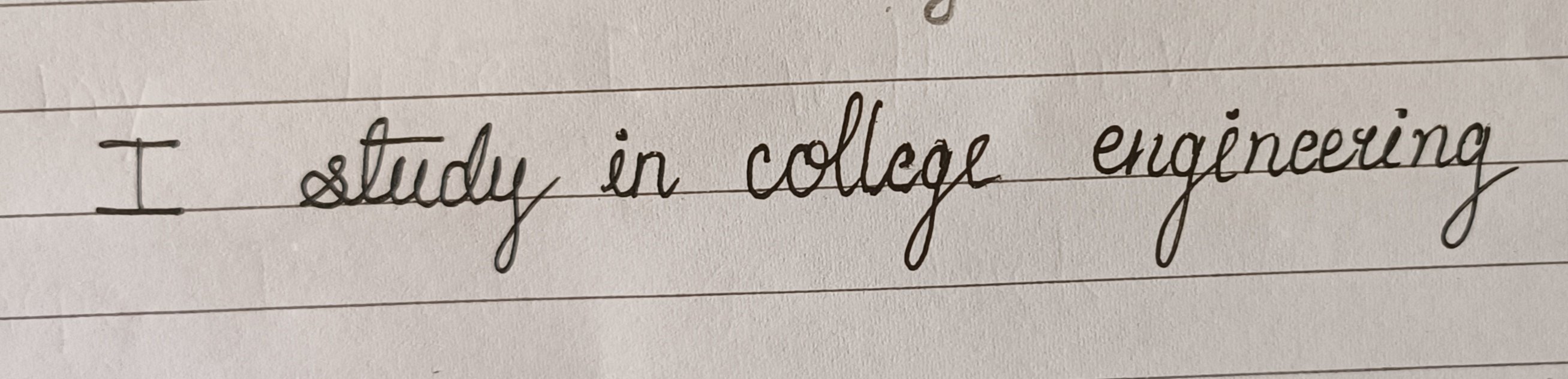
The Collegiate Engineer
This handwriting shows neatness and legibility, suggesting a methodical and efficient writer. However, minor improvements in spacing and letter formation would elevate the overall clarity and professionalism.
This handwriting sample presents a generally legible and neat cursive style, with a consistent slant and letter size. The letters are well-formed, although some, like the "g" in "engineering", show a distinctive flourish. The baseline is relatively straight, indicating a focus and attention to detail. The overall impression is one of competence and efficiency.
The consistency in letter formation and slant suggests a methodical and organized individual. The neatness and legibility further reinforce this impression, pointing to a clear and direct communication style. The slight flourish in some letters hints at a touch of creativity and individuality. The decisive strokes of the "t" bars and the clean connections between letters indicate a practical, goal-oriented approach. The writer's style may reflect their disciplined approach to problem-solving, suggesting a logical mind.
While the handwriting is generally neat and legible, some improvements could enhance its clarity and aesthetic appeal. Paying attention to the spacing between words could prevent them from appearing cramped, as seen between "college" and "engineering." The lower-case "l" in both "study" and "college" appears a bit short and might benefit from being extended slightly to improve differentiation. Practicing these minor adjustments would enhance the overall elegance and professionalism of the handwriting.
Legibility
Expressiveness
Consistency
Overall
Leaderboard for Monday, 27 October 2025
| 1 | The Divine Calligrapher |
80
|
| 2 | The Humble Hand |
76
|
| 3 | The Analytical Mind |
74
|
| 4 | The Pristine Print |
71
|
| 5 | The Diligent Student |
71
|
| 6 | The Student's Script |
70
|
| 7 | The Coastal Bard |
69
|
| 8 | The Optimistic Poet |
68
|
| 9 | The Cursive Cartographer |
68
|
| 10 | Sunrise Musings |
68
|
| 11 | The Coastal Dreamer |
67
|
| 12 | The Coastal Chronicler |
67
|
| 13 | The Cursive Narrator |
67
|
| 14 | The River's Flow |
67
|
| 15 | The Diligent Note-Taker |
67
|
| 16 | The Diligent Penman |
67
|
| 17 | The Pragmatic Pen |
66
|
| 18 | The Eloquent Pen |
66
|
| 19 | The Studious Note-Taker |
66
|
| 20 | The Analytical Alchemist |
65
|
| 21 | The Aesthetic Typist |
65
|
| 22 | The Deliberate Draftsman |
65
|
| 23 | The Scientific Hand |
65
|
| 24 | The Script of Devotion |
64
|
| 25 | The Diligent Note-Taker |
64
|
| 26 | The Traditionalist's Script |
64
|
| 27 | The Agile Leaper |
64
|
| 28 | The Typographer's Testament |
63
|
| 29 | The Studious Note-Taker |
63
|
| 30 | The Elegant Academic |
63
|