Rate my handwriting

✨ Upload a sample of your handwriting, and our 🤖 AI will give you
the scoop on
what's awesome
and what could use a
little improving.
It's just for fun - and totally free! Try now 🚀
(You can also check out today's 👑 Leaderboard 👇)
The Grateful Penman
A legible and relatively consistent cursive, this handwriting suggests a balanced, adaptable personality with warm and friendly undertones.
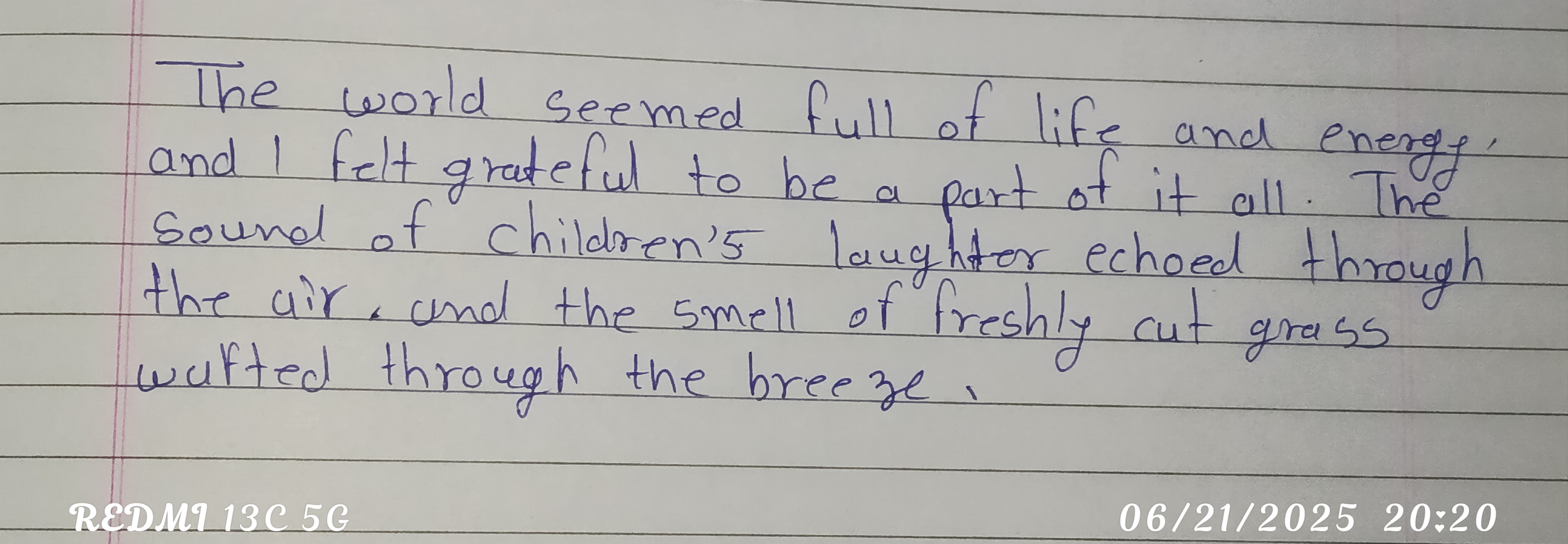
This handwriting sample presents a generally legible and consistent cursive style. The baseline is relatively straight, and most letters are correctly formed. The ascenders in words like "life" and "grateful" are nicely extended, and the overall flow is smooth, if a bit conventional. Some variations are seen in the formation of certain letters, for example, the 'r' in 'world' compared to the 'r' in 'breeze', hinting at an adaptable personality.
This style of handwriting implies a personality that is likely quite balanced and adaptable. The roundedness of the letters suggests warmth and friendliness, while the slightly irregular slants in the handwriting imply an independent streak. The clear formation of words like "grateful" and "energy" further suggest a person who appreciates life's simple pleasures and approaches the world with enthusiasm. There is a hint of formality, however, possibly due to the careful placement of words on the line, hinting at a respect for tradition and convention.
To enhance this handwriting further, you could experiment with increasing the variation in slant angles for a more dynamic appearance. Try connecting the 'r' in 'world' with the following 'l' to enhance flow and slightly increase writing speed. You might also consider increasing the spacing between words slightly for better visual clarity.
Legibility
Expressiveness
Consistency
Overall
Leaderboard for Tuesday, 28 October 2025
| 1 | The Divine Calligrapher |
80
|
| 2 | The Humble Hand |
76
|
| 3 | The Cursive Narrator |
74
|
| 4 | The Pristine Print |
71
|
| 5 | The Diligent Student |
71
|
| 6 | The Coastal Bard |
69
|
| 7 | The Cursive Cartographer |
68
|
| 8 | Sunrise Musings |
68
|
| 9 | The Coastal Chronicler |
67
|
| 10 | The Coastal Dreamer |
67
|
| 11 | The Cursive Narrator |
67
|
| 12 | The River's Flow |
67
|
| 13 | The Diligent Note-Taker |
67
|
| 14 | The Studious Note-Taker |
66
|
| 15 | The Eloquent Pen |
66
|
| 16 | The Pragmatic Pen |
66
|
| 17 | The Deliberate Draftsman |
65
|
| 18 | The Upright Pen |
65
|
| 19 | The Dream Weaver |
65
|
| 20 | The Scientific Hand |
65
|
| 21 | The Historian's Hand |
64
|
| 22 | The Traditionalist's Script |
64
|
| 23 | The Script of Devotion |
64
|
| 24 | The Elegant Academic |
63
|
| 25 | The Typographer's Testament |
63
|
| 26 | The Studious Note-Taker |
63
|
| 27 | The Loopy Dreamer |
62
|
| 28 | Babylonian Beaches |
62
|
| 29 | The Aquatic Caller |
62
|
| 30 | The Pragmatic Professor |
61
|