Rate my handwriting

✨ Upload a sample of your handwriting, and our 🤖 AI will give you
the scoop on
what's awesome
and what could use a
little improving.
It's just for fun - and totally free! Try now 🚀
(You can also check out today's 👑 Leaderboard 👇)
The Serpentine Script
This handwriting shows a flowing, elegant style suggesting an agreeable and outgoing personality, but consistency could be improved. With practice, focusing on letter size and pressure, this handwriting can become even more refined.
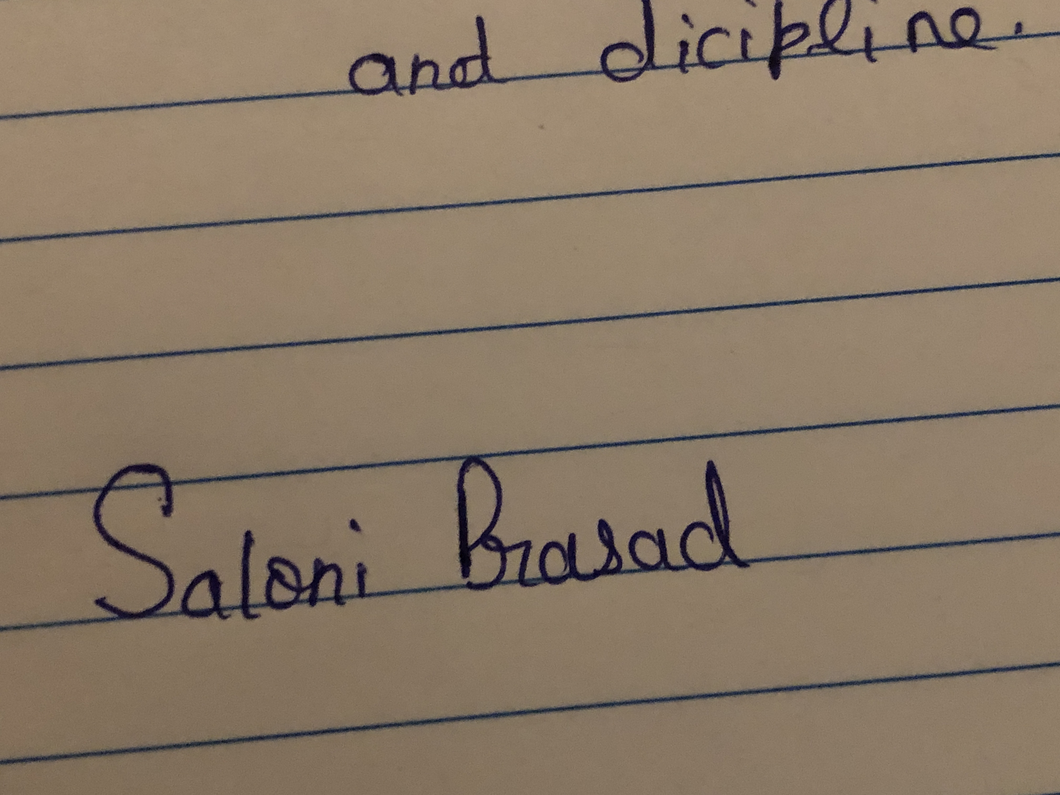
The handwriting sample showcases a flowing, cursive style. The connections between letters are smooth and rounded, creating a sense of fluidity, particularly noticeable in the words "Saloni" and "Prasad". The letters exhibit a moderate slant to the right. The baseline is followed, though with slight variations. There is a certain elegance in the curves, but it lacks a degree of consistency; for example, the size of the loops in 'l' and 'd' vary. The pressure applied is relatively uniform, resulting in consistent line thickness.
This handwriting suggests a personality that is agreeable, diplomatic, and values harmony. The smooth connections between letters imply a natural sociability. The rightward slant may indicate an outgoing nature, while the uniformity of pressure could suggest emotional stability. The writer probably has an appreciation for aesthetics, given the somewhat ornamental style. They might be artistic, or simply enjoy beauty in everyday life.
To improve this handwriting, try focusing on maintaining a consistent letter size, particularly the height of ascenders and descenders. Practice exercises to develop more uniform loops in letters like 'l' and 'd'. Experiment with varying the pressure slightly to add more character and emphasis to your writing. Consciously strive for a more consistent slant.
Legibility
Expressiveness
Consistency
Overall
Leaderboard for Tuesday, 16 September 2025
| 31 | The Civic-Minded Cursive |
55
|
| 32 | The Goofy Goose's Gabble |
55
|
| 33 | The Introspective Inker |
54
|
| 34 | The Pragmatic Physicist |
53
|
| 35 | The Flowing Wellspring |
52
|
| 36 | The Diligent Student |
52
|
| 37 | The Sightseer's Itinerary |
52
|
| 38 | The Serpentine Script |
51
|
| 39 | The Pragmatic Pen |
50
|