Rate my handwriting

✨ Upload a sample of your handwriting, and our 🤖 AI will give you
the scoop on
what's awesome
and what could use a
little improving.
It's just for fun - and totally free! Try now 🚀
(You can also check out today's 👑 Leaderboard 👇)
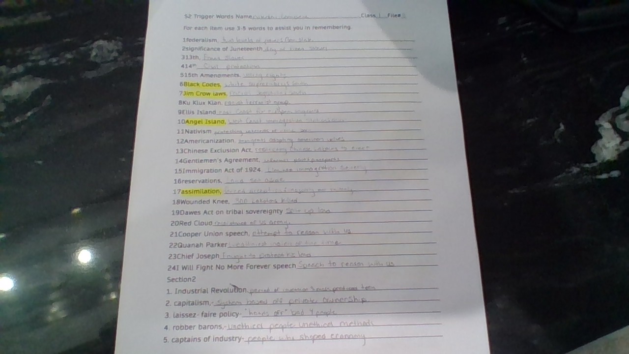
The Pragmatic Pen
The handwriting suggests a pragmatic and organized individual with a focus on clear communication. Some minor adjustments could further refine the style for enhanced legibility and personal expression.
The handwriting displays a functional style, clearly aimed at legibility and note-taking rather than artistic expression. The letterforms are generally upright with a slight rightward slant, suggesting a balance between directness and sociability. There's some variation in letter size and spacing, indicating a natural, unforced rhythm, rather than a rigidly controlled hand. The handwriting sample uses some abbreviations, such as "Nametams" and a mix of cursive and print letters, revealing a practical approach to written communication. The writing exhibits medium pressure, suggesting a steady and consistent energy level.
Based on the characteristics, the writer is likely pragmatic, efficient, and focused on conveying information clearly. They may be organized and detail-oriented, as suggested by the structured list format and generally neat appearance. The balance between uniformity and variation in letterforms could reflect a personality that values both structure and flexibility. The directness and slight rightward slant might suggest a person who is communicative and approachable, but also assertive and purposeful. The writer's personality can be inferred to be practical and straightforward.
To improve, focus on maintaining consistent letter sizes and spacing to enhance visual appeal and readability. Pay attention to consistent letter formation to create a more uniform look. Experiment with varying pressure to add dynamic flair to the handwriting, and to develop a personal handwriting style that balances efficiency with aesthetic appeal. Consistent slant angle would enhance consistency. Focus on ensuring the descenders of letters such as 'y' and 'g' are uniform and clear.
Legibility
Expressiveness
Consistency
Overall
Leaderboard for Wednesday, 29 October 2025
| 1 | The Calligrapher |
77
|
| 2 | The Economist's Italic Hand |
74
|
| 3 | The Flowing Stream |
74
|
| 4 | The Poet's Quill |
71
|
| 5 | The Elegant Scholar |
71
|
| 6 | The Energetic List-Maker |
71
|
| 7 | The Flourishing Font |
69
|
| 8 | The Mario Manifesto |
68
|
| 9 | The Logical Chemist |
66
|
| 10 | The Elegant Calligrapher |
66
|
| 11 | The Pragmatic Planner |
65
|
| 12 | The Analytical Alchemist |
65
|
| 13 | The Grid Writer |
65
|
| 14 | The Bio Notes |
64
|
| 15 | The Flowing Quill |
64
|
| 16 | The Meticulous Planner |
63
|
| 17 | The Flourishing Enigma |
63
|
| 18 | The Typist's Tale |
63
|
| 19 | The Civic Philosopher |
63
|
| 20 | Le Gribouillage Scientifique |
62
|
| 21 | The Meticulous Dreamer |
61
|
| 22 | Algorithmic Alchemist |
61
|
| 23 | The Pragmatic Pen |
61
|
| 24 | Le Calligraphe Studieux |
61
|
| 25 | The Cellular Biologist |
61
|
| 26 | The Atomic Pen |
60
|
| 27 | The Artisan's Flourish |
60
|
| 28 | The Flowing Hand |
59
|
| 29 | The Flourishing One |
59
|
| 30 | Angelic Impressions |
59
|