Rate my handwriting

✨ Upload a sample of your handwriting, and our 🤖 AI will give you
the scoop on
what's awesome
and what could use a
little improving.
It's just for fun - and totally free! Try now 🚀
(You can also check out today's 👑 Leaderboard 👇)
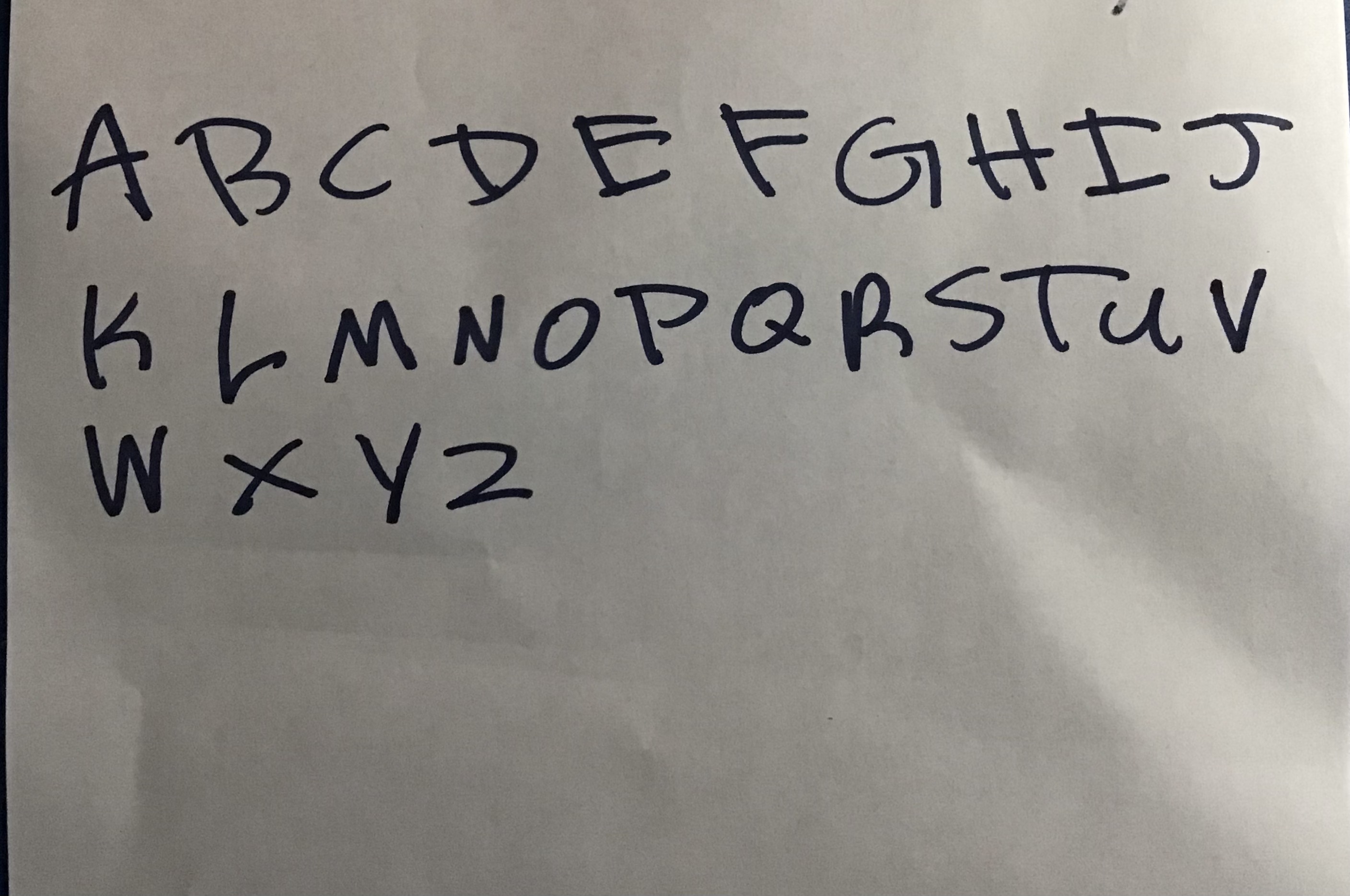
The Architect's Alphabet
The handwriting sample demonstrates a functional, architectural style, hinting at a methodical and confident personality. Experimenting with stroke variation and letter connections could improve the flow and visual appeal.
This handwriting style exhibits a blocky, almost architectural quality, with clearly defined letterforms. The capital letters are large and uniform in height. There is a degree of consistency across the letters, though the 'R' and 'S' deviate slightly. The pressure appears consistent throughout, resulting in even strokes. Overall, the handwriting leans towards the side of functionality over flair.
Given the structured nature of the writing, it suggests a personality that values clarity and order. The writer may be methodical, organized, and have a practical approach to problem-solving. The clear and deliberate strokes could indicate a thoughtful and detail-oriented individual. There's an air of self-assurance in the bold letterforms, suggesting confidence and directness.
To add more personality to the writing, try experimenting with varying the stroke thickness to add depth. Incorporating slight slants or curves can introduce a more dynamic feel. Practicing different letter connections, or ligatures, could improve the writing's overall flow. Finally, consciously adjusting the spacing between letters and words can make the handwriting appear more balanced and visually appealing.
Legibility
Expressiveness
Consistency
Overall
Leaderboard for Monday, 27 October 2025
| 1 | The Analytical Mind |
74
|
| 2 | The Eloquent Educator |
71
|
| 3 | The Student's Script |
70
|
| 4 | The Optimistic Poet |
68
|
| 5 | The Agrarian Academic |
67
|
| 6 | The Diligent Penman |
67
|
| 7 | The Analytical Alchemist |
65
|
| 8 | The Calculating Hand |
65
|
| 9 | The Scientific Hand |
65
|
| 10 | The Aesthetic Typist |
65
|
| 11 | The Mathematical Muse |
64
|
| 12 | The Agile Leaper |
64
|
| 13 | The Diligent Note-Taker |
64
|
| 14 | The Quill of Conviction |
62
|
| 15 | The Agile Artisan |
61
|
| 16 | The Curious Chemist |
59
|
| 17 | The Practical Notetaker |
58
|
| 18 | The Devout Note-Taker |
58
|
| 19 | The Elaborate Chronicler |
58
|
| 20 | The Considerate Confidant |
56
|
| 21 | The Orderly Typewriter |
56
|
| 22 | The Hurried Healer |
55
|
| 23 | The Aspiring Typesetter |
53
|
| 24 | The Architect of Letters |
53
|
| 25 | The Flourishing Academic |
53
|
| 26 | The Diligent Note-Taker |
53
|
| 27 | The Steadfast Student |
53
|
| 28 | The Ambitious Note-Taker |
52
|
| 29 | Celestial Notes |
52
|
| 30 | The Pragmatic Hand |
52
|