Rate my handwriting

✨ Upload a sample of your handwriting, and our 🤖 AI will give you
the scoop on
what's awesome
and what could use a
little improving.
It's just for fun - and totally free! Try now 🚀
(You can also check out today's 👑 Leaderboard 👇)

The Geographer's Quill
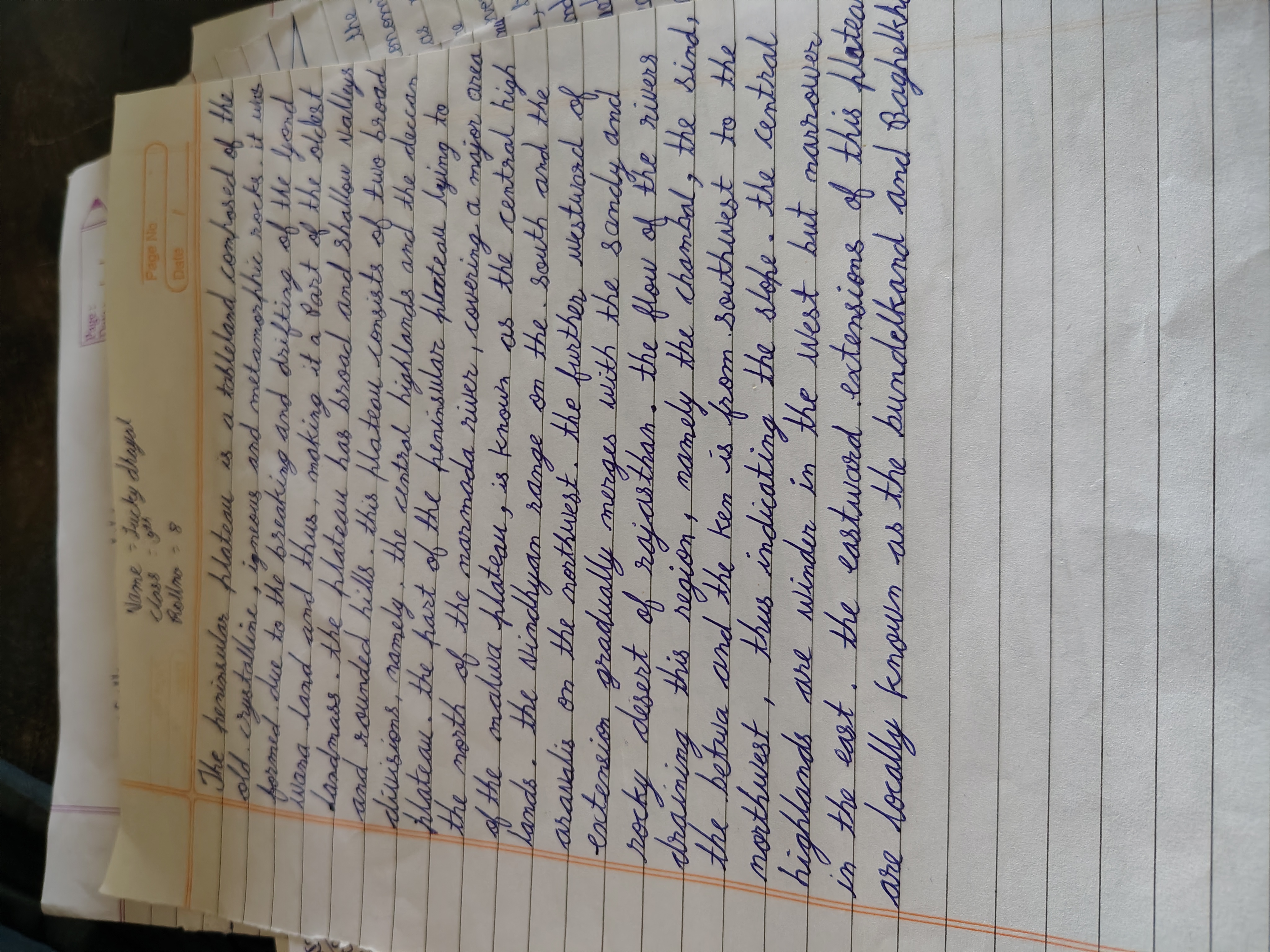
This handwriting is neat and consistent, suggesting an organized and disciplined individual with a desire for clarity and harmony.
The handwriting presents a generally neat and consistent appearance. The letter formation is quite uniform, and the baseline adherence is steady, suggesting good control. Words are spaced reasonably well, and the letter size is consistent throughout the sample. The script is flowing with rounded letters, such as in the words "plateau" and "crystalline", and the slant is generally upright, with a slight tendency towards a rightward inclination.
Based on the handwriting, the writer appears to be someone who values order and clarity. The consistent letter formation and baseline suggest a disciplined and methodical approach to tasks. The rounded forms may indicate a desire for harmony and cooperation. The generally upright slant could mean the writer is balanced and self-controlled, but the slight rightward inclination suggests warmth and engagement with others.
To enhance the handwriting, focusing on varying the letter size slightly could add more expressiveness. Practicing different slants could also bring dynamism to the writing. Experimenting with a finer pen might allow for more intricate detailing in letter formation. While the current handwriting is legible, incorporating these elements could make it more aesthetically pleasing and reflective of personal flair.
Legibility
Expressiveness
Consistency
Overall
Leaderboard for Sunday, 26 October 2025
| 1 | The Pristine Penman |
76
|
| 2 | The Determined Diarist |
75
|
| 3 | The Constitutionalist |
74
|
| 4 | The Flowing Quill |
74
|
| 5 | The Pragmatic Planner |
73
|
| 6 | The Student |
73
|
| 7 | The Diligent Dreamer |
73
|
| 8 | Geometric Author |
73
|
| 9 | The Curator's Script |
72
|
| 10 | The Pragmatist's Script |
72
|
| 11 | The Eloquent Calligrapher |
71
|
| 12 | The Dreamer's Quill |
70
|
| 13 | The Organized Storyteller |
69
|
| 14 | The Hopeful Heart's Script |
68
|
| 15 | The Flowing Hand |
68
|
| 16 | The Flowing Quill |
68
|
| 17 | The Constitutionalist |
68
|
| 18 | The Looping Luminary |
68
|
| 19 | The Unassuming Hand |
66
|
| 20 | The Studious Student |
65
|
| 21 | The Classicist's Quill |
65
|
| 22 | The Optimistic Artist |
65
|
| 23 | The Minimalist's Mark |
64
|
| 24 | The Contemplative Soul |
64
|
| 25 | The Efficient Note-Taker |
64
|
| 26 | The Gentle Flow |
63
|
| 27 | The Flowing Font |
63
|
| 28 | Diligent Student |
63
|
| 29 | The Looping Legend |
62
|
| 30 | The Liberty Lover's Cursive |
61
|