Rate my handwriting

✨ Upload a sample of your handwriting, and our 🤖 AI will give you
the scoop on
what's awesome
and what could use a
little improving.
It's just for fun - and totally free! Try now 🚀
(You can also check out today's 👑 Leaderboard 👇)
The Practical Dreamer
This handwriting belongs to someone who is organized and warm, with a hint of impulsive creativity and a generally positive outlook.
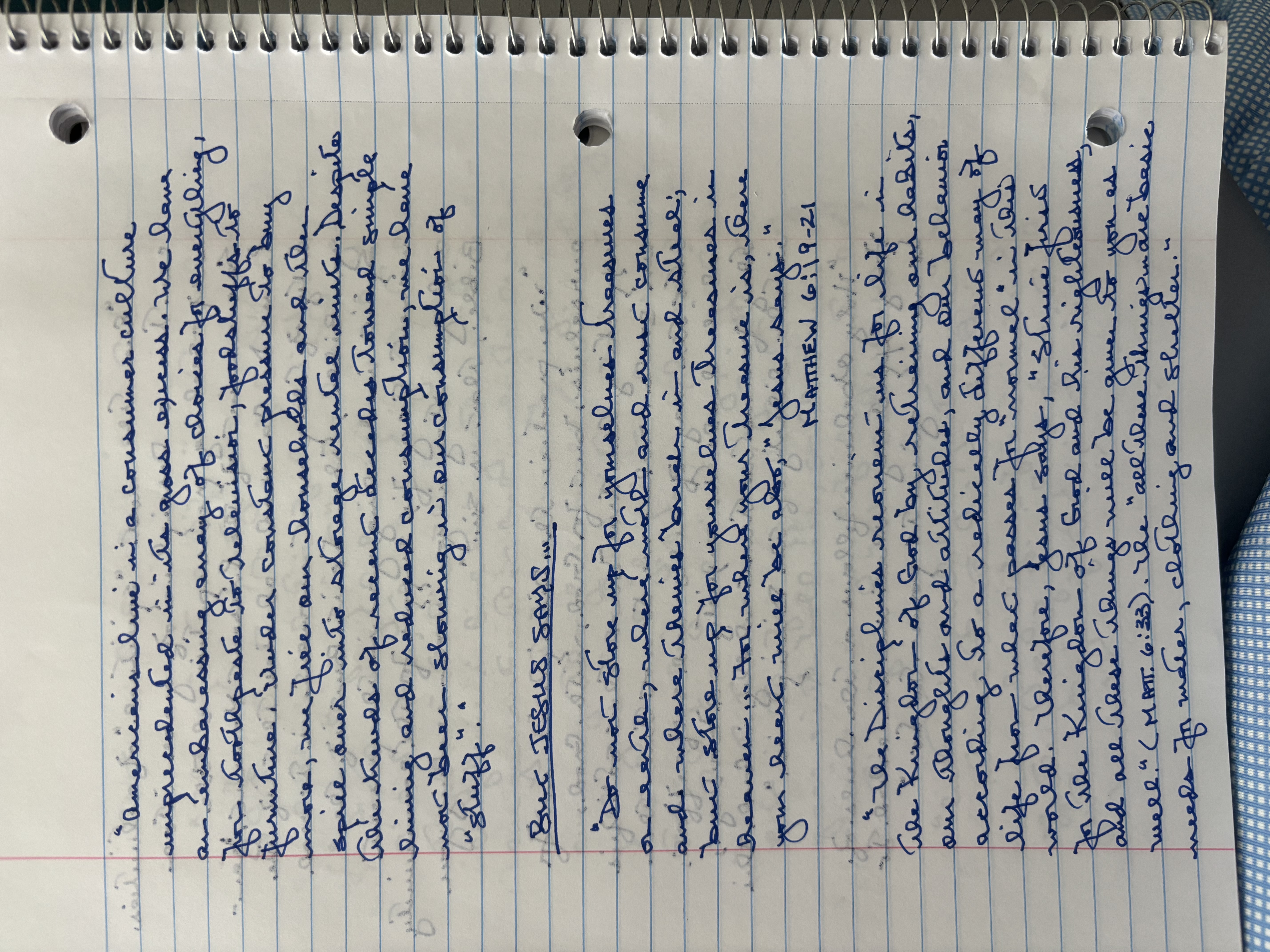
This handwriting is generally legible, with a connected style and a consistent slant. The letters are rounded, and the words flow smoothly across the page. There's a rhythm to the writing, with occasional flourishes, such as in the long tails of "g" and "y" and the rounded tops of "m" and "n". While mostly uniform in size, some words, like "embarrassing" and "furniture", vary slightly in height and width, adding a touch of personality. The baseline is mostly straight, showing focus, but some lines drift slightly upwards, hinting at optimism.
This handwriting suggests a practical, yet dreamy personality. The connected letters reveal a methodical mind, someone who likes to think things through. The consistent slant and rounded letters indicate a warm and approachable nature. The occasional flourishes hint at a touch of creativity and expressiveness, suggesting that the writer enjoys adding their own personal touch to things. The varying heights and widths of words might indicate some impulsiveness, a willingness to deviate from the norm. The mostly straight baseline shows focus and determination, while the occasional upward drift indicates optimism and a positive outlook on life.
To improve this handwriting, focusing on maintaining consistent letter sizes and heights would enhance its neatness. Paying closer attention to the baseline will create a more polished look. Practicing loops and joins, especially for letters like "g" and "y", could refine their form and add more flair. While the expressiveness is a positive aspect, working on more controlled ascenders and descenders would improve the overall legibility and visual appeal.
Legibility
Expressiveness
Consistency
Overall
Leaderboard for Monday, 27 October 2025
| 1 | The Divine Calligrapher |
80
|
| 2 | The Humble Hand |
76
|
| 3 | The Analytical Mind |
74
|
| 4 | The Diligent Student |
71
|
| 5 | The Pristine Print |
71
|
| 6 | The Student's Script |
70
|
| 7 | The Coastal Bard |
69
|
| 8 | The Optimistic Poet |
68
|
| 9 | Sunrise Musings |
68
|
| 10 | The Cursive Cartographer |
68
|
| 11 | The River's Flow |
67
|
| 12 | The Diligent Penman |
67
|
| 13 | The Coastal Chronicler |
67
|
| 14 | The Diligent Note-Taker |
67
|
| 15 | The Coastal Dreamer |
67
|
| 16 | The Cursive Narrator |
67
|
| 17 | The Pragmatic Pen |
66
|
| 18 | The Eloquent Pen |
66
|
| 19 | The Scientific Hand |
65
|
| 20 | The Analytical Alchemist |
65
|
| 21 | The Deliberate Draftsman |
65
|
| 22 | The Aesthetic Typist |
65
|
| 23 | The Agile Leaper |
64
|
| 24 | The Script of Devotion |
64
|
| 25 | The Mathematical Muse |
64
|
| 26 | The Traditionalist's Script |
64
|
| 27 | The Diligent Note-Taker |
64
|
| 28 | The Typographer's Testament |
63
|
| 29 | The Elegant Academic |
63
|
| 30 | The Studious Note-Taker |
63
|