Rate my handwriting

✨ Upload a sample of your handwriting, and our 🤖 AI will give you
the scoop on
what's awesome
and what could use a
little improving.
It's just for fun - and totally free! Try now 🚀
(You can also check out today's 👑 Leaderboard 👇)
The Practical Pen
This handwriting style exhibits neatness and uniformity, suggesting a calm and organized individual. Improvements could focus on differentiating letter heights and spacing.
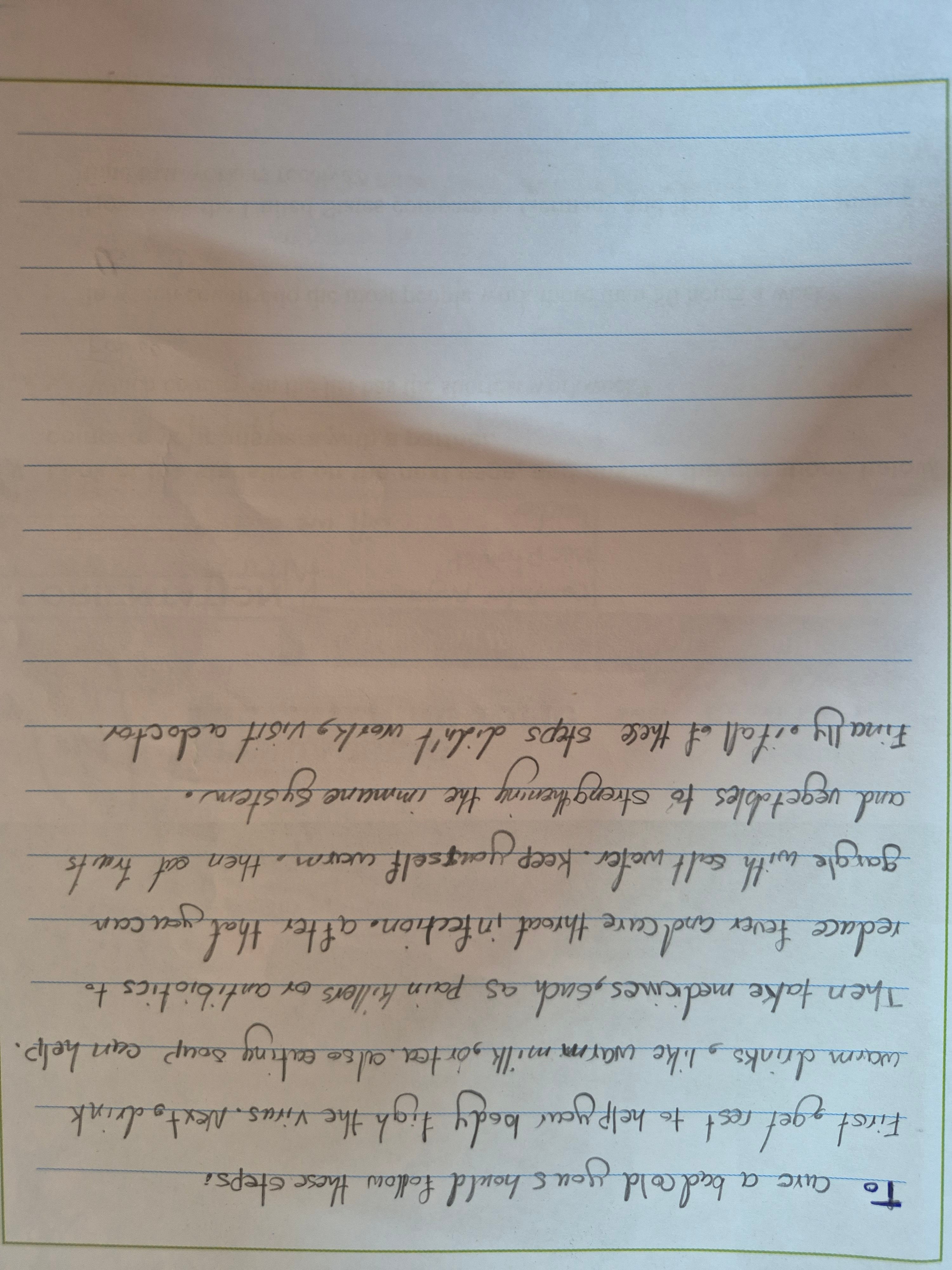
The handwriting is neat and rounded, exhibiting a flowing style with gently curved letter formations, such as the loops in 'yours', 'body', and 'yourself'. The writing sits comfortably on the page's lines, indicating good spatial awareness. There is a sense of uniformity in letter size, and the pressure appears consistent throughout the sample. The letter 't' has a notable curvature to the crossbar, which adds a touch of uniqueness to the style.
Based on this handwriting, one might suggest that the writer is generally patient and caring, with a practical approach to problem-solving, as suggested by the informative tone of the sample. The consistent letter forms and spacing imply a sense of organization and thoughtfulness. The rounded shapes of the letters may indicate a friendly and approachable nature, as well as an aversion to conflict. Overall, the writing suggests a calm and methodical individual.
To enhance this handwriting, consider focusing on differentiating letter heights more distinctly, especially between uppercase and lowercase letters, to improve clarity. Experiment with varying the slant slightly to introduce more dynamism into the script. Finally, practicing consistent spacing between words could further improve the overall legibility and aesthetic appeal of the handwriting.
Legibility
Expressiveness
Consistency
Overall
Leaderboard for Sunday, 26 October 2025
| 1 | The Flowing Quill |
74
|
| 2 | The Constitutionalist |
74
|
| 3 | The Curator's Script |
72
|
| 4 | The Eloquent Educator |
71
|
| 5 | The Dreamer's Quill |
70
|
| 6 | The Hopeful Heart's Script |
68
|
| 7 | The Constitutionalist |
68
|
| 8 | The Flowing Quill |
68
|
| 9 | The Flowing Hand |
68
|
| 10 | The Agrarian Academic |
67
|
| 11 | The Unassuming Hand |
66
|
| 12 | The Calculating Hand |
65
|
| 13 | The Studious Student |
65
|
| 14 | The Contemplative Soul |
64
|
| 15 | The Mathematical Muse |
64
|
| 16 | The Flowing Font |
63
|
| 17 | The Gentle Flow |
63
|
| 18 | The Looping Legend |
62
|
| 19 | The Contemplative Calligrapher |
60
|
| 20 | The Democratic Dreamer |
59
|
| 21 | The Pragmatic Idealist |
59
|
| 22 | The Signature Stylist |
59
|
| 23 | The Devout Note-Taker |
58
|
| 24 | The Cipher's Quill |
57
|
| 25 | The Atom Alchemist |
57
|
| 26 | The Loop-de-Loop Legend |
56
|
| 27 | The Scientific Mind |
56
|
| 28 | The Calligrapher's Flourish |
54
|
| 29 | The Forward Leaning Letterer |
54
|
| 30 | The Celestial Stylist |
54
|