Rate my handwriting

✨ Upload a sample of your handwriting, and our 🤖 AI will give you
the scoop on
what's awesome
and what could use a
little improving.
It's just for fun - and totally free! Try now 🚀
(You can also check out today's 👑 Leaderboard 👇)
The Practical Penman
This handwriting reveals a pragmatic individual who values clarity over artistry, with room for improvement in consistency and neatness. The writer would benefit from practicing letter formations and focusing on even pressure.
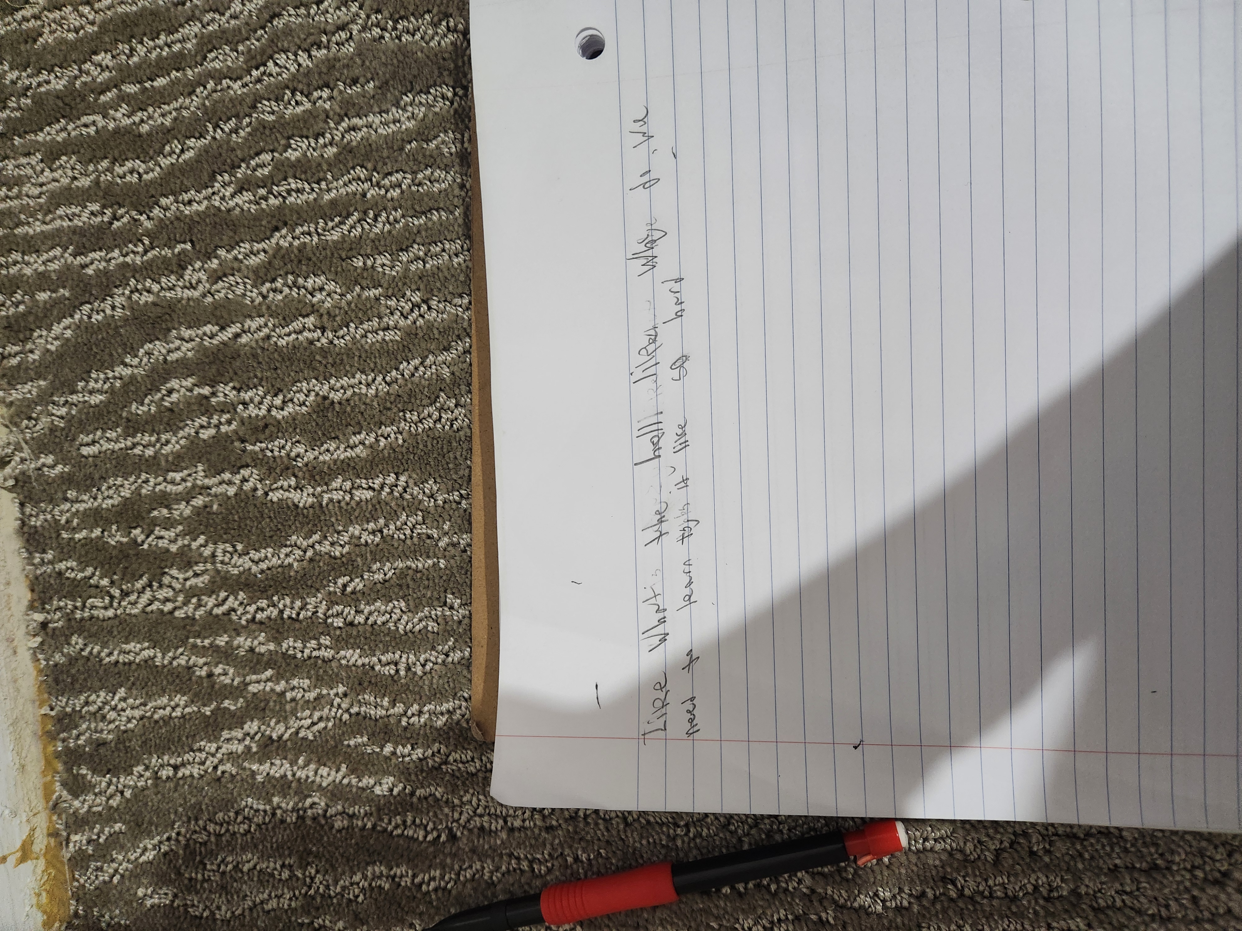
The handwriting exhibits a practical and straightforward style. The script is somewhat inconsistent, with variations in letter size and spacing. The words "Like Whatis the hell Wilker" are legible but the overall impression is a slightly hurried, functional script. There's a clear attempt to stay within the lines, suggesting a degree of organization, but the pressure applied to the pen varies, leading to an uneven appearance. The formation of letters such as 'W' and 'l' suggests a certain lack of flourish, prioritizing clarity over aesthetic appeal.
This style hints at a personality that values efficiency and directness. The writer is likely pragmatic and focused on conveying information clearly, even if it means sacrificing elegance. They may be more concerned with getting the job done than with appearances or formalities. The slight inconsistency could indicate a flexible approach, adapting to circumstances rather than adhering rigidly to rules.
To improve, try focusing on consistent letter sizing and spacing. Practicing letter formations with even pressure can enhance legibility and create a more polished look. Paying attention to the baseline and ensuring letters sit uniformly on the line can also improve the overall neatness of the handwriting. Regular practice and conscious effort can refine the style and make it more visually appealing.
Legibility
Expressiveness
Consistency
Overall
Leaderboard for Saturday, 01 November 2025
| 1 | The Precise Constitutionalist |
72
|
| 2 | The Idealist's Quill |
71
|
| 3 | The Optimist |
71
|
| 4 | The Architect's Hand |
69
|
| 5 | The Communal Calligrapher |
68
|
| 6 | The Serpentine Thinker |
68
|
| 7 | The Friendly Tester |
68
|
| 8 | The Print-Maker |
68
|
| 9 | The Pragmatist's Script |
67
|
| 10 | The Benevolent Calligrapher |
66
|
| 11 | Geometric Soul |
66
|
| 12 | The Elementary Author |
65
|
| 13 | The Spirited Athlete |
65
|
| 14 | The Maverick's Mark |
65
|
| 15 | The Leader's Mark |
64
|
| 16 | The Bard's Quill |
63
|
| 17 | The Deliberate Student |
63
|
| 18 | The Determined Deep Diver |
62
|
| 19 | The Deliberate Artificer |
61
|
| 20 | The Environmentalist's Cursive |
61
|
| 21 | The Maverick's Manifesto |
60
|
| 22 | The Cosmographer's Quill |
59
|
| 23 | The Introspective Calligrapher |
59
|
| 24 | Optimistic Outlook |
58
|
| 25 | Optimistic Penman |
57
|
| 26 | The Environmentalist's Cursive |
56
|
| 27 | The Looping Liberal |
56
|
| 28 | The Diligent Student |
56
|
| 29 | The Student |
56
|
| 30 | Arctic Musings |
55
|