Rate my handwriting

✨ Upload a sample of your handwriting, and our 🤖 AI will give you
the scoop on
what's awesome
and what could use a
little improving.
It's just for fun - and totally free! Try now 🚀
(You can also check out today's 👑 Leaderboard 👇)

The Flowing Hand
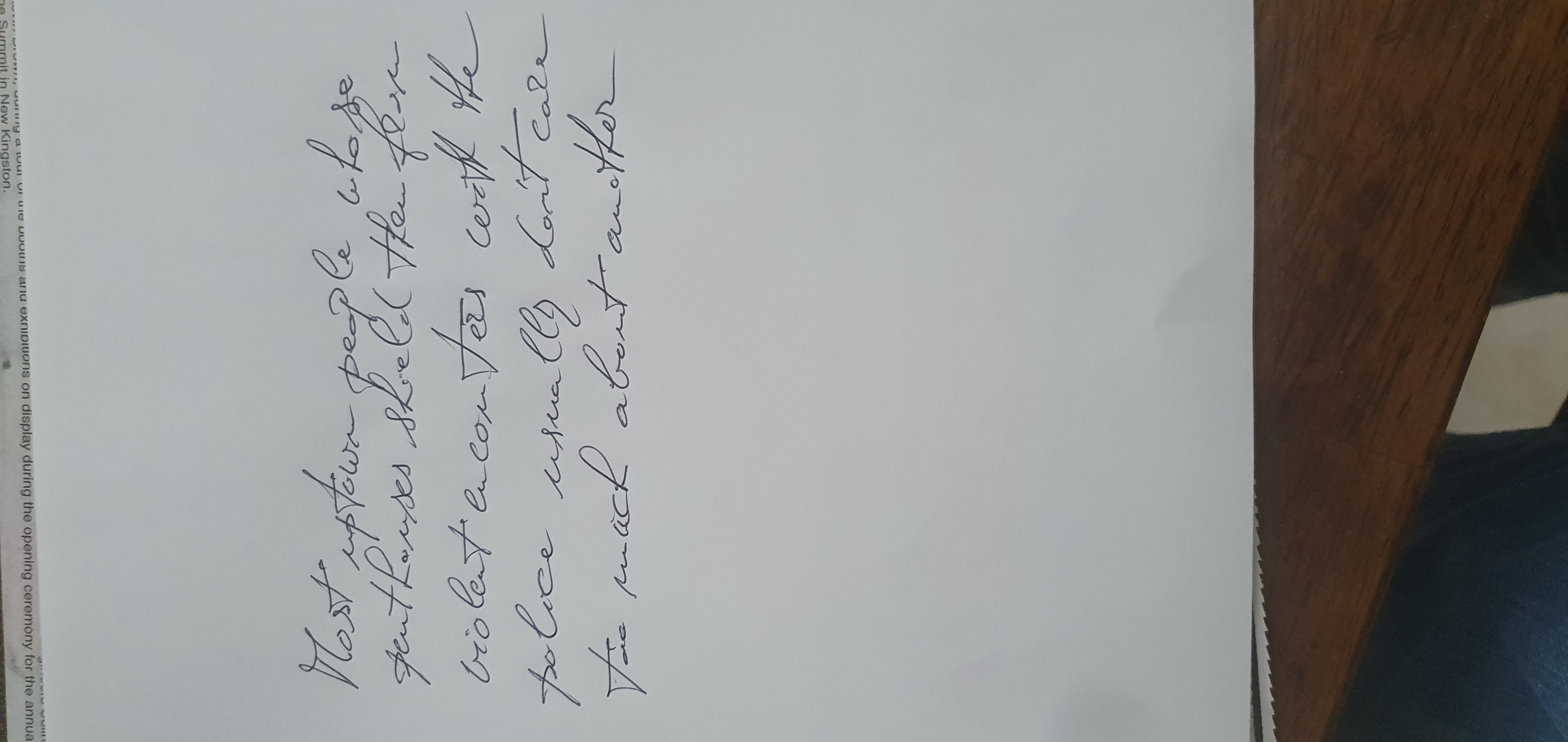
The handwriting exhibits a flowing, cursive style with some inconsistencies, suggesting a sociable and adaptable personality. By focusing on consistent letter formation and spacing, the writer can improve legibility and enhance the overall aesthetic of their handwriting.
The handwriting in this sample presents a cursive style, where letters are generally connected, though some breaks occur. The overall appearance is fluid, as seen in the connections within words like "people" and "usually", yet there's a degree of inconsistency in letter formation, particularly with the letter 't' in words such as "uptown" and "violent". The size of the letters is moderately uniform, but the slant is variable, leaning slightly to the right. The baseline adherence is relatively stable, with a few words like "too much about" dipping slightly. Overall legibility is acceptable, but some letter formations, such as the 's' in "houses" and "encounters", could be clearer. The writing is generally neat, but some words are slightly cramped.
Based on this sample, the writer likely possesses a blend of adaptability and independence. The flowing connections suggest a sociable nature, enjoying the ease of interaction. However, the inconsistencies in letter formation and slant could imply a degree of impulsiveness or a tendency to adapt to different situations. The rightward slant typically indicates a forward-thinking and enthusiastic approach to life, while the baseline stability suggests emotional balance. The legibility and neatness suggest a thoughtful individual, though not overly meticulous. The variable pressure indicates someone who is capable of strong emotions, but does not express them very frequently.
To improve handwriting, focusing on consistent letter formation would be beneficial. Practicing specific letters, such as the 't' and 's', with attention to detail, could enhance legibility. Maintaining a more uniform slant and spacing between words would also improve overall appearance. Consider experimenting with different pen grips to find one that allows for more consistent pressure and flow. Regular practice with mindful attention to these details will lead to more polished and expressive handwriting.
Legibility
Expressiveness
Consistency
Overall
Leaderboard for Saturday, 01 November 2025
| 1 | The Precise Constitutionalist |
72
|
| 2 | The Optimist |
71
|
| 3 | The Idealist's Quill |
71
|
| 4 | The Architect's Hand |
69
|
| 5 | The Serpentine Thinker |
68
|
| 6 | The Diplomat's Script |
68
|
| 7 | The Communal Calligrapher |
68
|
| 8 | The Friendly Tester |
68
|
| 9 | The Pragmatist's Script |
67
|
| 10 | The Benevolent Calligrapher |
66
|
| 11 | Geometric Soul |
66
|
| 12 | The Elementary Author |
65
|
| 13 | The Diligent Student |
65
|
| 14 | The Maverick's Mark |
65
|
| 15 | The Resilient Hand |
64
|
| 16 | The Diligent Student |
64
|
| 17 | The Civil Servant |
64
|
| 18 | The Deliberate Student |
63
|
| 19 | The Diplomat's Doodlings |
61
|
| 20 | The Environmentalist's Cursive |
61
|
| 21 | The Deliberate Artificer |
61
|
| 22 | The Maverick's Manifesto |
60
|
| 23 | The Cosmographer's Quill |
59
|
| 24 | Optimistic Outlook |
58
|
| 25 | Optimistic Penman |
57
|
| 26 | The Looping Liberal |
56
|
| 27 | The Diligent Student |
56
|
| 28 | The Environmentalist's Cursive |
56
|
| 29 | The Student |
56
|
| 30 | The Budding Author's Script |
55
|