Rate my handwriting

✨ Upload a sample of your handwriting, and our 🤖 AI will give you
the scoop on
what's awesome
and what could use a
little improving.
It's just for fun - and totally free! Try now 🚀
(You can also check out today's 👑 Leaderboard 👇)
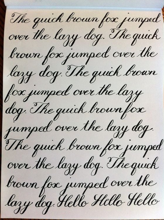
The Calligrapher's Cursive
This sample exhibits a fluid, right-slanted cursive style, hinting at a personality that balances tradition with a touch of creative expression. Minor improvements in size and baseline consistency would further enhance legibility and polish.
This handwriting sample showcases a consistently right-slanted cursive, marked by rounded letters and fluid strokes. The 'f' in 'fox', for instance, exhibits a distinctive upward curve, and the 'z' in 'lazy' is consistently looped. Words like 'jumped' and 'over' demonstrate the writer's easy transition between letters, suggesting practiced, fluent penmanship. While there is a pleasant rhythm to the repeated 'quick brown fox' phrase, the overall neatness and proportion are slightly variable. The size of the words tends to decrease towards the end of each line, and some letters, such as 'o' and 'a', vary slightly in size. Legibility remains good, as each word is distinctly formed, although a slight tightening of letter spacing might further enhance clarity.
This style hints at a personality that values tradition and classicism. The choice of cursive, particularly this well-formed variant, implies a degree of formality and attention to detail. The rightward slant suggests a forward-thinking, expressive individual, comfortable sharing their thoughts and ideas. The subtle variations in letter size and baseline indicate adaptability and a flexible nature. This writer may have a creative streak, enjoying elegant, flowing scripts, but there's also a practical side, balancing artistic expression with a need for clear communication.
To further refine this lovely cursive, consider paying closer attention to maintaining consistent letter sizes throughout each line. Practice writing on lined paper to improve baseline consistency, ensuring the script remains uniform. Experimenting with different pen nibs and paper textures can also help discover a sweet spot for optimal ink flow, enhancing the natural grace of the cursive. Maintaining uniform spacing between letters will improve legibility and create a more polished, professional look.
Legibility
Expressiveness
Consistency
Overall
Leaderboard for Monday, 27 October 2025
| 1 | The Constitutionalist |
74
|
| 2 | The Eloquent Educator |
71
|
| 3 | The Student's Script |
70
|
| 4 | The Dreamer's Quill |
70
|
| 5 | The Hopeful Heart's Script |
68
|
| 6 | The Constitutionalist |
68
|
| 7 | The Diligent Penman |
67
|
| 8 | The Agrarian Academic |
67
|
| 9 | The Analytical Alchemist |
65
|
| 10 | The Calculating Hand |
65
|
| 11 | The Contemplative Soul |
64
|
| 12 | The Agile Leaper |
64
|
| 13 | The Mathematical Muse |
64
|
| 14 | The Diligent Note-Taker |
64
|
| 15 | The Gentle Flow |
63
|
| 16 | The Looping Legend |
62
|
| 17 | The Agile Artisan |
61
|
| 18 | The Contemplative Calligrapher |
60
|
| 19 | The Democratic Dreamer |
59
|
| 20 | The Devout Note-Taker |
58
|
| 21 | The Practical Notetaker |
58
|
| 22 | The Considerate Confidant |
56
|
| 23 | The Orderly Typewriter |
56
|
| 24 | The Forward Leaning Letterer |
54
|
| 25 | The Steadfast Student |
53
|
| 26 | The Diligent Student |
53
|
| 27 | The Diligent Note-Taker |
53
|
| 28 | The Flowing River |
53
|
| 29 | The Architect of Letters |
53
|
| 30 | The Pragmatic Hand |
52
|