Rate my handwriting

✨ Upload a sample of your handwriting, and our 🤖 AI will give you
the scoop on
what's awesome
and what could use a
little improving.
It's just for fun - and totally free! Try now 🚀
(You can also check out today's 👑 Leaderboard 👇)
The Tempestuous Pen
The handwriting displays a unique and expressive style, suggesting an outgoing and creative personality, although some attention to consistency and neatness could improve its legibility. This sample shows a flair for creativity and a devil-may-care attitude.
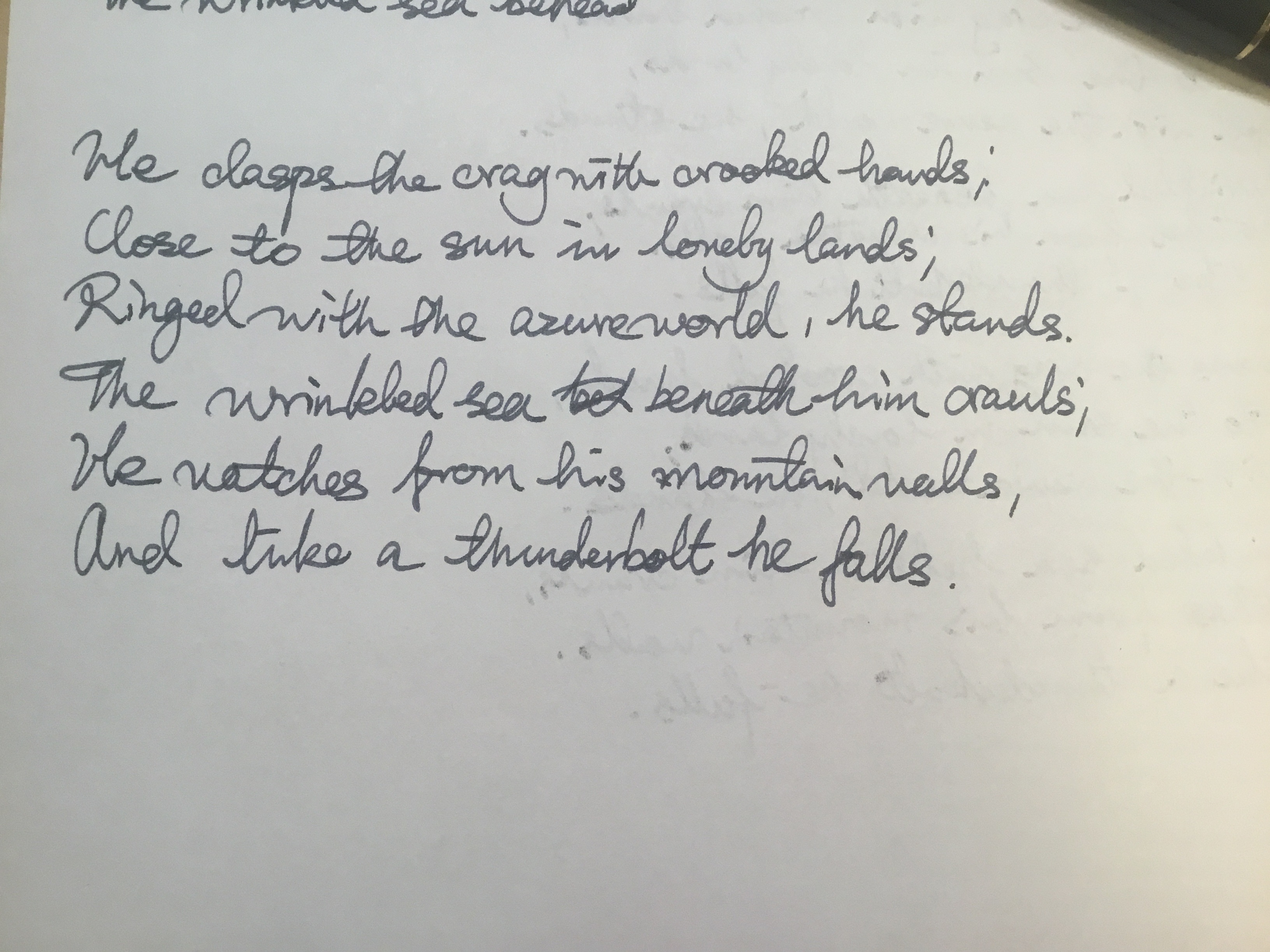
The handwriting leans towards a cursive style, with letters often connected within words, giving it a sense of flow. There's a notable slant to the right, and the size is relatively consistent, though the spacing between words can vary. Certain letter formations are distinctive, such as the open 'o' and the slightly angular 'n', and the looping 'l' and 'h'. The pressure seems fairly consistent throughout, resulting in a uniform line weight. Overall, the writing has a personal touch but leans towards casual rather than formal. It is not the neatest example; for instance, the spelling of 'wrinkled' as 'wrinkleded' shows that it may have been written in haste. Some words are joined up ('azureworld') while others have excessive space ('lonely lands').
Based on the handwriting, one might infer a personality that is expressive and engaged, perhaps a bit impulsive. The rightward slant suggests a forward-thinking and outgoing nature. The slight inconsistencies in letter formation and spacing might indicate a person who is adaptable but also prone to occasional carelessness or impatience. The handwriting shows signs of creativity and confidence.
To improve legibility and consistency, try practicing letter forms individually, paying attention to spacing and size. Slowing down and focusing on each stroke can help create more uniform letter formations and improve the overall neatness of the handwriting. Concentrating on consistent spacing between words will also make the writing easier to read. The slant is consistent, so it is part of the handwriting's style, but a more vertical hand might give the impression of increased organisation.
Legibility
Expressiveness
Consistency
Overall
Leaderboard for Monday, 27 October 2025
| 1 | The Divine Calligrapher |
80
|
| 2 | The Humble Hand |
76
|
| 3 | The Cursive Narrator |
74
|
| 4 | The Analytical Mind |
74
|
| 5 | The Pristine Print |
71
|
| 6 | The Diligent Student |
71
|
| 7 | The Coastal Bard |
69
|
| 8 | The Optimistic Poet |
68
|
| 9 | Sunrise Musings |
68
|
| 10 | The Cursive Cartographer |
68
|
| 11 | The Cursive Narrator |
67
|
| 12 | The Diligent Note-Taker |
67
|
| 13 | The Coastal Dreamer |
67
|
| 14 | The River's Flow |
67
|
| 15 | The Coastal Chronicler |
67
|
| 16 | The Pragmatic Pen |
66
|
| 17 | The Studious Note-Taker |
66
|
| 18 | The Eloquent Pen |
66
|
| 19 | The Aesthetic Typist |
65
|
| 20 | The Scientific Hand |
65
|
| 21 | The Deliberate Draftsman |
65
|
| 22 | The Analytical Alchemist |
65
|
| 23 | The Dream Weaver |
65
|
| 24 | The Traditionalist's Script |
64
|
| 25 | The Agile Leaper |
64
|
| 26 | The Script of Devotion |
64
|
| 27 | The Studious Note-Taker |
63
|
| 28 | The Elegant Academic |
63
|
| 29 | The Typographer's Testament |
63
|
| 30 | Babylonian Beaches |
62
|