Rate my handwriting

✨ Upload a sample of your handwriting, and our 🤖 AI will give you
the scoop on
what's awesome
and what could use a
little improving.
It's just for fun - and totally free! Try now 🚀
(You can also check out today's 👑 Leaderboard 👇)
The Romantic's Script
This handwriting showcases a right-leaning cursive style, suggesting an expressive personality with room for improvement in consistency and spacing. It indicates a blend of emotional openness and artistic inclination.
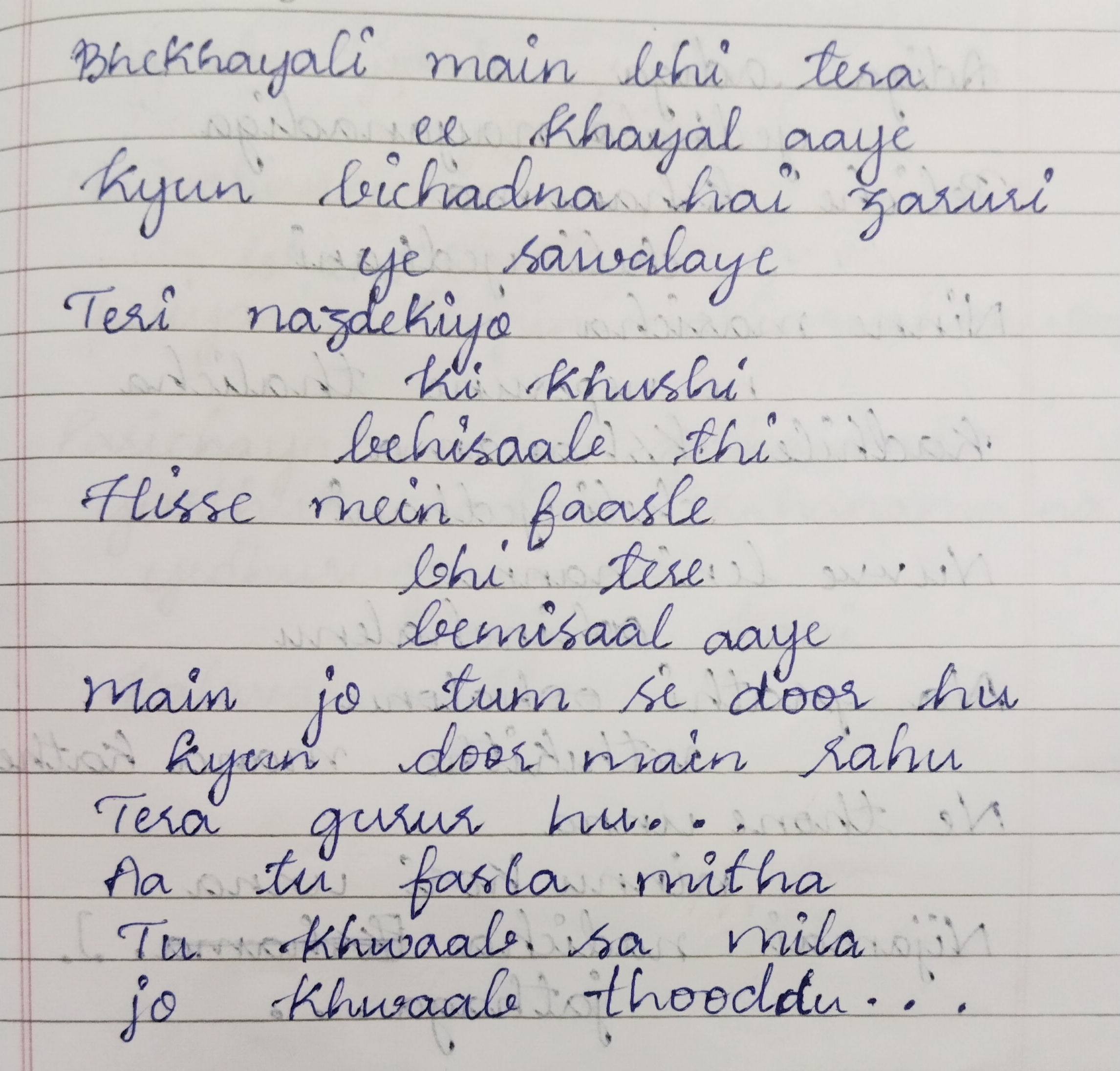
The handwriting sample presents a cursive style with a noticeable slant to the right, evident in words like "khayal" and "zaruri." The letter formations are generally rounded, giving a soft and flowing appearance, though consistency varies, as seen in the different heights of the letters. The baseline undulates slightly, and there's a moderate pressure applied, suggesting a gentle but firm hand. Overall, the handwriting leans towards a decorative aesthetic rather than strict functionality.
The writer likely possesses a warm and expressive personality, valuing emotional connection and artistic expression. The slant indicates openness and a willingness to engage with others. The varying consistency could suggest a dynamic nature, adaptable to different situations but also prone to occasional inconsistency. There may also be a creative side, as the style suggests a person who values aesthetics.
To improve, focusing on maintaining a more consistent baseline would enhance legibility. Practicing uniform letter heights could also contribute to a neater appearance. Additionally, working on consistent spacing between words, which sometimes appears cramped, would make the handwriting easier to read. Overall, by concentrating on consistency, the writing could be even more visually appealing.
Legibility
Expressiveness
Consistency
Overall