Rate my handwriting

✨ Upload a sample of your handwriting, and our 🤖 AI will give you
the scoop on
what's awesome
and what could use a
little improving.
It's just for fun - and totally free! Try now 🚀
(You can also check out today's 👑 Leaderboard 👇)
The Determined Dreamer
This handwriting reveals a balanced individual with a thoughtful and expressive nature, who values both structure and creativity.
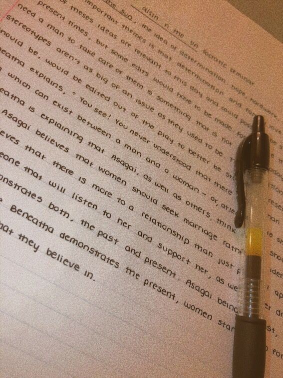
This handwriting sample presents a captivating blend of consistency and delicate flourishes. The letters, while generally uniform in size and slant, exhibit a subtle dance of spontaneity, particularly noticeable in words like "determination" and "stereotypes." The gentle curves and rounded forms suggest a flowing, adaptable nature, while the occasional pointed ascenders and descenders, seen in letters like "h" and "g," hint at a touch of quiet determination. The baseline is remarkably straight, conveying a sense of stability and focus. The overall impression is one of neatness and legibility, making the text easy to decipher and conveying a respect for clear communication.
This handwriting suggests a personality that is both thoughtful and expressive. The balance between consistency and subtle flourishes indicates a person who appreciates order and structure, yet is open to new experiences and ideas. The flowing, interconnected letters hint at a strong sense of intuition and empathy, while the clear legibility suggests a desire to connect with others and share their thoughts and insights. The writer is likely someone who values both logic and emotion, carefully considering their words before expressing them. They may also possess a quiet determination and perseverance, allowing them to pursue their goals with a steady hand and a clear vision.
To further enhance this already pleasing handwriting, one could focus on increasing the contrast between the strokes. While the overall presentation is neat, adding a bit more weight to the downstrokes would create a more dynamic and visually engaging effect. This could be achieved by applying slightly more pressure to the pen during those downward motions. Additionally, paying attention to the spacing between words could improve readability and create a more polished look. Ensuring consistent spacing throughout the text will give the writing a more professional and refined feel.
Legibility
Expressiveness
Consistency
Overall
Leaderboard for Monday, 27 October 2025
| 1 | The Constitutionalist |
74
|
| 2 | The Eloquent Educator |
71
|
| 3 | The Student's Script |
70
|
| 4 | The Dreamer's Quill |
70
|
| 5 | The Hopeful Heart's Script |
68
|
| 6 | The Constitutionalist |
68
|
| 7 | The Diligent Penman |
67
|
| 8 | The Agrarian Academic |
67
|
| 9 | The Analytical Alchemist |
65
|
| 10 | The Calculating Hand |
65
|
| 11 | The Contemplative Soul |
64
|
| 12 | The Agile Leaper |
64
|
| 13 | The Mathematical Muse |
64
|
| 14 | The Diligent Note-Taker |
64
|
| 15 | The Gentle Flow |
63
|
| 16 | The Looping Legend |
62
|
| 17 | The Agile Artisan |
61
|
| 18 | The Contemplative Calligrapher |
60
|
| 19 | The Democratic Dreamer |
59
|
| 20 | The Devout Note-Taker |
58
|
| 21 | The Practical Notetaker |
58
|
| 22 | The Considerate Confidant |
56
|
| 23 | The Orderly Typewriter |
56
|
| 24 | The Forward Leaning Letterer |
54
|
| 25 | The Steadfast Student |
53
|
| 26 | The Diligent Student |
53
|
| 27 | The Diligent Note-Taker |
53
|
| 28 | The Flowing River |
53
|
| 29 | The Architect of Letters |
53
|
| 30 | The Pragmatic Hand |
52
|