Rate my handwriting

✨ Upload a sample of your handwriting, and our 🤖 AI will give you
the scoop on
what's awesome
and what could use a
little improving.
It's just for fun - and totally free! Try now 🚀
(You can also check out today's 👑 Leaderboard 👇)
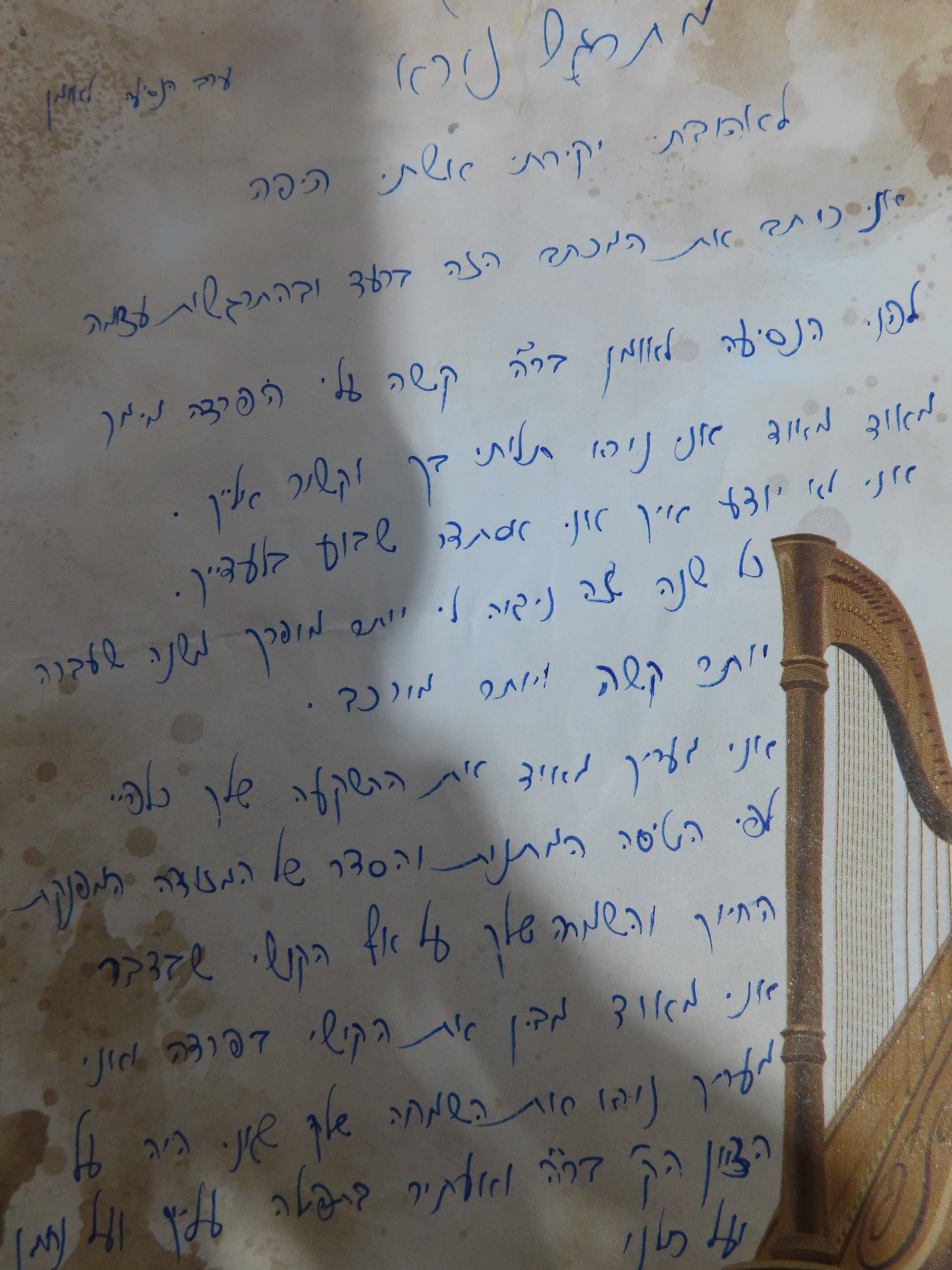
The Lyrical Penman
This handwriting expresses a creative and expressive personality, but consistency in slant, baseline, and spacing would enhance legibility.
The handwriting in this sample dances across the page with a rhythmic, almost musical quality. The rounded curves and delicate loops, particularly evident in words like "کی" and "کا", suggest a flowing, connected script. However, the varying slant and baseline of words such as "کے" and "میں" indicate a touch of spontaneity and perhaps a hint of impatience. The inconsistent spacing between letters and words further contributes to the impression of a free-spirited hand.
This handwriting suggests a personality that is both creative and expressive. The lyrical flow of the script hints at an artistic nature, while the variable slant and baseline indicate a flexible and adaptable approach to life. The inconsistent spacing and varying letter sizes might suggest a certain impulsiveness and a tendency to follow one's own path. The writer likely enjoys expressing themselves and values personal connections.
While this handwriting possesses a certain charm, improving consistency would enhance legibility. Focusing on maintaining a consistent slant and baseline, especially in longer sentences, could make the writing easier to follow. Practicing consistent spacing between letters and words would further improve readability and give the writing a more polished look. This will enhance the writer's natural expressiveness and prevent any misinterpretations due to readability issues.
Legibility
Expressiveness
Consistency
Overall
Leaderboard for Tuesday, 28 October 2025
| 1 | The Divine Calligrapher |
80
|
| 2 | The Humble Hand |
76
|
| 3 | The Cursive Narrator |
74
|
| 4 | The Pristine Print |
71
|
| 5 | The Diligent Student |
71
|
| 6 | The Coastal Bard |
69
|
| 7 | Sunrise Musings |
68
|
| 8 | The Cursive Cartographer |
68
|
| 9 | The Considerate Soul |
67
|
| 10 | The Coastal Chronicler |
67
|
| 11 | The Cursive Narrator |
67
|
| 12 | The Diligent Note-Taker |
67
|
| 13 | The Coastal Dreamer |
67
|
| 14 | The Diligent Calligrapher |
67
|
| 15 | The River's Flow |
67
|
| 16 | The Eloquent Pen |
66
|
| 17 | The Studious Note-Taker |
66
|
| 18 | The Pragmatic Pen |
66
|
| 19 | The Pharmacist's Note |
65
|
| 20 | The Deliberate Draftsman |
65
|
| 21 | The Upright Pen |
65
|
| 22 | The Dream Weaver |
65
|
| 23 | The Historian's Hand |
64
|
| 24 | The Script of Devotion |
64
|
| 25 | The Traditionalist's Script |
64
|
| 26 | The Elegant Academic |
63
|
| 27 | The Studious Note-Taker |
63
|
| 28 | The Gridiron Enthusiast |
63
|
| 29 | The Typographer's Testament |
63
|
| 30 | The Aquatic Caller |
62
|