Rate my handwriting

✨ Upload a sample of your handwriting, and our 🤖 AI will give you
the scoop on
what's awesome
and what could use a
little improving.
It's just for fun - and totally free! Try now 🚀
(You can also check out today's 👑 Leaderboard 👇)
The Arithmetician's Quill
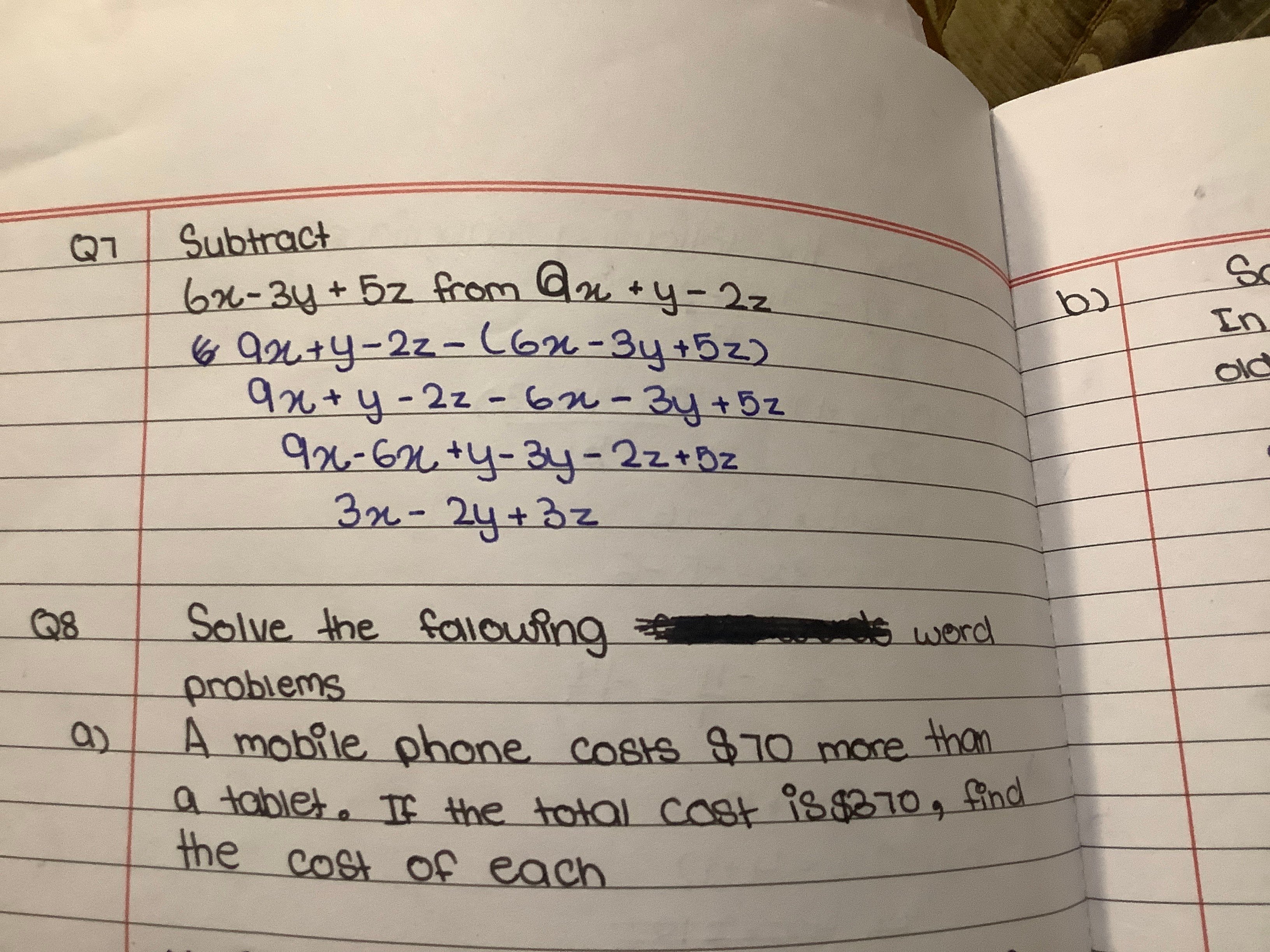
This handwriting exhibits a practical and organized style with room for improvement in consistency and spacing. The writer demonstrates a methodical approach, yet can benefit from exercises to enhance fluidity and overall legibility.
The handwriting sample presents a blend of rounded forms and simplified letter structures. There's a slight forward slant evident in words like "Subtract", "Solve" and the equations. The letter 'y' is distinctive with a curved descender, and the 'x' maintains a consistent form throughout the mathematical expressions. Spacing between words and lines is moderate, creating a readable, but somewhat crowded, appearance on the page.
This style suggests a practical and straightforward approach to tasks. The rounded letters indicate a tendency towards empathy and a desire for harmony. The consistency in letter formation, particularly in mathematical symbols, hints at a methodical and organized nature. However, the slight crowding suggests a potential to become overwhelmed when faced with too much information or too many responsibilities.
To improve, focus on consistent letter sizing and spacing between words. Practice exercises that encourage a more fluid connection between letters within words, promoting a smoother, more confident stroke. Paying attention to the baseline and maintaining consistent slant can further enhance legibility and visual appeal.
Legibility
Expressiveness
Consistency
Overall
Leaderboard for Saturday, 01 November 2025
| 31 | The Grateful Heart's Script |
54
|
| 32 | The Deliberate Draftsman |
53
|
| 33 | The Naturalist's Cursive |
53
|
| 34 | The Jolly Jottings |
53
|
| 35 | The Biochemist's Cursive |
53
|
| 36 | The Optimist's Affirmation |
52
|
| 37 | The Gamer's Itch |
52
|
| 38 | The Eco-Conscious Cursive |
51
|
| 39 | The Casual Communicator |
51
|
| 40 | The Diplomat's Quill |
51
|
| 41 | The Pragmatic Petitioner |
50
|
| 42 | The Budding Explorer |
46
|