Rate my handwriting

✨ Upload a sample of your handwriting, and our 🤖 AI will give you
the scoop on
what's awesome
and what could use a
little improving.
It's just for fun - and totally free! Try now 🚀
(You can also check out today's 👑 Leaderboard 👇)
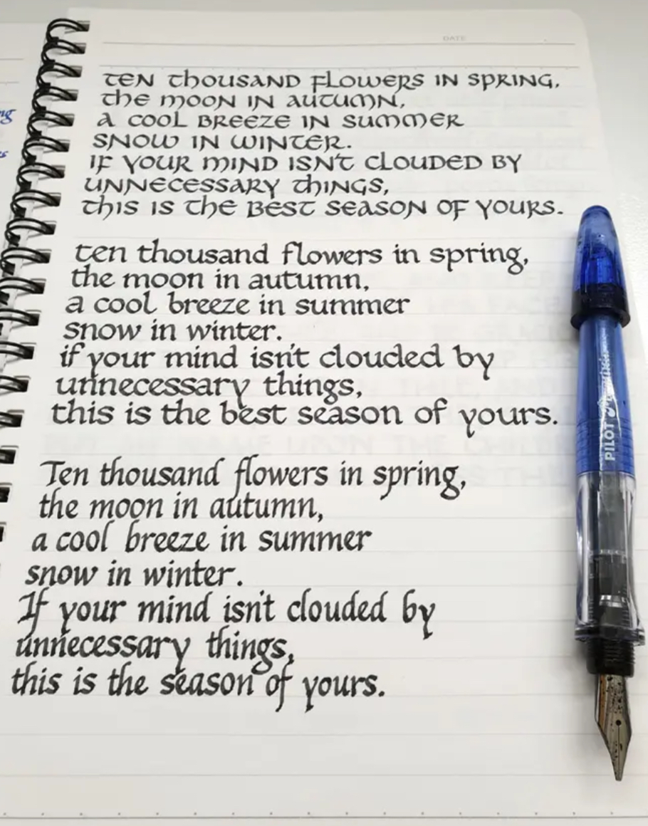
The Calligrapher's Contemplation
This handwriting exhibits a deliberate and elegant style, suggesting a personality that appreciates beauty and precision. Further refinements in spacing and stroke variation could enhance its visual impact.
The handwriting sample presents a distinctive, almost calligraphic style, reminiscent of elegant book lettering. The capital letters, like the 'T' in 'Ten' and 'I' in 'If', are noticeably larger and more elaborate than the lowercase, creating a sense of visual hierarchy. The use of thick and thin strokes within each letter, as seen in the 'S' of 'SPRING' and the curves of 'FLOWERS', suggests a deliberate and controlled hand. There is a high degree of consistency in letter formation throughout the sample, particularly in the repeated phrases, indicating a practiced hand and a clear vision for the desired aesthetic. However, the occasional slight variations, such as in the slant of certain letters, add a touch of individuality to the otherwise formal style.
This handwriting style suggests a personality that values beauty, precision, and order. The deliberate and controlled strokes indicate a thoughtful and methodical approach to tasks. The writer likely appreciates aesthetics and may have a creative or artistic inclination. The consistency in letter formation also implies a strong sense of discipline and attention to detail. The blend of formality and slight variations hints at a personality that balances tradition with individuality, someone who appreciates established norms but also seeks to express their unique perspective.
To further enhance this handwriting style, consider focusing on maintaining consistent spacing between letters and words to improve readability. Experimenting with different nib sizes and ink colors could add even more visual interest. Practice varying the pressure applied to the pen to create even more dramatic thick-and-thin stroke variations, which could elevate the calligraphic feel. Overall, the current style is already quite refined, so these are merely suggestions for further exploration and personal expression.
Legibility
Expressiveness
Consistency
Overall
Leaderboard for Monday, 17 November 2025
| 1 | The Pragmatic Planner |
73
|
| 2 | The Elegant Poet |
71
|
| 3 | The Outsider's Quill |
70
|
| 4 | The Dreamer's Quill |
70
|
| 5 | Ocean Gazer |
70
|
| 6 | The Gourmet's Penmanship |
69
|
| 7 | The Whimsical Looper |
68
|
| 8 | The Flourishing Signature |
68
|
| 9 | The Refined Alchemist |
68
|
| 10 | The Friendly Loop |
68
|
| 11 | La Caligrafía Reflexiva |
68
|
| 12 | The Spirited Signature |
68
|
| 13 | The Flowing Stream |
68
|
| 14 | The Yuletide Wish List |
66
|
| 15 | The Professor's Lecture Notes |
66
|
| 16 | The Copperplate Prodigy |
66
|
| 17 | Calligraphic Muse |
66
|
| 18 | The Diligent Notetaker |
64
|
| 19 | The Diligent Pen |
64
|
| 20 | The Fluid Dreamer |
63
|
| 21 | The Orchard Typist |
62
|
| 22 | The Aviator's Itinerary |
61
|
| 23 | The Pragmatic Professor |
61
|
| 24 | The Calligrapher's Contemplation |
61
|
| 25 | The Pragmatic Planner |
60
|
| 26 | The Flourishing Signature |
60
|
| 27 | The Precise Performer |
60
|
| 28 | The Scholar's Cursive |
58
|
| 29 | The Practical Dreamer |
58
|
| 30 | The Pragmatic Hand |
58
|