Rate my handwriting

✨ Upload a sample of your handwriting, and our 🤖 AI will give you
the scoop on
what's awesome
and what could use a
little improving.
It's just for fun - and totally free! Try now 🚀
(You can also check out today's 👑 Leaderboard 👇)
The Innocent Hand
The handwriting reveals an unpretentious and straightforward nature, but could benefit from more consistent letter formation and spacing. Improving consistency will create a more polished appearance.
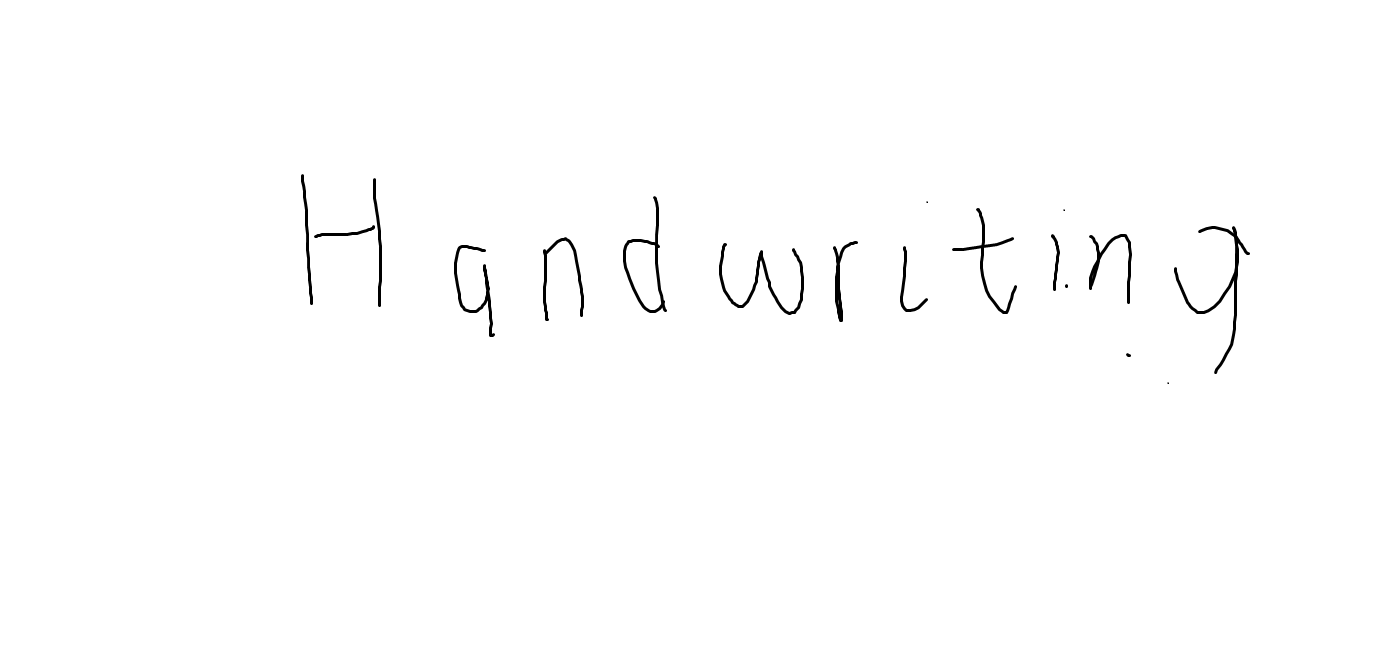
The handwriting sample showcases a simple and somewhat childlike style. The letters are generally upright, with rounded forms evident in characters like 'a', 'd', 'w', 'r', and 'g'. The baseline wavers slightly, giving it an unrefined appearance. The spacing between letters and words is somewhat inconsistent. Overall, it is legible, though not particularly polished. The letter heights also vary, which contributes to the lack of uniformity. The letter 'H' and 'g' have descenders. The pressure appears to be consistent throughout the sample.
Based on the handwriting, it suggests a personality that is unpretentious, straightforward, and possibly a bit naive. The roundness of the letters hints at a friendly and approachable nature, while the inconsistent baseline may indicate a flexible or adaptable temperament. The simplicity of the style suggests someone who is down-to-earth and not overly concerned with appearances. The lack of flourishes or complex formations implies a practical and no-nonsense approach to life.
To improve the handwriting, focus on practicing consistency in letter height and spacing. Deliberately draw lines between letters to maintain uniformity. Spend some time practicing individual letter formations to refine their shapes and make them more consistent. Try to maintain a steady baseline to create a more stable and polished look. Experiment with different writing tools, such as a finer pen or pencil, to achieve better control and precision.
Legibility
Expressiveness
Consistency
Overall
Leaderboard for Saturday, 01 November 2025
| 1 | The Precise Constitutionalist |
72
|
| 2 | The Idealist's Quill |
71
|
| 3 | The Optimist |
71
|
| 4 | The Architect's Hand |
69
|
| 5 | The Communal Calligrapher |
68
|
| 6 | The Serpentine Thinker |
68
|
| 7 | The Friendly Tester |
68
|
| 8 | The Print-Maker |
68
|
| 9 | The Pragmatist's Script |
67
|
| 10 | The Benevolent Calligrapher |
66
|
| 11 | Geometric Soul |
66
|
| 12 | The Elementary Author |
65
|
| 13 | The Spirited Athlete |
65
|
| 14 | The Maverick's Mark |
65
|
| 15 | The Leader's Mark |
64
|
| 16 | The Bard's Quill |
63
|
| 17 | The Deliberate Student |
63
|
| 18 | The Determined Deep Diver |
62
|
| 19 | The Deliberate Artificer |
61
|
| 20 | The Environmentalist's Cursive |
61
|
| 21 | The Maverick's Manifesto |
60
|
| 22 | The Cosmographer's Quill |
59
|
| 23 | The Introspective Calligrapher |
59
|
| 24 | Optimistic Outlook |
58
|
| 25 | Optimistic Penman |
57
|
| 26 | The Environmentalist's Cursive |
56
|
| 27 | The Looping Liberal |
56
|
| 28 | The Diligent Student |
56
|
| 29 | The Student |
56
|
| 30 | Arctic Musings |
55
|