Rate my handwriting

✨ Upload a sample of your handwriting, and our 🤖 AI will give you
the scoop on
what's awesome
and what could use a
little improving.
It's just for fun - and totally free! Try now 🚀
(You can also check out today's 👑 Leaderboard 👇)
The Graceful Leaper
This handwriting suggests an adaptable and outgoing personality with a gentle nature, but legibility could be improved with more consistent letter sizing and spacing.
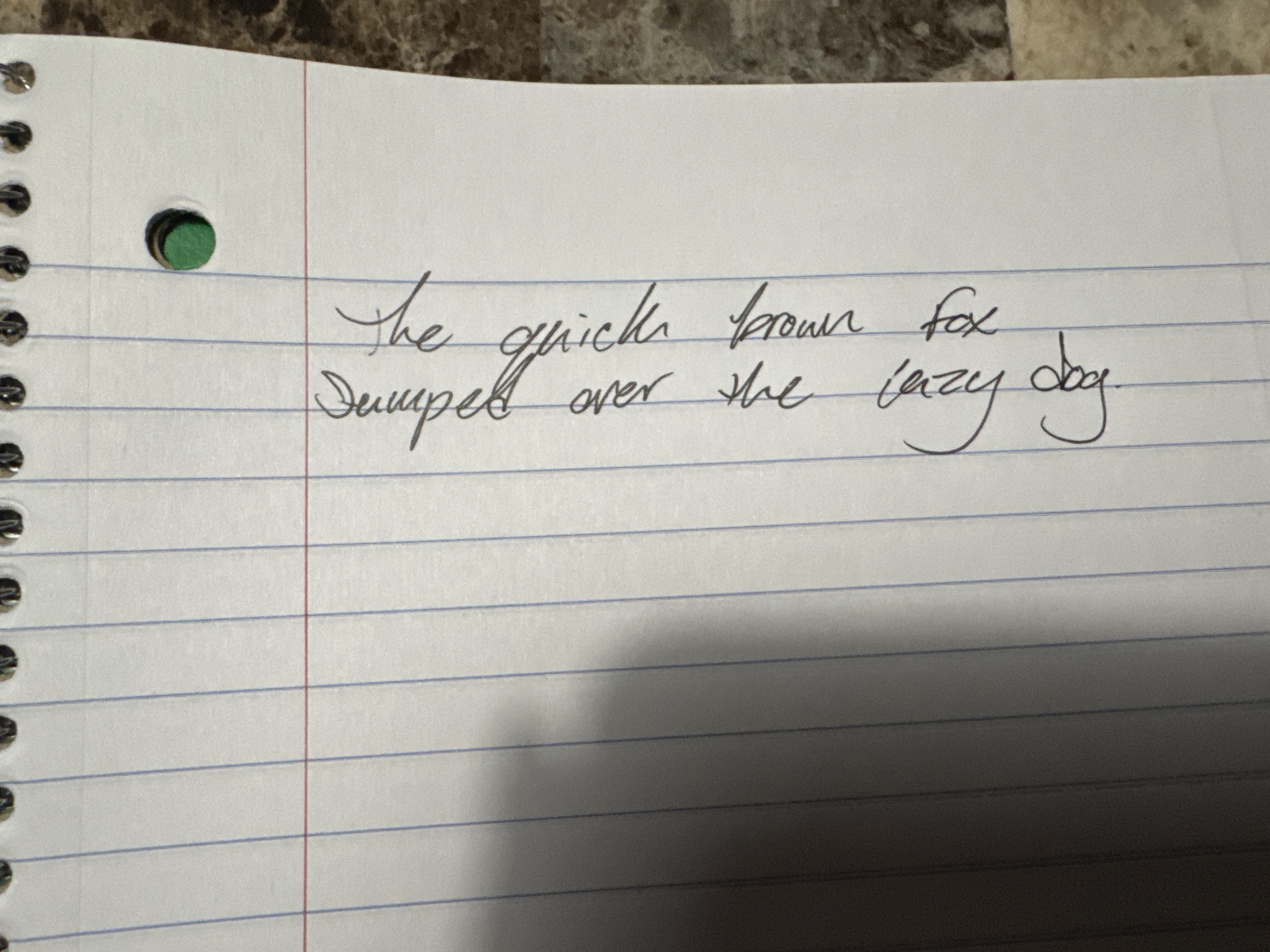
This handwriting presents a cursive style, exhibiting a notable slant to the right. The letter formations are generally rounded, as seen in words like "brown" and "dog", giving a flowing, connected appearance. The baseline adherence is relatively consistent, indicating good control. There's a moderate degree of pressure, suggesting a balanced approach. Overall, the handwriting appears neat and relatively legible, although some letters, like the 'k' in "quick", could benefit from clearer definition.
Based on the handwriting, one might infer personality traits such as adaptability and a tendency to be outgoing, as indicated by the rightward slant. The rounded letterforms could suggest a gentle and agreeable nature. The consistency in the baseline and pressure implies a degree of emotional stability and focus. The flowing connections between letters may reflect a mind that readily connects ideas and concepts.
To improve your handwriting, focus on consistent letter sizing and spacing to enhance legibility. Practice maintaining uniform pressure throughout each word to avoid any unintended variations. Pay specific attention to clarifying letter formations, such as the 'k' in "quick", to ensure they are easily distinguishable. Experiment with varying the slant slightly to find the most comfortable and readable angle for you.
Legibility
Expressiveness
Consistency
Overall
Leaderboard for Tuesday, 16 September 2025
| 1 | The Measured Hand |
74
|
| 2 | The Artful Elegant |
73
|
| 3 | The Gentle Flow |
71
|
| 4 | The Disciplined Intellectual |
68
|
| 5 | The Optimistic Dreamer |
68
|
| 6 | The Unconventional Ballerina |
67
|
| 7 | The Meditative Devotee |
67
|
| 8 | The Upright Penman |
67
|
| 9 | The Cartographer's Quill |
65
|
| 10 | The Pondering Penman |
64
|
| 11 | The Pragmatic Pen |
64
|
| 12 | The Artful Ascender |
63
|
| 13 | The Flowing Font |
63
|
| 14 | The Diligent Documenter |
63
|
| 15 | The Encourager's Script |
63
|
| 16 | The Logical Thinker |
62
|
| 17 | The Scholarly Hand |
61
|
| 18 | The Pragmatic Penman |
59
|
| 19 | The Constitutional Quill |
59
|
| 20 | The Determined Dreamer |
58
|
| 21 | The Fluid Philosopher |
58
|
| 22 | The Anatomist's Script |
58
|
| 23 | The Royal Decree |
58
|
| 24 | The Graceful Leaper |
58
|
| 25 | The Precise Penman |
56
|
| 26 | The Academic Hustler |
56
|
| 27 | The Rounded Romantic |
56
|
| 28 | The Curious Cosmographer |
56
|
| 29 | The Eloquent Essayist |
56
|
| 30 | The Elementary Elocutionist |
56
|