Rate my handwriting

✨ Upload a sample of your handwriting, and our 🤖 AI will give you
the scoop on
what's awesome
and what could use a
little improving.
It's just for fun - and totally free! Try now 🚀
(You can also check out today's 👑 Leaderboard 👇)

The Practical Minimalist
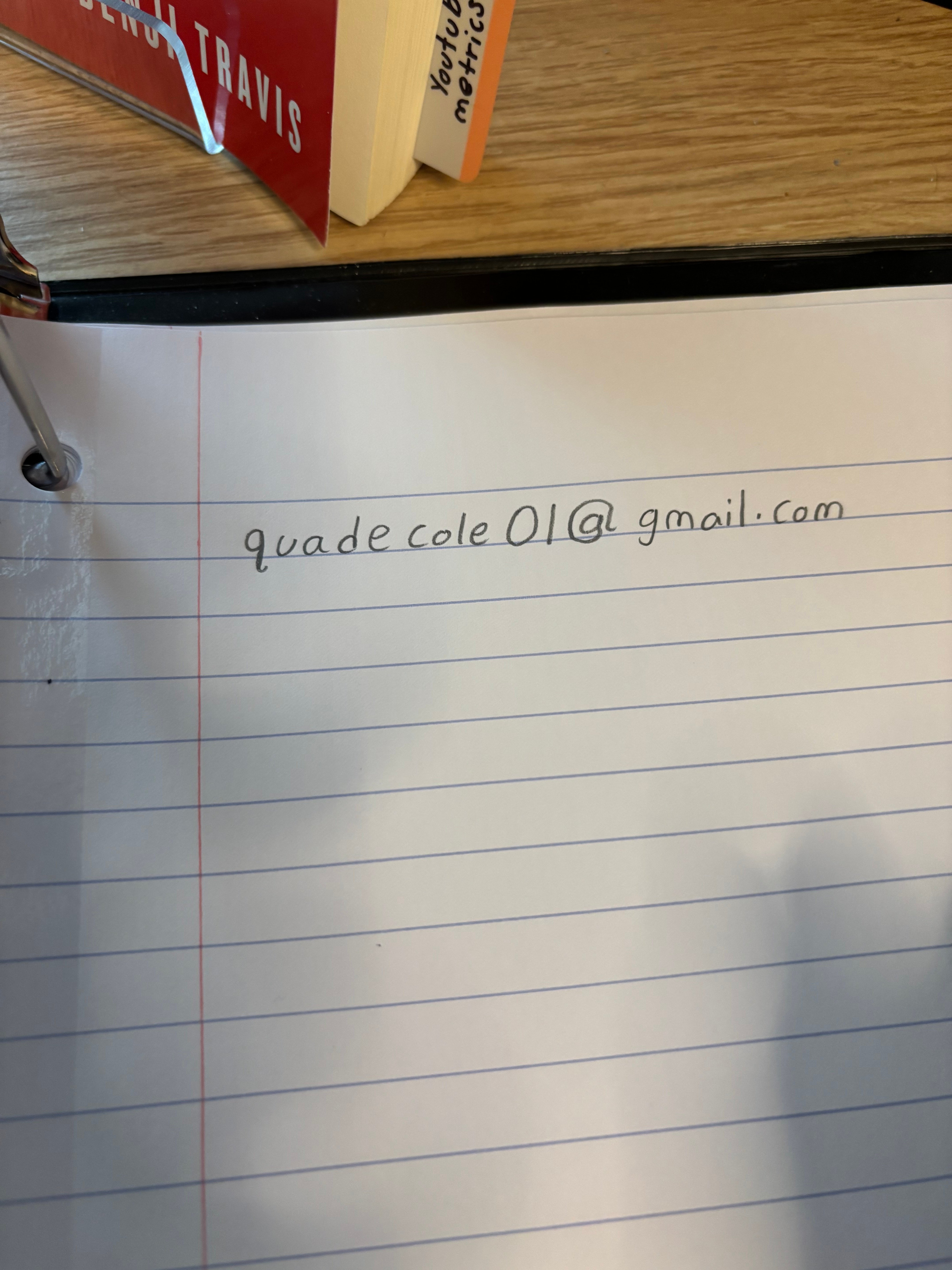
This handwriting reflects a practical and organized individual, though improvements could be made in expressiveness. A more stylized hand would add personality.
The handwriting is upright and somewhat simplified, with a consistent slant and spacing between letters and words. The letter 'a' is formed with a closed top, and the 'g' has a simple, rounded loop. Overall, the handwriting is neat and relatively legible, although the individual letterforms are not particularly stylized or elaborate. The pressure appears to be even and moderate, suggesting a steady hand.
This style suggests a personality that is practical and straightforward. The consistent slant and spacing indicate a person who is organized and reliable. The simplified letterforms suggest a no-nonsense approach and an emphasis on clarity and efficiency. The moderate pressure suggests a balanced and grounded temperament.
To improve your handwriting, focus on varying the pressure to add some flair. Practice making more distinct letterforms, especially for letters like 'a' and 'g', to enhance readability. Experiment with adding slight variations in slant to make your handwriting more expressive.
Legibility
Expressiveness
Consistency
Overall
Leaderboard for Monday, 27 October 2025
| 1 | The Analytical Mind |
74
|
| 2 | The Eloquent Educator |
71
|
| 3 | The Student's Script |
70
|
| 4 | The Optimistic Poet |
68
|
| 5 | The Agrarian Academic |
67
|
| 6 | The Diligent Penman |
67
|
| 7 | The Analytical Alchemist |
65
|
| 8 | The Calculating Hand |
65
|
| 9 | The Scientific Hand |
65
|
| 10 | The Aesthetic Typist |
65
|
| 11 | The Mathematical Muse |
64
|
| 12 | The Agile Leaper |
64
|
| 13 | The Diligent Note-Taker |
64
|
| 14 | The Quill of Conviction |
62
|
| 15 | The Agile Artisan |
61
|
| 16 | The Curious Chemist |
59
|
| 17 | The Practical Notetaker |
58
|
| 18 | The Devout Note-Taker |
58
|
| 19 | The Elaborate Chronicler |
58
|
| 20 | The Considerate Confidant |
56
|
| 21 | The Orderly Typewriter |
56
|
| 22 | The Hurried Healer |
55
|
| 23 | The Aspiring Typesetter |
53
|
| 24 | The Architect of Letters |
53
|
| 25 | The Flourishing Academic |
53
|
| 26 | The Diligent Note-Taker |
53
|
| 27 | The Steadfast Student |
53
|
| 28 | The Ambitious Note-Taker |
52
|
| 29 | Celestial Notes |
52
|
| 30 | The Pragmatic Hand |
52
|