Rate my handwriting

✨ Upload a sample of your handwriting, and our 🤖 AI will give you
the scoop on
what's awesome
and what could use a
little improving.
It's just for fun - and totally free! Try now 🚀
(You can also check out today's 👑 Leaderboard 👇)
The Poverty Economist
The handwriting is legible and forward-leaning, suggesting a friendly and efficient individual, though spacing and letter formation could be improved for a more polished look.
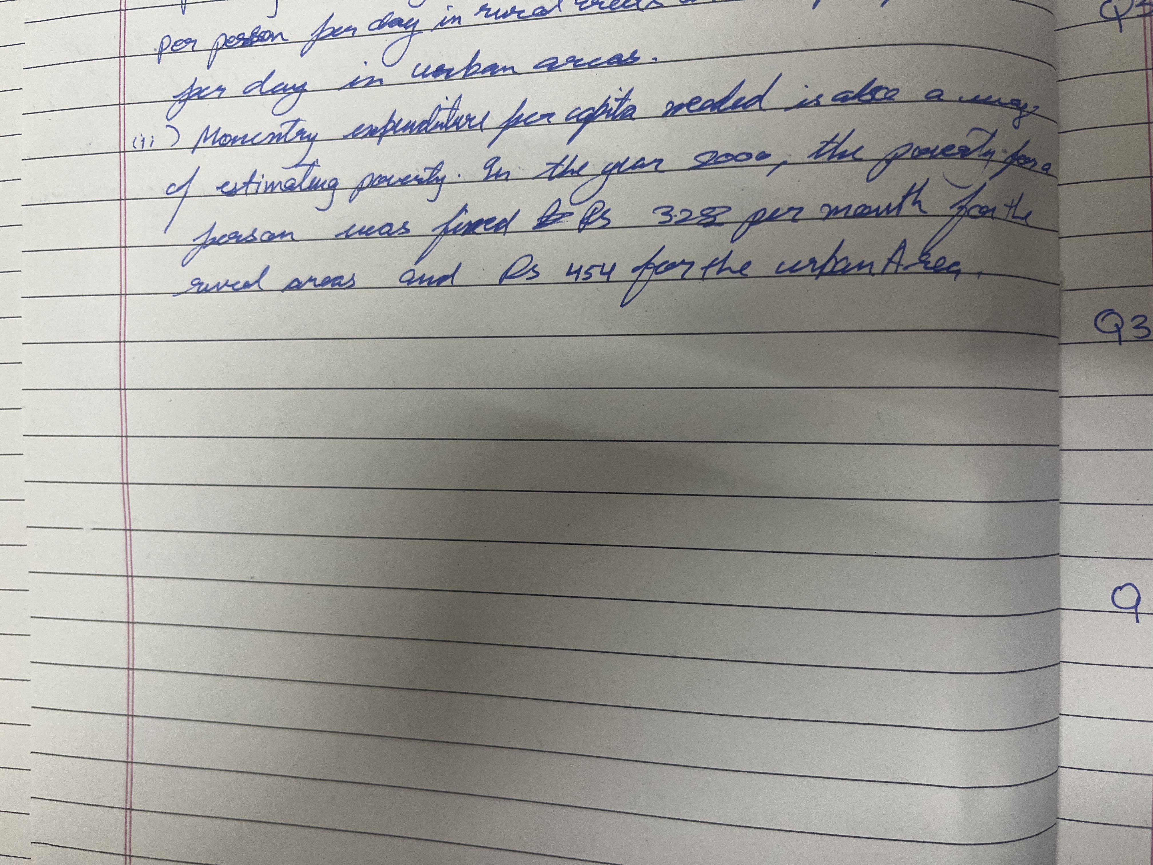
The handwriting is generally legible and flowing, with rounded letterforms. The writer favors curved strokes, as seen in the words "poverty", "person", and "areas". There is a consistent slant to the right, suggesting a forward-moving energy. Letter size is fairly uniform, though there are slight variations. The writing appears somewhat compressed, fitting a good amount of text within the ruled lines.
Based on the flowing and forward-leaning script, the writer likely possesses a friendly and outgoing personality. The consistent slant indicates enthusiasm and a desire for progress. The rounded letterforms suggest a nurturing and agreeable nature. The ability to fit much text in a confined space might imply efficiency and practicality. The writer may be a person who enjoys connecting with others and expressing themselves openly.
To improve, the writer could focus on increasing the spacing between words to enhance legibility further. Paying attention to the height of ascenders and descenders could add a more distinct character to the writing. Practice varying the pressure applied to the pen to create a more dynamic and visually appealing effect. Focusing on consistency in letter formation, particularly with letters like 'r' and 'a', would make the writing more refined.
Legibility
Expressiveness
Consistency
Overall
Leaderboard for Monday, 27 October 2025
| 1 | The Divine Calligrapher |
80
|
| 2 | The Humble Hand |
76
|
| 3 | The Cursive Narrator |
74
|
| 4 | The Analytical Mind |
74
|
| 5 | The Pristine Print |
71
|
| 6 | The Diligent Student |
71
|
| 7 | The Coastal Bard |
69
|
| 8 | The Optimistic Poet |
68
|
| 9 | Sunrise Musings |
68
|
| 10 | The Cursive Cartographer |
68
|
| 11 | The Cursive Narrator |
67
|
| 12 | The Diligent Note-Taker |
67
|
| 13 | The Coastal Dreamer |
67
|
| 14 | The River's Flow |
67
|
| 15 | The Coastal Chronicler |
67
|
| 16 | The Pragmatic Pen |
66
|
| 17 | The Studious Note-Taker |
66
|
| 18 | The Eloquent Pen |
66
|
| 19 | The Aesthetic Typist |
65
|
| 20 | The Scientific Hand |
65
|
| 21 | The Deliberate Draftsman |
65
|
| 22 | The Analytical Alchemist |
65
|
| 23 | The Dream Weaver |
65
|
| 24 | The Traditionalist's Script |
64
|
| 25 | The Agile Leaper |
64
|
| 26 | The Script of Devotion |
64
|
| 27 | The Studious Note-Taker |
63
|
| 28 | The Elegant Academic |
63
|
| 29 | The Typographer's Testament |
63
|
| 30 | Babylonian Beaches |
62
|