Rate my handwriting

✨ Upload a sample of your handwriting, and our 🤖 AI will give you
the scoop on
what's awesome
and what could use a
little improving.
It's just for fun - and totally free! Try now 🚀
(You can also check out today's 👑 Leaderboard 👇)
The Science Student's Script
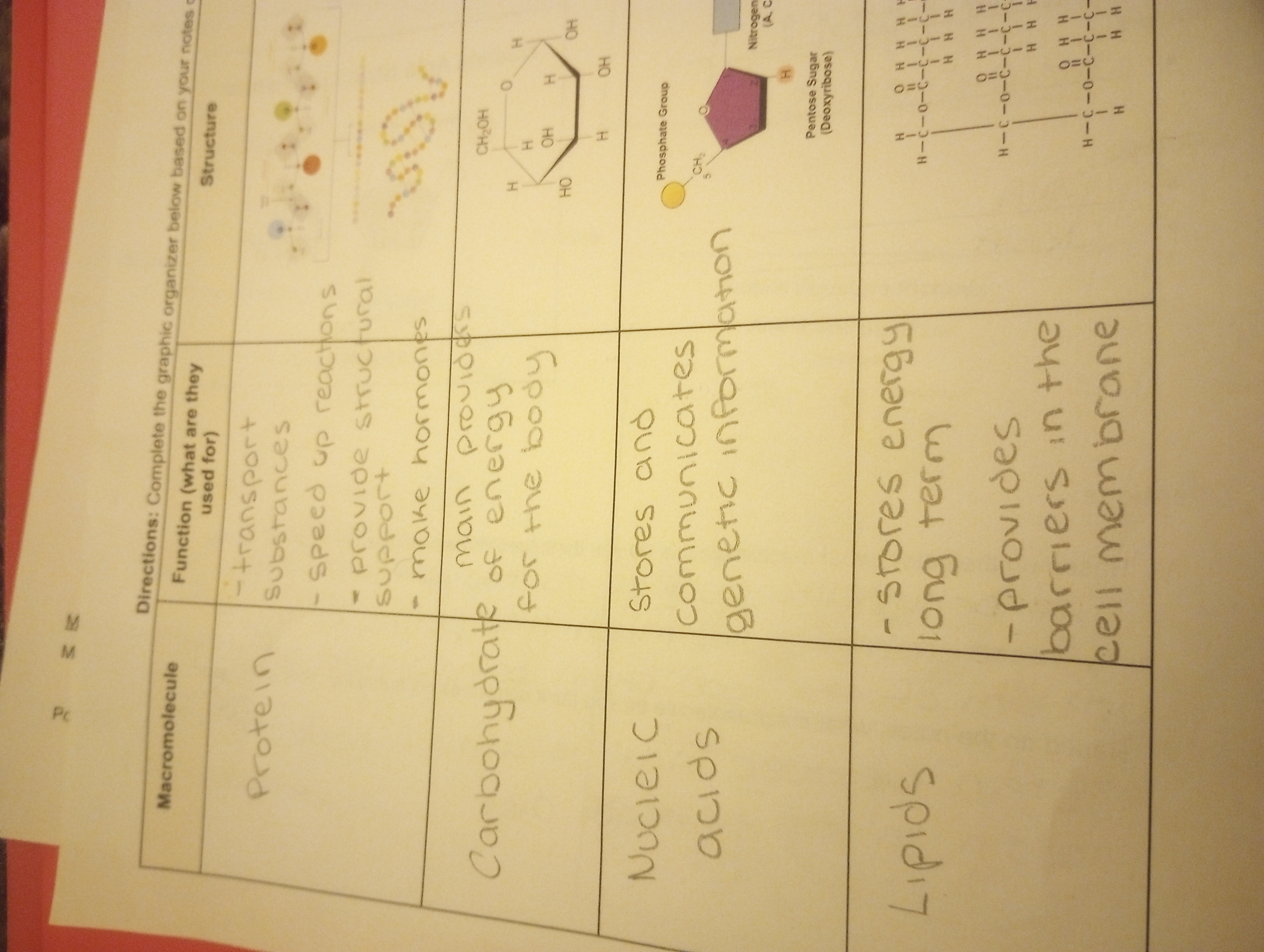
This handwriting style demonstrates a clear and organized approach, indicating a personality that values clarity and precision. A few refinements could further enhance the expressiveness and overall aesthetic appeal of the script.
The handwriting in this sample presents as neat and organized, exhibiting a clear intention to communicate information effectively. The letterforms are generally well-defined, with consistent spacing between words, as can be seen in phrases such as "speed up reactions" and "cell membrane". There is a slight roundness to the letters, suggesting a careful and deliberate approach to writing, rather than a rushed or impulsive one. The writing appears to be executed with a light touch, and the text maintains a consistent size and slant, further contributing to its overall legibility and uniform appearance.
Given the handwriting's structured and organized nature, one might infer a personality that values clarity and precision. The individual may possess traits such as conscientiousness, attention to detail, and a preference for orderliness. The rounded letterforms and even spacing could also suggest a calm and patient disposition, someone who takes their time to ensure accuracy and completeness in their work. The consistency of the writing points to a person who is reliable and dependable, with a strong sense of responsibility.
To further enhance the handwriting, focusing on varying the pressure applied while writing could add depth and character to the script. Experimenting with slightly more differentiated letter heights might also create a more dynamic and visually appealing impression. While legibility is already high, practicing consistent letter connections could improve fluency and overall aesthetic appeal. Also, focus on slant consistency for a better look.
Legibility
Expressiveness
Consistency
Overall
Leaderboard for Tuesday, 28 October 2025
| 1 | The Divine Calligrapher |
80
|
| 2 | The Humble Hand |
76
|
| 3 | The Cursive Narrator |
74
|
| 4 | The Pristine Print |
71
|
| 5 | The Diligent Student |
71
|
| 6 | The Coastal Bard |
69
|
| 7 | The Cursive Cartographer |
68
|
| 8 | Sunrise Musings |
68
|
| 9 | The Coastal Chronicler |
67
|
| 10 | The Coastal Dreamer |
67
|
| 11 | The Cursive Narrator |
67
|
| 12 | The River's Flow |
67
|
| 13 | The Diligent Note-Taker |
67
|
| 14 | The Studious Note-Taker |
66
|
| 15 | The Eloquent Pen |
66
|
| 16 | The Pragmatic Pen |
66
|
| 17 | The Deliberate Draftsman |
65
|
| 18 | The Upright Pen |
65
|
| 19 | The Dream Weaver |
65
|
| 20 | The Scientific Hand |
65
|
| 21 | The Historian's Hand |
64
|
| 22 | The Traditionalist's Script |
64
|
| 23 | The Script of Devotion |
64
|
| 24 | The Elegant Academic |
63
|
| 25 | The Typographer's Testament |
63
|
| 26 | The Studious Note-Taker |
63
|
| 27 | The Loopy Dreamer |
62
|
| 28 | Babylonian Beaches |
62
|
| 29 | The Aquatic Caller |
62
|
| 30 | The Pragmatic Professor |
61
|