Rate my handwriting

✨ Upload a sample of your handwriting, and our 🤖 AI will give you
the scoop on
what's awesome
and what could use a
little improving.
It's just for fun - and totally free! Try now 🚀
(You can also check out today's 👑 Leaderboard 👇)
The Reflective Ink-Slinger
This handwriting displays a blend of cursive and print, suggesting a balanced personality that values both efficiency and self-expression. A bit more attention to consistency will greatly enhance legibility and aesthetic appeal.
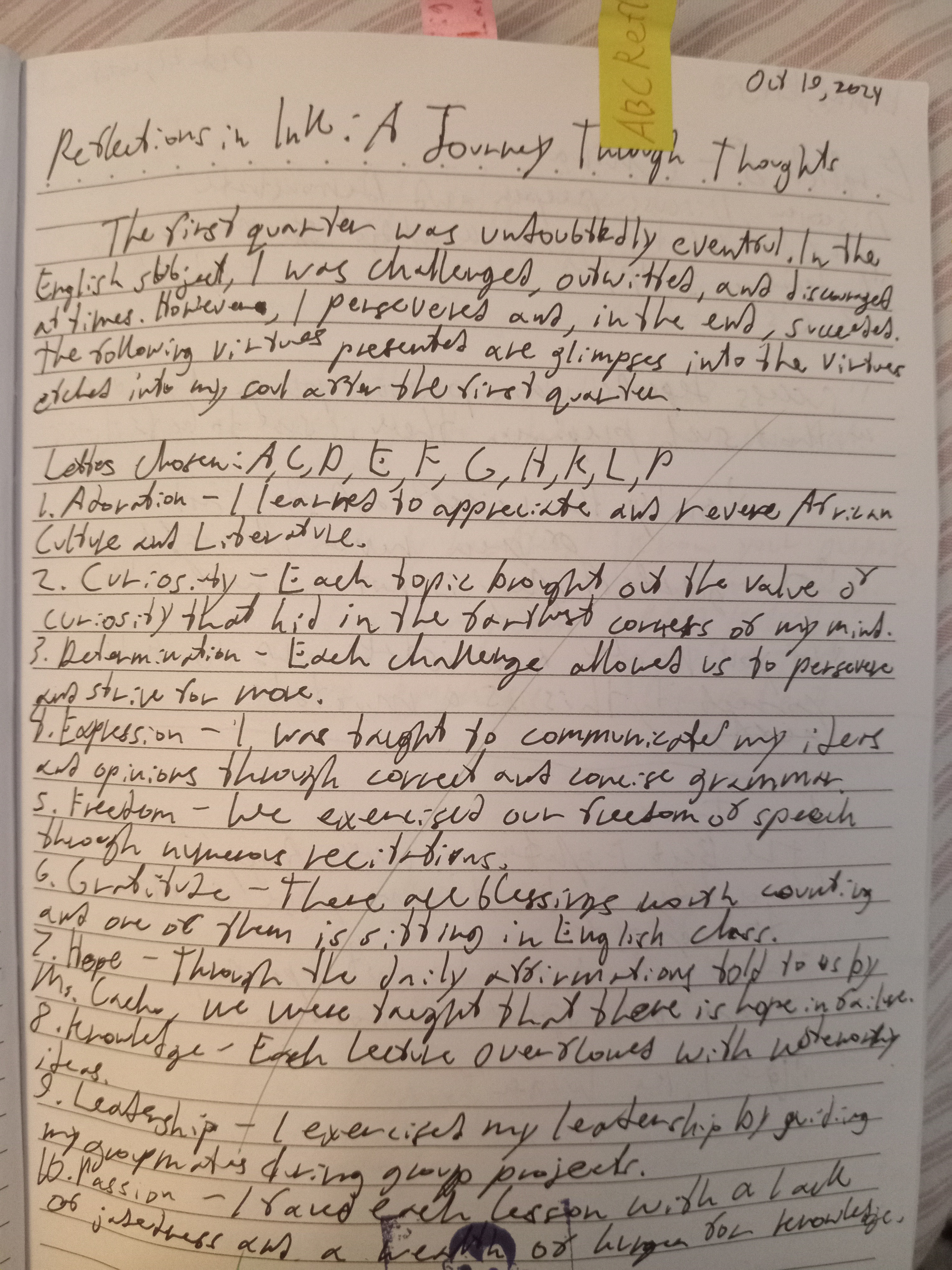
This handwriting sample presents a blend of rounded and slightly angular forms, with varying letter sizes and slants. Words like "undoubtedly" and "persevere" showcase a connected cursive style, interspersed with occasional print-like formations, particularly in uppercase letters such as the 'A' in 'African.' The baseline generally adheres to the ruled lines, though occasional upward slopes hint at a touch of impulsiveness. Overall, legibility remains fairly consistent despite these variations, indicating a conscious effort towards neatness, though some inconsistencies in spacing and slant detract slightly from its overall polish.
The handwriting suggests a personality that balances pragmatism with a dash of creativity. The connected script speaks to a desire for efficient communication, while the rounded forms hint at a friendly and approachable nature. The fluctuating letter sizes and occasional upward slants betray an underlying enthusiasm and a mind that races ahead of itself at times. The conscious effort to maintain legibility, despite the variations in style, suggests a desire to be understood and appreciated by others, coupled with a respect for conventions. The variations themselves indicate a personality that is not afraid to express its individuality within established boundaries.
While generally legible, some improvements can elevate this handwriting further. Maintaining a consistent slant and spacing between letters and words will improve readability and give the script a more polished appearance. Practicing consistent letter formations, especially with uppercase letters, can further enhance its visual appeal. Paying attention to the baseline and ensuring it remains consistently horizontal will eliminate the slightly erratic feel. Lastly, slowing down slightly during writing can help achieve greater control and precision, further enhancing the overall aesthetic and legibility.
Legibility
Expressiveness
Consistency
Overall
Leaderboard for Monday, 27 October 2025
| 1 | The Divine Calligrapher |
80
|
| 2 | The Humble Hand |
76
|
| 3 | The Cursive Narrator |
74
|
| 4 | The Analytical Mind |
74
|
| 5 | The Pristine Print |
71
|
| 6 | The Diligent Student |
71
|
| 7 | The Coastal Bard |
69
|
| 8 | The Optimistic Poet |
68
|
| 9 | Sunrise Musings |
68
|
| 10 | The Cursive Cartographer |
68
|
| 11 | The Cursive Narrator |
67
|
| 12 | The Diligent Note-Taker |
67
|
| 13 | The Coastal Dreamer |
67
|
| 14 | The River's Flow |
67
|
| 15 | The Coastal Chronicler |
67
|
| 16 | The Pragmatic Pen |
66
|
| 17 | The Studious Note-Taker |
66
|
| 18 | The Eloquent Pen |
66
|
| 19 | The Aesthetic Typist |
65
|
| 20 | The Scientific Hand |
65
|
| 21 | The Deliberate Draftsman |
65
|
| 22 | The Analytical Alchemist |
65
|
| 23 | The Dream Weaver |
65
|
| 24 | The Traditionalist's Script |
64
|
| 25 | The Agile Leaper |
64
|
| 26 | The Script of Devotion |
64
|
| 27 | The Studious Note-Taker |
63
|
| 28 | The Elegant Academic |
63
|
| 29 | The Typographer's Testament |
63
|
| 30 | Babylonian Beaches |
62
|