Rate my handwriting

✨ Upload a sample of your handwriting, and our 🤖 AI will give you
the scoop on
what's awesome
and what could use a
little improving.
It's just for fun - and totally free! Try now 🚀
(You can also check out today's 👑 Leaderboard 👇)
The Time Traveller
This neat and consistent handwriting suggests a methodical and thoughtful personality, with potential for enhanced expressiveness through subtle adjustments to slant, size, and spacing.
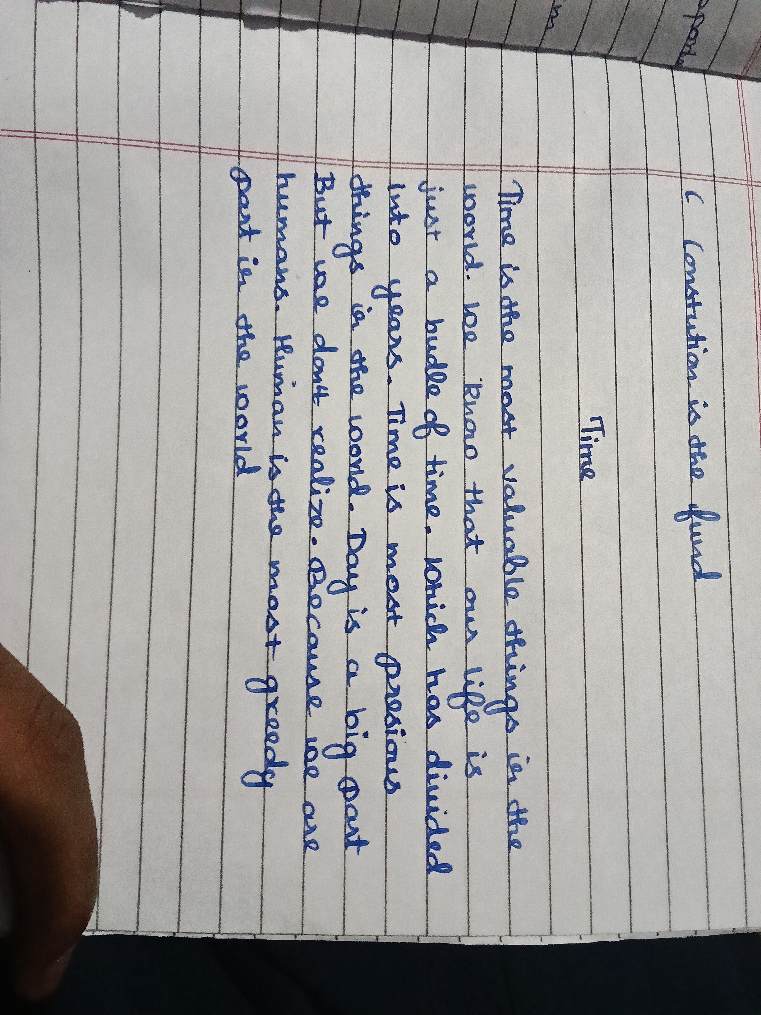
This handwriting is notable for its neatness and consistency. The words are generally well-formed, with legible letters such as the rounded 'o' in 'world' and the distinctive 'T' in 'Time'. While mostly uniform in size, there's a slight variation in the height of letters like 'h' and 'l', suggesting a hint of impulsiveness underlying the overall controlled appearance. The baseline is relatively straight, adhering closely to the ruled lines, indicative of a disciplined and methodical nature. The spacing between words is consistent, contributing to the overall legibility. The slant is mostly upright, leaning slightly to the right in words like 'things', revealing a balance between introversion and a willingness to engage with the world.
The writer's personality, as reflected in their handwriting, is likely one of careful consideration and methodical planning. The neatness and consistency point to a preference for order and structure, while the controlled size of the letters suggests an ability to contain emotions and impulses. The slightly rightward slant indicates a degree of sociability and a willingness to connect with others. Phrases like 'most precious' and 'most valuable' suggest a thoughtful and appreciative approach to life, and an inclination to ponder existential questions about time and human existence.
To further enhance this handwriting, focusing on a more consistent slant and experimenting with a slightly larger letter size could be beneficial. This would add dynamism and personality, without sacrificing the current clarity and neatness. Embracing flourishes in letters like 'f' and 'g' could add a touch of elegance and expressiveness. Additionally, varying the spacing between lines could create a more visually appealing rhythm to the writing.
Legibility
Expressiveness
Consistency
Overall
Leaderboard for Monday, 27 October 2025
| 1 | The Divine Calligrapher |
80
|
| 2 | The Humble Hand |
76
|
| 3 | The Analytical Mind |
74
|
| 4 | The Diligent Student |
71
|
| 5 | The Pristine Print |
71
|
| 6 | The Student's Script |
70
|
| 7 | The Coastal Bard |
69
|
| 8 | The Optimistic Poet |
68
|
| 9 | Sunrise Musings |
68
|
| 10 | The Cursive Cartographer |
68
|
| 11 | The River's Flow |
67
|
| 12 | The Diligent Penman |
67
|
| 13 | The Coastal Chronicler |
67
|
| 14 | The Diligent Note-Taker |
67
|
| 15 | The Coastal Dreamer |
67
|
| 16 | The Cursive Narrator |
67
|
| 17 | The Pragmatic Pen |
66
|
| 18 | The Eloquent Pen |
66
|
| 19 | The Scientific Hand |
65
|
| 20 | The Analytical Alchemist |
65
|
| 21 | The Deliberate Draftsman |
65
|
| 22 | The Aesthetic Typist |
65
|
| 23 | The Agile Leaper |
64
|
| 24 | The Script of Devotion |
64
|
| 25 | The Mathematical Muse |
64
|
| 26 | The Traditionalist's Script |
64
|
| 27 | The Diligent Note-Taker |
64
|
| 28 | The Typographer's Testament |
63
|
| 29 | The Elegant Academic |
63
|
| 30 | The Studious Note-Taker |
63
|