Rate my handwriting

✨ Upload a sample of your handwriting, and our 🤖 AI will give you
the scoop on
what's awesome
and what could use a
little improving.
It's just for fun - and totally free! Try now 🚀
(You can also check out today's 👑 Leaderboard 👇)
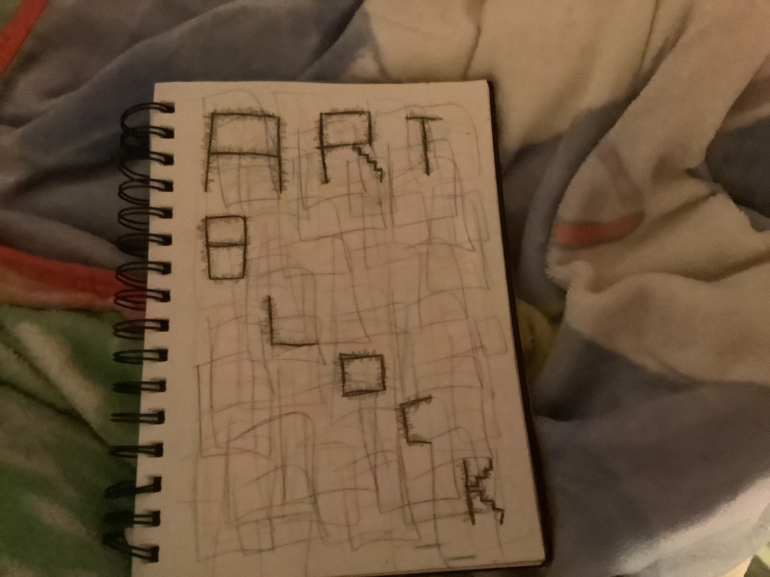
The Architect's Interruption
This handwriting exhibits a geometric, stylized approach, suggesting a detail-oriented and structured personality with a hint of playful creativity.
The handwriting, a collection of fragmented block letters forming "ART BLOCK", is highly stylized and geometric. Each letter appears meticulously constructed from straight lines, lacking any curves or fluid strokes. The letters are not uniform in size or spacing, creating a somewhat disjointed appearance. The addition of jagged lines to the "R" adds a playful, almost architectural detail to the composition.
Based on this style, the writer is likely a detail-oriented individual with a strong sense of structure and a penchant for precision. They may approach tasks methodically and appreciate clarity and order. The geometric nature of the letters suggests a preference for logical thinking and problem-solving. The playful additions to the "R" hints at a creative spark, possibly tempered by a need for control.
To improve legibility, try experimenting with cursive or a more rounded, flowing style. Focus on consistent letter spacing and size. Practice forming letters with smoother, more continuous strokes to achieve a more natural and fluid handwriting style. Introducing some curves into your style could allow you to express your artistic flare, while retaining the structural qualities of your existing style.
Legibility
Expressiveness
Consistency
Overall
Leaderboard for Thursday, 20 November 2025
| 31 | The Elementary Instructor |
54
|
| 32 | The Cosmic Coder |
53
|
| 33 | The Precise Physicist |
53
|
| 34 | The Generous Gnocchi Appreciator |
53
|
| 35 | Holiday Hues |
52
|
| 36 | The Environmentalist's Hand |
52
|
| 37 | The Biologist's Ballpoint |
51
|
| 38 | The Earnest Essayist |
50
|
| 39 | The Precise Planner |
50
|
| 40 | The Highlands Historian |
49
|
| 41 | Audrey's Afterlife Adventures |
49
|
| 42 | The Rushed Idealist |
46
|