Rate my handwriting

✨ Upload a sample of your handwriting, and our 🤖 AI will give you
the scoop on
what's awesome
and what could use a
little improving.
It's just for fun - and totally free! Try now 🚀
(You can also check out today's 👑 Leaderboard 👇)
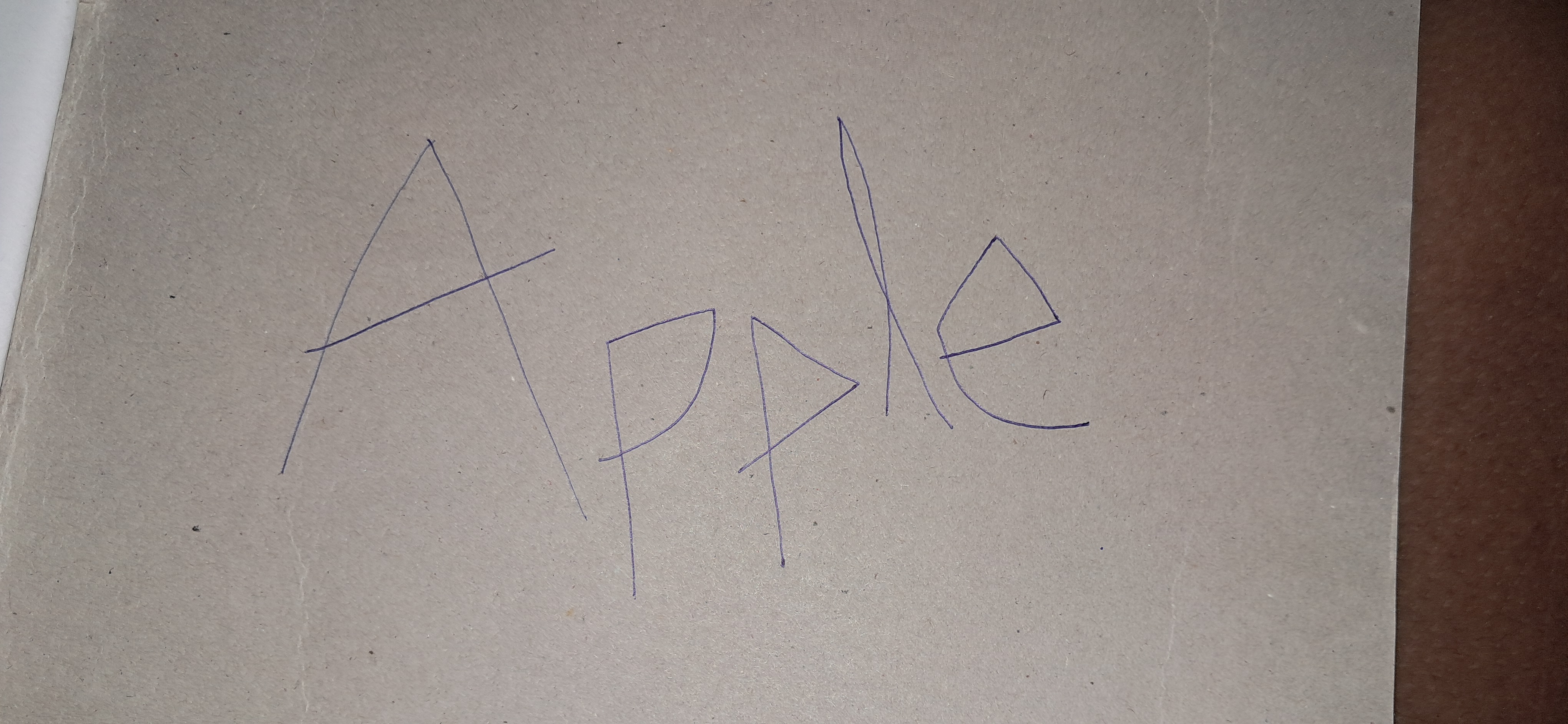
The Architect
This sample exhibits a structured, architectural style, indicating a logical, detail-oriented personality with a preference for clear communication. Improved legibility could be achieved by focusing on joining letters and incorporating curves to soften the overall impression.
The handwriting sample presents a unique style, characterized by sharp, angular strokes. The capital "A" resembles a triangular framework, mirroring the structured approach of an architect. Similarly, the "p" and "l" are constructed with distinct, straight lines, hinting at a preference for clarity and precision. The "e" offers a slight curve, a welcome contrast to the otherwise rigid forms, suggesting a subtle touch of adaptability within a generally ordered mind. The overall impression is one of deliberateness, with each letter formed as a separate entity, indicating a measured and thoughtful approach to communication.
This style suggests a personality that values structure and order. The architectural precision implies a logical mind, possibly with an inclination towards engineering or design. The clarity of the letters suggests a desire for clear communication and a dislike for ambiguity. While the angularity hints at a degree of firmness and resolve, the slight curve in the "e" suggests a willingness to adapt when necessary. This individual likely enjoys problem-solving and appreciates a systematic approach to tasks, preferring well-defined processes over improvisation. They may have an eye for detail and an appreciation for aesthetics, valuing both form and function.
While generally legible, the disconnected nature of the letters could be improved by focusing on joining them more fluidly. This would enhance the flow of the writing and create a more unified visual impression. Practicing consistent letter sizing and spacing would further improve legibility. Introducing some curves to the sharper angles could soften the overall impression and add a touch of warmth to the writing, while still maintaining its distinctive architectural quality. This could be achieved by practicing rounded letterforms, such as "o" and "c". Experimenting with different pen grips and writing speeds might also help discover a more comfortable and expressive style.
Legibility
Expressiveness
Consistency
Overall
Leaderboard for Thursday, 30 October 2025
| 1 | The Economist's Italic Hand |
74
|
| 2 | The Poet's Quill |
71
|
| 3 | The Flourishing Font |
69
|
| 4 | The Scientific Hand |
68
|
| 5 | The Upright Student |
67
|
| 6 | The Digital Diarist |
67
|
| 7 | The Logical Chemist |
66
|
| 8 | The Prudent Pen |
66
|
| 9 | The Pensive Student |
65
|
| 10 | The Literary Cartographer |
65
|
| 11 | The Agile Quill |
65
|
| 12 | The Pragmatic Planner |
65
|
| 13 | The Bio Notes |
64
|
| 14 | The Civic Philosopher |
63
|
| 15 | The Studious Scholar |
63
|
| 16 | The Meticulous Planner |
63
|
| 17 | The Elusive Poet |
62
|
| 18 | The Calligrapher's Chronicle |
62
|
| 19 | Le Gribouillage Scientifique |
62
|
| 20 | The Deliberate Democrat |
62
|
| 21 | Le Calligraphe Studieux |
61
|
| 22 | Algorithmic Alchemist |
61
|
| 23 | The Cellular Biologist |
61
|
| 24 | The Atomic Pen |
60
|
| 25 | The Spirited Student |
60
|
| 26 | The Fluent Intellectual |
60
|
| 27 | The Global Trotter |
59
|
| 28 | The Forthright Fount |
59
|
| 29 | The Determined Hand |
58
|
| 30 | The Energetic Note-Taker |
58
|