Rate my handwriting

✨ Upload a sample of your handwriting, and our 🤖 AI will give you
the scoop on
what's awesome
and what could use a
little improving.
It's just for fun - and totally free! Try now 🚀
(You can also check out today's 👑 Leaderboard 👇)
The Practical Planner
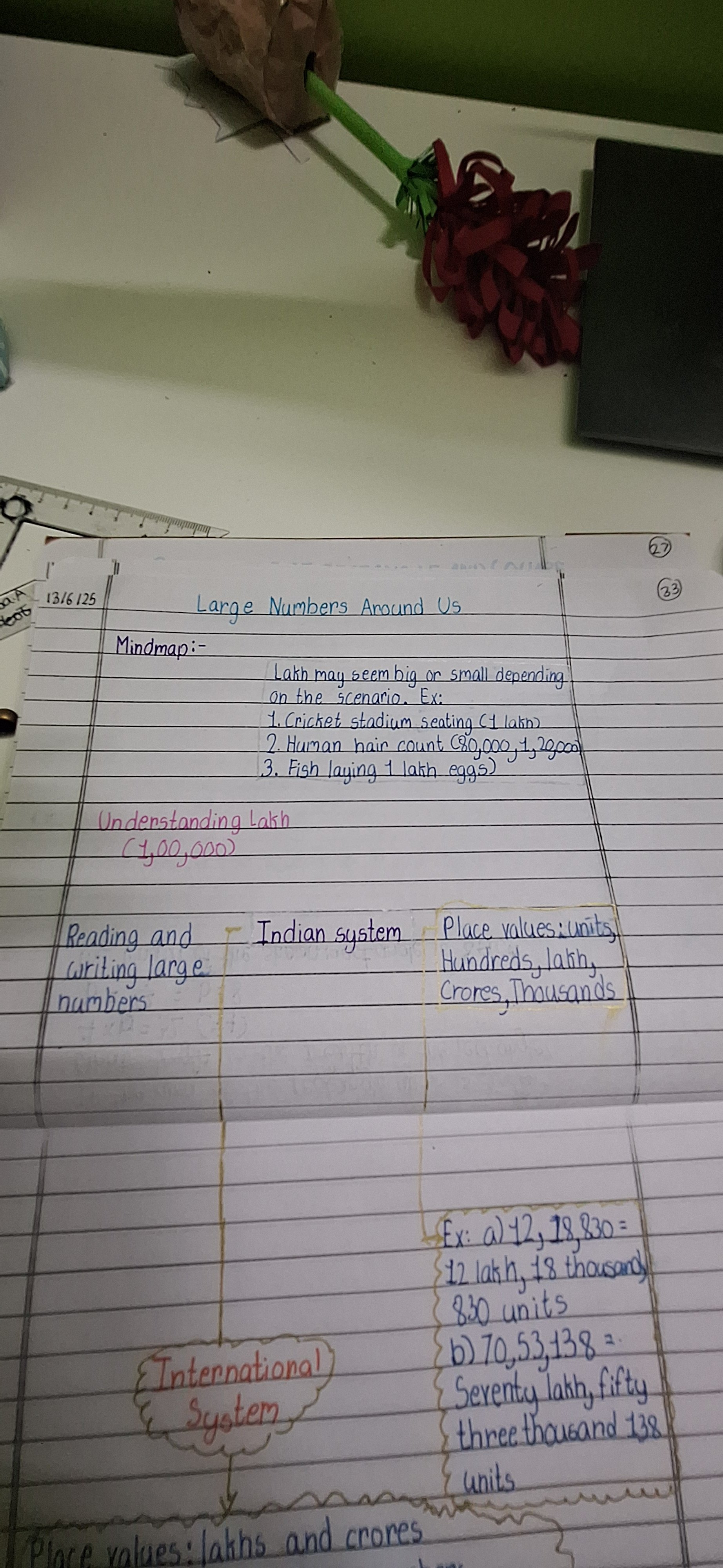
This handwriting sample demonstrates practicality and a methodical nature, with a hint of creativity. Focusing on kerning and pen grip could improve readability and add flair.
This handwriting sample is neat, legible, and consistent, suggesting a practical and organized mind. The letters are generally uniform in size and shape, as seen in the repeated formation of the word "lakh", and the spacing between words and lines is regular. While mostly printed, there's a slight cursive slant in some letters, such as the lowercase 'a' and 'h', indicating adaptability. The pointed tops of letters like 'm' and 'n' hint at a sharp intellect, while the rounded 'o' and 'a' suggest a touch of approachability.
This writing style reflects someone who values clarity and efficiency. The consistent slant implies a person who is generally reliable and steady, while the occasional flourishes in letters like 'L' and 'F' hint at a creative streak beneath the practical exterior. The neatness indicates a methodical approach to tasks, and the legibility suggests a desire for clear communication. The overall impression is one of competence and a focus on getting things done.
While the handwriting is generally legible, there's room for improvement in the spacing between letters within words. Some letters appear cramped, like in "stadium", which can occasionally hinder readability. Paying more attention to the kerning, especially with longer words, could enhance the overall flow and aesthetic appeal. Additionally, exploring different pen grips might add more dynamism and expressiveness to the writing.
Legibility
Expressiveness
Consistency
Overall
Leaderboard for Tuesday, 28 October 2025
| 1 | The Divine Calligrapher |
80
|
| 2 | The Humble Hand |
76
|
| 3 | The Cursive Narrator |
74
|
| 4 | The Analytical Mind |
74
|
| 5 | The Pristine Print |
71
|
| 6 | The Diligent Student |
71
|
| 7 | The Coastal Bard |
69
|
| 8 | The Cursive Cartographer |
68
|
| 9 | Sunrise Musings |
68
|
| 10 | The Optimistic Poet |
68
|
| 11 | The Diligent Note-Taker |
67
|
| 12 | The River's Flow |
67
|
| 13 | The Coastal Chronicler |
67
|
| 14 | The Coastal Dreamer |
67
|
| 15 | The Cursive Narrator |
67
|
| 16 | The Pragmatic Pen |
66
|
| 17 | The Eloquent Pen |
66
|
| 18 | The Studious Note-Taker |
66
|
| 19 | The Dream Weaver |
65
|
| 20 | The Aesthetic Typist |
65
|
| 21 | The Scientific Hand |
65
|
| 22 | The Upright Pen |
65
|
| 23 | The Analytical Alchemist |
65
|
| 24 | The Deliberate Draftsman |
65
|
| 25 | The Historian's Hand |
64
|
| 26 | The Script of Devotion |
64
|
| 27 | The Agile Leaper |
64
|
| 28 | The Traditionalist's Script |
64
|
| 29 | The Elegant Academic |
63
|
| 30 | The Typographer's Testament |
63
|