Rate my handwriting

✨ Upload a sample of your handwriting, and our 🤖 AI will give you
the scoop on
what's awesome
and what could use a
little improving.
It's just for fun - and totally free! Try now 🚀
(You can also check out today's 👑 Leaderboard 👇)
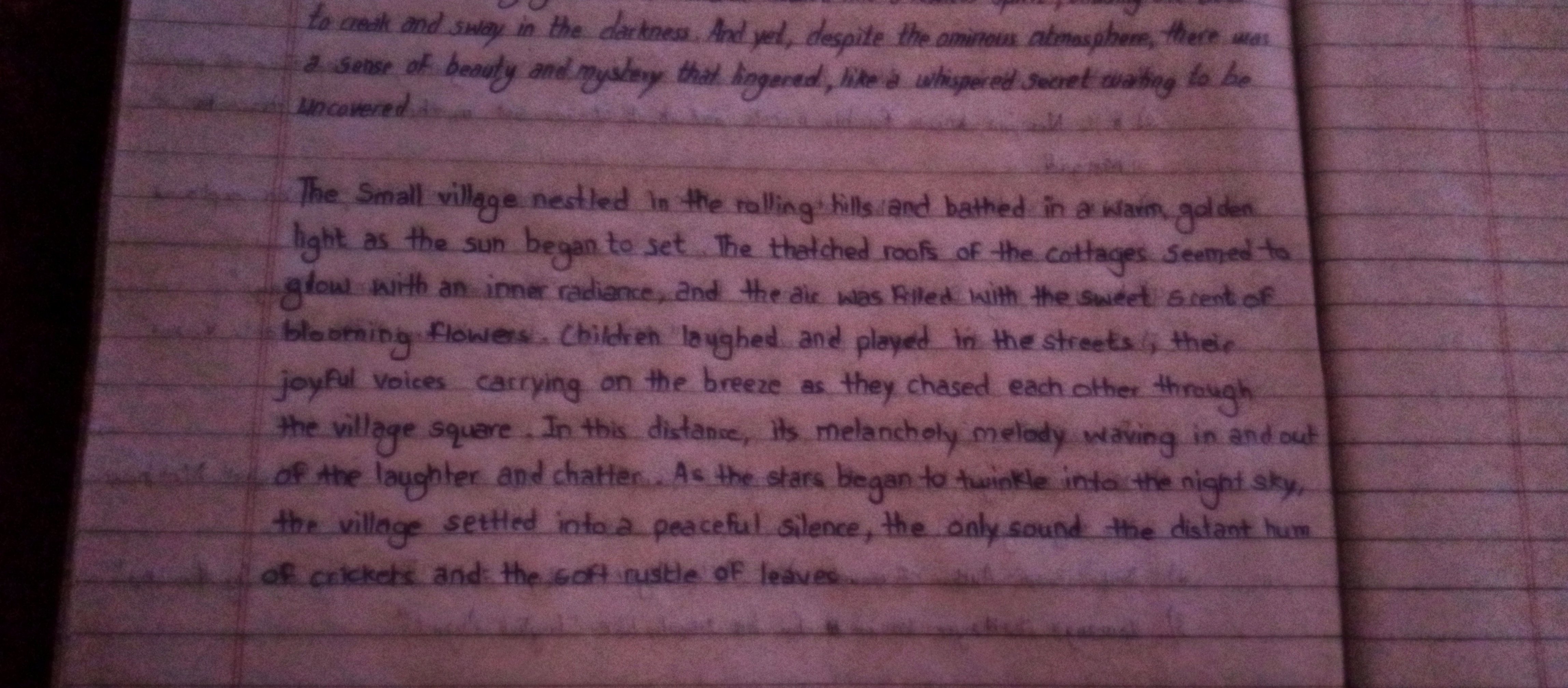
The Village Storyteller
This handwriting demonstrates a pleasant, legible cursive with hints of creativity and a touch of romanticism. Enhancing consistency in letter size would improve readability and polish its presentation.
This handwriting sample presents a pleasant, legible cursive style. The letters are generally well-formed, with a consistent slant and spacing. The baseline is relatively straight, showing a focus and discipline in the writing. Certain letters like "g", "y", and "f" extend gracefully below the baseline, giving a sense of flow and rhythm. The writing is punctuated correctly. There are some variations in letter size, as seen in the word "uncovered" which are less uniform and slightly larger than the surrounding words, giving it a dynamic and expressive quality.
This handwriting suggests a personality that is both creative and organized. The blend of flowing lines and controlled structure implies a balance between imagination and practicality. The legibility and neatness suggest a clear and thoughtful communicator, someone who values precision and detail. The expressive flourishes hint at an underlying romanticism and a fondness for storytelling, which are supported by the narrative itself. The consistent slant also suggests optimism and emotional responsiveness. This is someone who feels things deeply, as demonstrated by their emotive description of the "sweet scent of blooming flowers."
While generally legible and attractive, the handwriting could benefit from greater consistency in letter size. Paying attention to the height and width of letters, especially those extending above or below the baseline, would further enhance the neatness and overall aesthetic appeal. Practicing with consistent letter formations, focusing on maintaining uniform proportions, would improve readability. Slowing down the writing process slightly could help refine control and further enhance the already pleasant appearance.
Legibility
Expressiveness
Consistency
Overall
Leaderboard for Tuesday, 28 October 2025
| 1 | The Divine Calligrapher |
80
|
| 2 | The Humble Hand |
76
|
| 3 | The Cursive Narrator |
74
|
| 4 | The Pristine Print |
71
|
| 5 | The Diligent Student |
71
|
| 6 | The Coastal Bard |
69
|
| 7 | Sunrise Musings |
68
|
| 8 | The Cursive Cartographer |
68
|
| 9 | The Considerate Soul |
67
|
| 10 | The Coastal Chronicler |
67
|
| 11 | The Cursive Narrator |
67
|
| 12 | The Diligent Note-Taker |
67
|
| 13 | The Coastal Dreamer |
67
|
| 14 | The Diligent Calligrapher |
67
|
| 15 | The River's Flow |
67
|
| 16 | The Eloquent Pen |
66
|
| 17 | The Studious Note-Taker |
66
|
| 18 | The Pragmatic Pen |
66
|
| 19 | The Pharmacist's Note |
65
|
| 20 | The Deliberate Draftsman |
65
|
| 21 | The Upright Pen |
65
|
| 22 | The Dream Weaver |
65
|
| 23 | The Historian's Hand |
64
|
| 24 | The Script of Devotion |
64
|
| 25 | The Traditionalist's Script |
64
|
| 26 | The Elegant Academic |
63
|
| 27 | The Studious Note-Taker |
63
|
| 28 | The Gridiron Enthusiast |
63
|
| 29 | The Typographer's Testament |
63
|
| 30 | The Aquatic Caller |
62
|