Rate my handwriting

✨ Upload a sample of your handwriting, and our 🤖 AI will give you
the scoop on
what's awesome
and what could use a
little improving.
It's just for fun - and totally free! Try now 🚀
(You can also check out today's 👑 Leaderboard 👇)

The Geometer's Hand
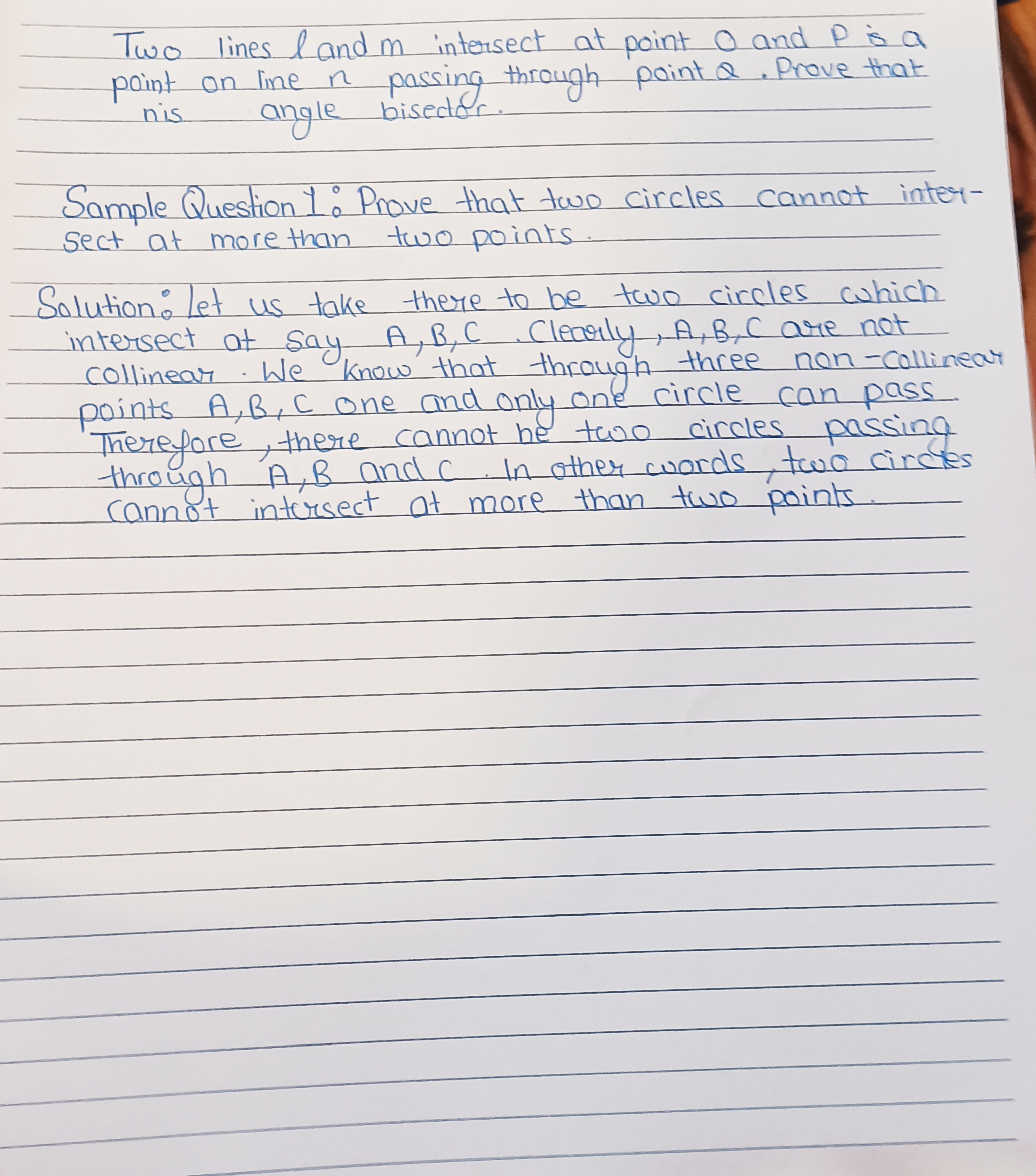
This handwriting reflects a precise and organized individual with a methodical approach, and can be improved through attention to pressure and baseline consistency. The writing style suggests competence and an appreciation for clarity.
The handwriting presents a carefully crafted, upright style. The letterforms are generally rounded and of medium size, showing a preference for clarity over flamboyance. Notice the deliberate connections between letters, creating a sense of flow, but also occasional breaks that suggest a measured pace. The even spacing between words and lines further enhances legibility. There is an admirable consistency in slant and size, indicating a disciplined approach to writing. The occasional flourish, like the rounded tops of the 't's and the curved tails on the 'y's, adds a touch of personality without detracting from the overall neatness.
This handwriting suggests a personality that values precision and clarity. The consistent letterforms and even spacing reflect a methodical and organized mind. The writer likely appreciates order and structure, approaching tasks with a thoughtful and deliberate manner. The subtle personal touches hint at a creative streak tempered by a practical sensibility. Overall, the handwriting conveys a sense of competence and attention to detail, suggesting someone who takes pride in their work and strives for accuracy.
To further refine the handwriting, focus on maintaining consistent pressure throughout each stroke. This will eliminate any slight variations in line thickness and create a more uniform appearance. Pay attention to the baseline, ensuring that letters remain consistently aligned. Practicing letter connections to enhance fluidity, without sacrificing legibility, can also improve the overall aesthetic appeal. Perhaps experiment with different pen types to find one that allows for optimal control and comfort.
Legibility
Expressiveness
Consistency
Overall
Leaderboard for Sunday, 26 October 2025
| 1 | The Pristine Penman |
76
|
| 2 | The Determined Diarist |
75
|
| 3 | The Flowing Quill |
74
|
| 4 | The Constitutionalist |
74
|
| 5 | The Diligent Dreamer |
73
|
| 6 | Geometric Author |
73
|
| 7 | The Student |
73
|
| 8 | The Pragmatic Planner |
73
|
| 9 | The Pragmatist's Script |
72
|
| 10 | The Curator's Script |
72
|
| 11 | The Eloquent Calligrapher |
71
|
| 12 | The Dreamer's Quill |
70
|
| 13 | The Organized Storyteller |
69
|
| 14 | The Hopeful Heart's Script |
68
|
| 15 | The Looping Luminary |
68
|
| 16 | The Flowing Quill |
68
|
| 17 | The Flowing Hand |
68
|
| 18 | The Constitutionalist |
68
|
| 19 | The Unassuming Hand |
66
|
| 20 | The Studious Student |
65
|
| 21 | The Classicist's Quill |
65
|
| 22 | The Optimistic Artist |
65
|
| 23 | The Efficient Note-Taker |
64
|
| 24 | The Contemplative Soul |
64
|
| 25 | The Minimalist's Mark |
64
|
| 26 | Diligent Student |
63
|
| 27 | The Flowing Font |
63
|
| 28 | The Gentle Flow |
63
|
| 29 | The Looping Legend |
62
|
| 30 | The Loop Whisperer |
61
|