Rate my handwriting

✨ Upload a sample of your handwriting, and our 🤖 AI will give you
the scoop on
what's awesome
and what could use a
little improving.
It's just for fun - and totally free! Try now 🚀
(You can also check out today's 👑 Leaderboard 👇)
The Wandering Quill
The handwriting shows spontaneity and a relaxed approach, while some focus on consistency could improve readability.
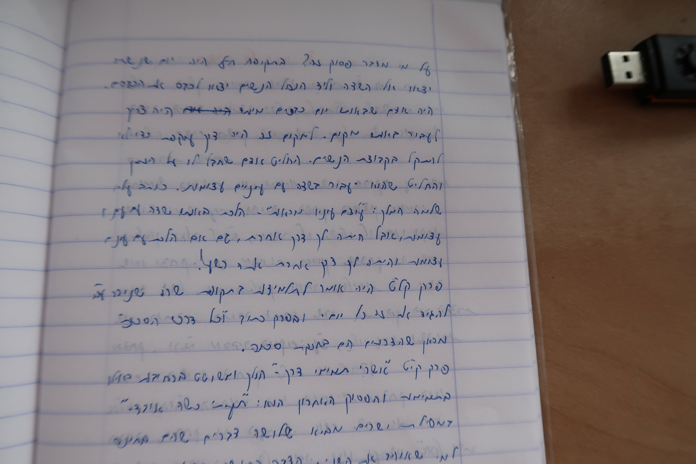
The handwriting in this sample is like a winding road, with letters meandering across the page. Words like "אנשים" and "הייתה" seem to flow into one another, and the baseline dances up and down. The letters are rounded and fairly uniform in size, which gives a friendly, relaxed appearance. The overall style suggests a casual, almost conversational tone, like a quick note to a friend.
This free-flowing style suggests a personality that is adaptable and spontaneous. The inconsistent baseline could hint at a creative mind, unafraid to think outside the box. The rounded letters and casual air speak of someone approachable and easygoing, someone who prioritizes personal expression over rigid adherence to form.
While charmingly casual, some work on consistency could enhance readability. A steady baseline would anchor the words, and attention to spacing between letters and words would improve clarity. Focusing on keeping letterforms distinct would prevent them from blurring together, making it easier for others to decipher. Remember, the goal is clear communication, not calligraphy, so a touch more discipline would not detract from the personal touch but amplify it.
Legibility
Expressiveness
Consistency
Overall
Leaderboard for Monday, 27 October 2025
| 1 | The Analytical Mind |
74
|
| 2 | The Eloquent Educator |
71
|
| 3 | The Student's Script |
70
|
| 4 | The Optimistic Poet |
68
|
| 5 | The Agrarian Academic |
67
|
| 6 | The Diligent Penman |
67
|
| 7 | The Analytical Alchemist |
65
|
| 8 | The Calculating Hand |
65
|
| 9 | The Scientific Hand |
65
|
| 10 | The Aesthetic Typist |
65
|
| 11 | The Mathematical Muse |
64
|
| 12 | The Agile Leaper |
64
|
| 13 | The Diligent Note-Taker |
64
|
| 14 | The Quill of Conviction |
62
|
| 15 | The Agile Artisan |
61
|
| 16 | The Curious Chemist |
59
|
| 17 | The Practical Notetaker |
58
|
| 18 | The Devout Note-Taker |
58
|
| 19 | The Elaborate Chronicler |
58
|
| 20 | The Considerate Confidant |
56
|
| 21 | The Orderly Typewriter |
56
|
| 22 | The Hurried Healer |
55
|
| 23 | The Aspiring Typesetter |
53
|
| 24 | The Architect of Letters |
53
|
| 25 | The Flourishing Academic |
53
|
| 26 | The Diligent Note-Taker |
53
|
| 27 | The Steadfast Student |
53
|
| 28 | The Ambitious Note-Taker |
52
|
| 29 | Celestial Notes |
52
|
| 30 | The Pragmatic Hand |
52
|