Rate my handwriting

✨ Upload a sample of your handwriting, and our 🤖 AI will give you
the scoop on
what's awesome
and what could use a
little improving.
It's just for fun - and totally free! Try now 🚀
(You can also check out today's 👑 Leaderboard 👇)
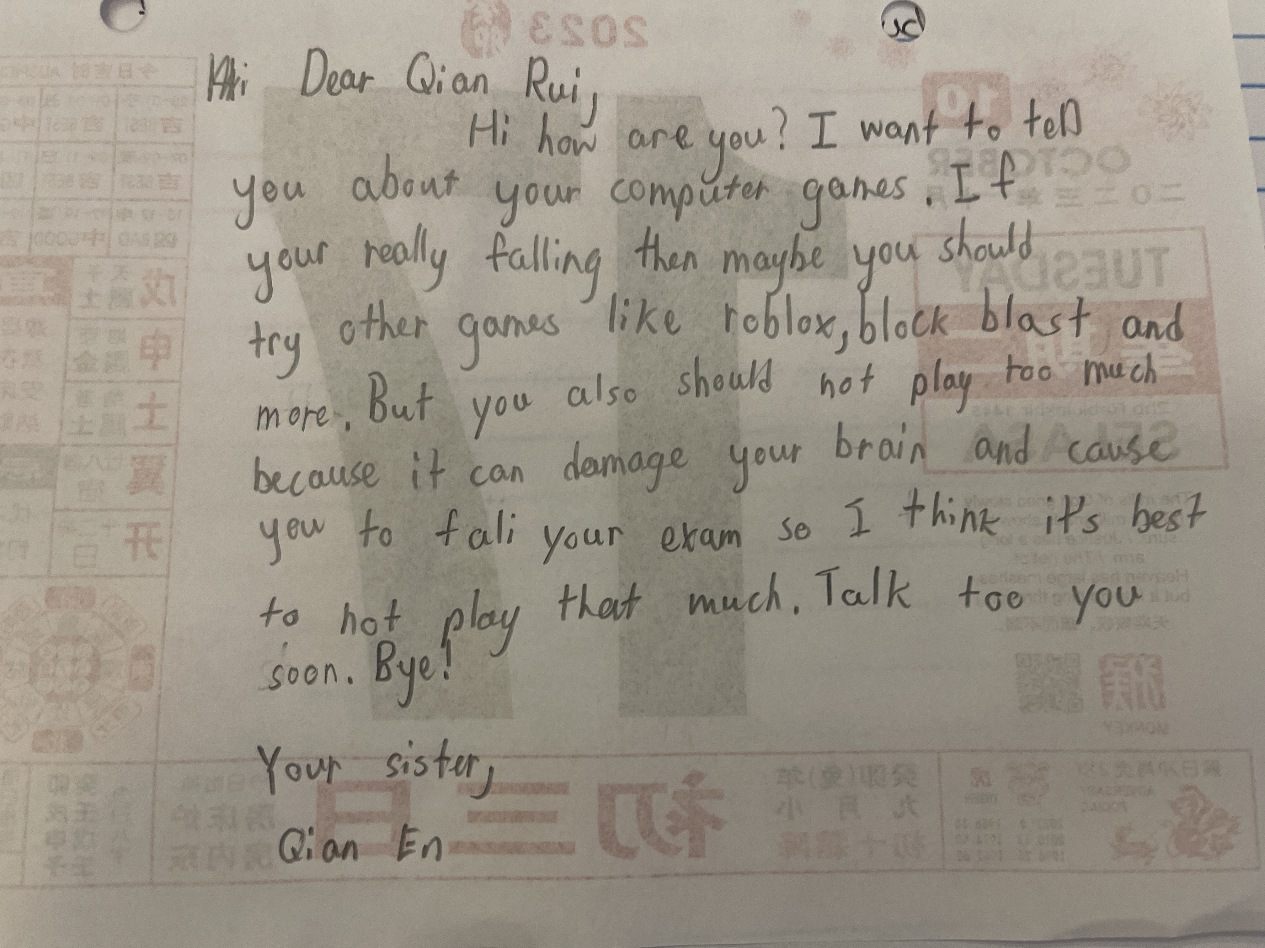
The Concerned Guardian
This handwriting suggests a caring and responsible person, but consistency in letter formation could be improved for enhanced legibility.
The handwriting is characterized by a rounded, almost childlike style. The letter forms are simple and clear, with a noticeable lack of sharp angles. Words like "Dear", "games" and "brain" exhibit consistent letter sizing and spacing, contributing to a generally legible appearance. However, there's some inconsistency, for example in the varying heights of the letter 't' and the slight slant that wavers from word to word.
Based on this handwriting, the writer appears to be someone who is caring and possibly a bit of a worrier. The clear and simple letter formation suggests a straightforward and honest personality. The gentle roundedness hints at someone who is approachable and kind, with a nurturing nature. The advice about computer games implies a responsible and thoughtful individual.
To improve the handwriting, focus on maintaining a consistent slant and letter height. Practicing with lined paper can help to regulate the baseline and ensure uniformity. Pay attention to the formation of specific letters like 't' and 'y' to refine their consistency across the entire text. Try slowing down when writing, to allow time for careful and deliberate strokes. Ultimately, consistency will improve legibility.
Legibility
Expressiveness
Consistency
Overall
Leaderboard for Wednesday, 29 October 2025
| 61 | The Historian's Quill |
52
|
| 62 | The Bold Capitalist |
52
|
| 63 | The Diligent Student |
52
|
| 64 | The Typist |
50
|
| 65 | The Architect's Blueprint |
47
|