Rate my handwriting

✨ Upload a sample of your handwriting, and our 🤖 AI will give you
the scoop on
what's awesome
and what could use a
little improving.
It's just for fun - and totally free! Try now 🚀
(You can also check out today's 👑 Leaderboard 👇)
The Considerate Cursive
This handwriting demonstrates a thoughtful cursive style, suggesting an outgoing and expressive personality, with room for improvement in letter clarity and baseline consistency. With some refinement, this handwriting can be even more appealing and readable.
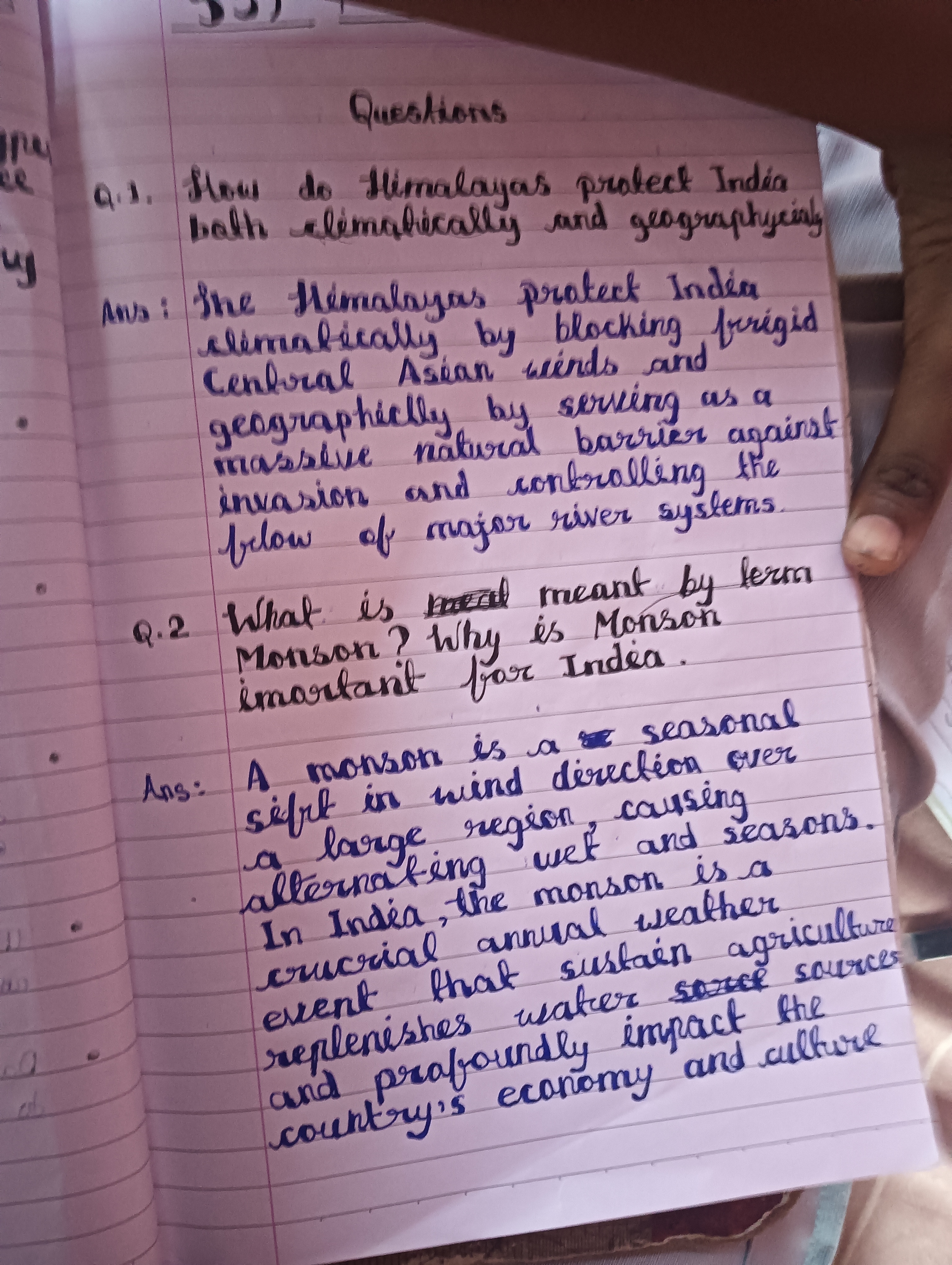
The handwriting presents a cursive style with notable loops and rounded forms, especially evident in letters like 'Himalayas', 'blocking' and 'culture'. The slant is generally consistent and towards the right, suggesting a natural flow. While mostly legible, there are instances where the clarity diminishes, such as in the word 'geographycinly', 'frrigid', and 'replenishes' where letter differentiation becomes slightly ambiguous. The pressure applied seems consistent throughout the sample. Overall, the handwriting is reasonably neat and spaced adequately, though the baseline wavers a bit.
The writer likely possesses a thoughtful and considerate nature, reflected in the carefully formed letters. The rightward slant indicates an outgoing personality and a desire for progress. The rounded forms suggest a harmonious and adaptable character, open to new experiences. The consistency in pressure reveals a steady and reliable demeanor. There is a tendency towards expressiveness, seen in the looping ascenders and descenders. The writer values clear communication but might occasionally prioritize aesthetics over perfect precision.
To enhance legibility, concentrate on maintaining consistent letter sizes and shapes, especially differentiating between similar-looking letters like 'n' and 'u'. Pay closer attention to baseline consistency for a more polished appearance. Consider slowing down slightly to improve letter formation in longer or more complex words. Practice focusing on maintaining a uniform slant throughout the writing. These adjustments would elevate both the readability and the overall visual appeal of the handwriting.
Legibility
Expressiveness
Consistency
Overall
Leaderboard for Sunday, 26 October 2025
| 1 | The Constitutionalist |
74
|
| 2 | The Flowing Quill |
74
|
| 3 | The Curator's Script |
72
|
| 4 | The Eloquent Educator |
71
|
| 5 | The Student's Script |
70
|
| 6 | The Dreamer's Quill |
70
|
| 7 | The Constitutionalist |
68
|
| 8 | The Flowing Quill |
68
|
| 9 | The Hopeful Heart's Script |
68
|
| 10 | The Diligent Penman |
67
|
| 11 | The Agrarian Academic |
67
|
| 12 | The Unassuming Hand |
66
|
| 13 | The Studious Student |
65
|
| 14 | The Calculating Hand |
65
|
| 15 | The Diligent Note-Taker |
64
|
| 16 | The Mathematical Muse |
64
|
| 17 | The Contemplative Soul |
64
|
| 18 | The Flowing Font |
63
|
| 19 | The Gentle Flow |
63
|
| 20 | The Looping Legend |
62
|
| 21 | The Contemplative Calligrapher |
60
|
| 22 | The Signature Stylist |
59
|
| 23 | The Democratic Dreamer |
59
|
| 24 | The Devout Note-Taker |
58
|
| 25 | The Cipher's Quill |
57
|
| 26 | The Atom Alchemist |
57
|
| 27 | The Scientific Mind |
56
|
| 28 | The Loop-de-Loop Legend |
56
|
| 29 | The Orderly Typewriter |
56
|
| 30 | The Forward Leaning Letterer |
54
|