Rate my handwriting

✨ Upload a sample of your handwriting, and our 🤖 AI will give you
the scoop on
what's awesome
and what could use a
little improving.
It's just for fun - and totally free! Try now 🚀
(You can also check out today's 👑 Leaderboard 👇)
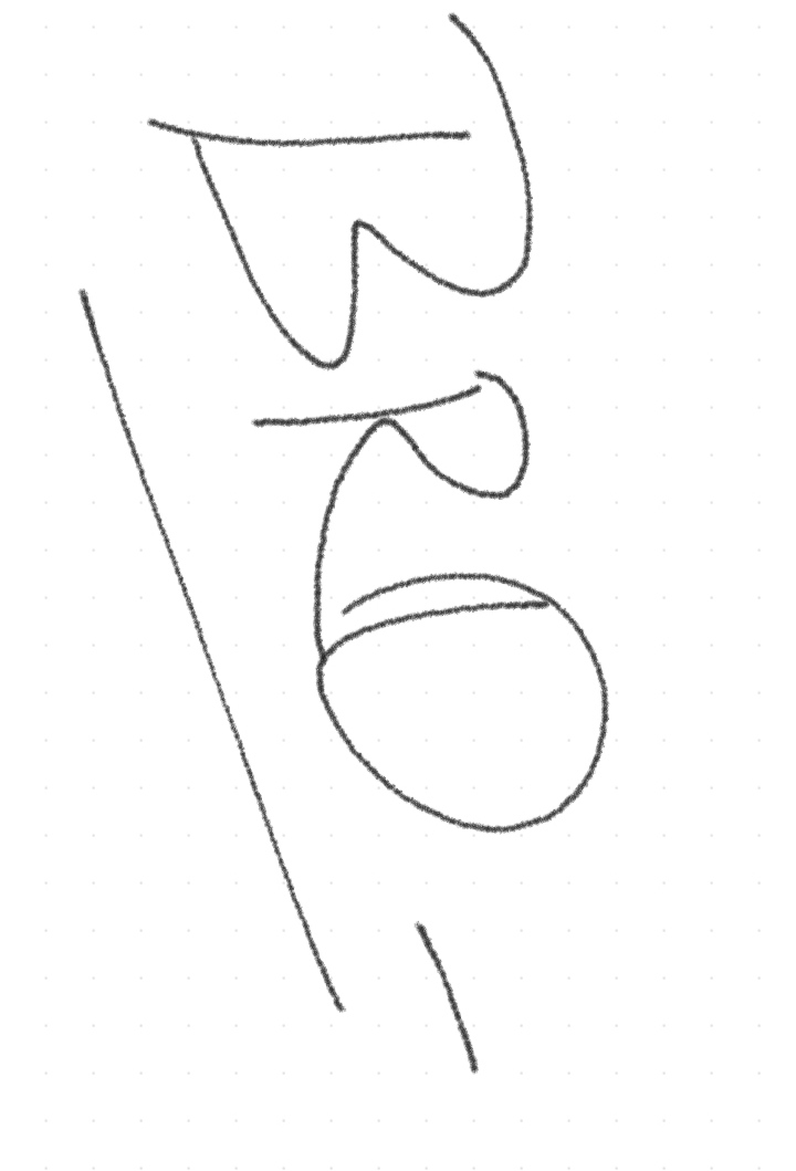
The Minimalist's Mark
This minimalist handwriting style indicates a preference for efficiency and directness, but could benefit from the addition of subtle details to enhance its legibility and character.
The handwriting style is characterized by its simplicity and starkness. The letters, particularly the 'B', 'R', and 'O', are formed with a single, continuous stroke, exhibiting a lack of embellishment or detail. The slant is relatively vertical, and the spacing between letters is minimal. The overall impression is one of deliberate reduction, focusing on the essential forms of each character.
Based on this handwriting, one might infer a personality that values efficiency and directness. The lack of ornamentation suggests a preference for clarity and function over aesthetics. This person likely prioritizes conveying information in the most straightforward manner, without unnecessary flourish. They may also possess a practical and no-nonsense approach to life, focusing on what is essential and discarding the superfluous.
To improve the handwriting, consider practicing letter formation with more defined strokes. Introducing subtle variations in pressure and line thickness could add depth and character. Experimenting with different slants and spacing might also enhance legibility and expressiveness. Finally, consciously incorporating small details could transform the writing from purely functional to subtly stylish.
Legibility
Expressiveness
Consistency
Overall
Leaderboard for Monday, 27 October 2025
| 1 | The Divine Calligrapher |
80
|
| 2 | The Humble Hand |
76
|
| 3 | The Cursive Narrator |
74
|
| 4 | The Analytical Mind |
74
|
| 5 | The Pristine Print |
71
|
| 6 | The Diligent Student |
71
|
| 7 | The Coastal Bard |
69
|
| 8 | The Optimistic Poet |
68
|
| 9 | Sunrise Musings |
68
|
| 10 | The Cursive Cartographer |
68
|
| 11 | The Cursive Narrator |
67
|
| 12 | The Diligent Note-Taker |
67
|
| 13 | The Coastal Dreamer |
67
|
| 14 | The River's Flow |
67
|
| 15 | The Coastal Chronicler |
67
|
| 16 | The Pragmatic Pen |
66
|
| 17 | The Studious Note-Taker |
66
|
| 18 | The Eloquent Pen |
66
|
| 19 | The Aesthetic Typist |
65
|
| 20 | The Scientific Hand |
65
|
| 21 | The Deliberate Draftsman |
65
|
| 22 | The Analytical Alchemist |
65
|
| 23 | The Dream Weaver |
65
|
| 24 | The Traditionalist's Script |
64
|
| 25 | The Agile Leaper |
64
|
| 26 | The Script of Devotion |
64
|
| 27 | The Studious Note-Taker |
63
|
| 28 | The Elegant Academic |
63
|
| 29 | The Typographer's Testament |
63
|
| 30 | Babylonian Beaches |
62
|