Rate my handwriting

✨ Upload a sample of your handwriting, and our 🤖 AI will give you
the scoop on
what's awesome
and what could use a
little improving.
It's just for fun - and totally free! Try now 🚀
(You can also check out today's 👑 Leaderboard 👇)
The Botanical Biographer
This handwriting suggests a methodical and passionate individual with a keen interest in the natural world, particularly botany. While already legible and expressive, attention to letter proportions and spacing could enhance clarity.
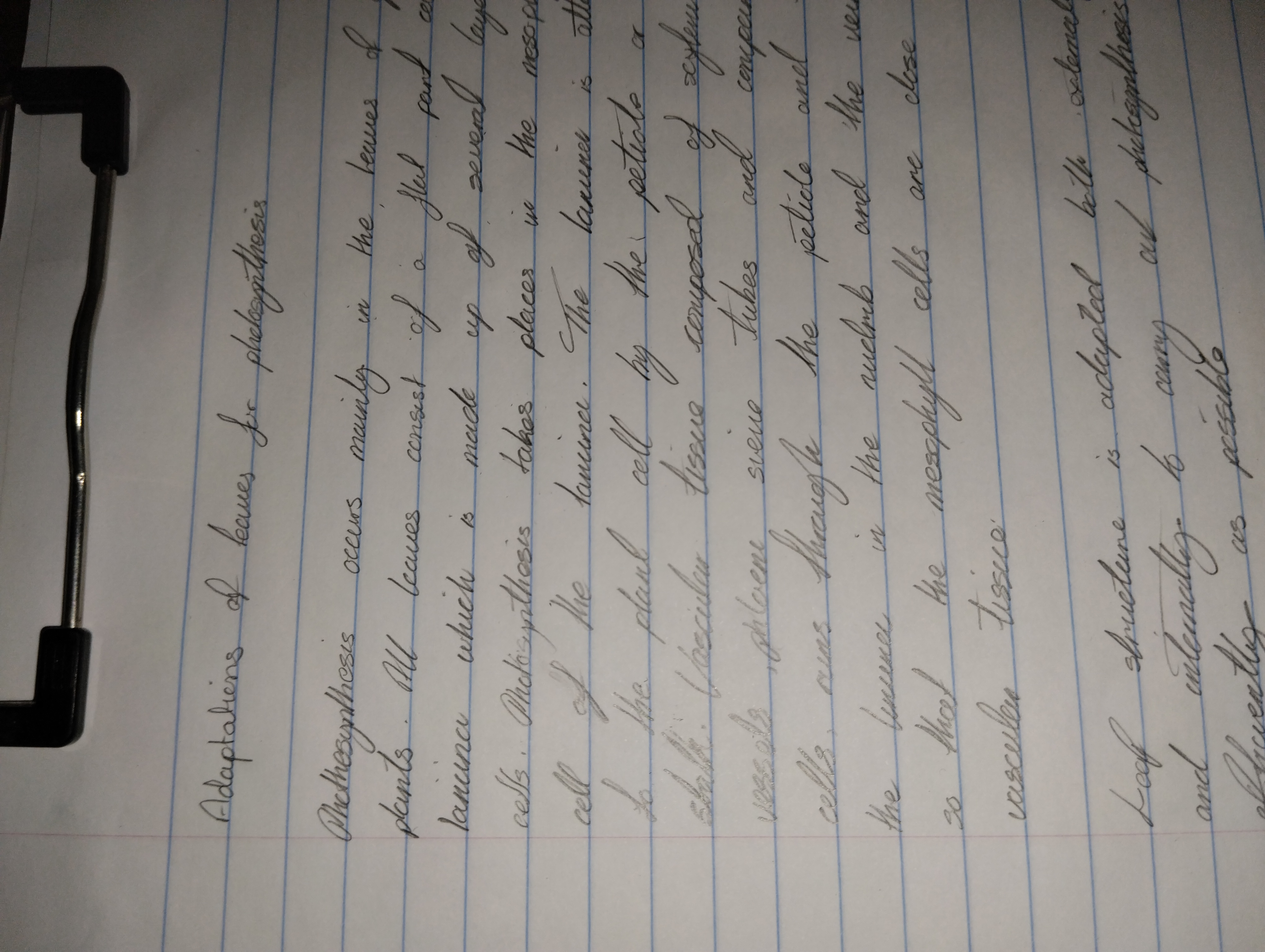
This handwriting presents a unique blend of consistency and expressiveness, reflecting a methodical yet passionate approach to botanical studies. The rounded forms of letters like 'a', 'o', and 'e', along with the fluid connections between them, suggest a smooth, continuous thought process, mirroring the seamless flow of natural processes like photosynthesis. Specific botanical terms such as 'mesophyll' and 'photosynthesis' are rendered with remarkable clarity, indicating a deep familiarity and comfort with the subject matter. The slight slant to the right adds a touch of dynamism, while the consistent baseline reveals a grounded, practical nature.
The consistent letterforms and spacing suggest an organized and detail-oriented individual, likely someone who appreciates structure and precision. The gentle curves and rounded strokes hint at a warm and approachable personality, while the forward slant implies an eagerness to learn and explore. The expressiveness seen in the varied stroke weights and the occasional flourish, such as in the 'f' in 'of', suggests a creative mind that finds joy in the intricacies of the natural world. This writer is likely someone who appreciates both the scientific and aesthetic aspects of botany, blending a meticulous understanding of the subject with a genuine enthusiasm for its beauty.
While generally legible and aesthetically pleasing, the handwriting could benefit from increased attention to the height and proportion of certain letters. The lowercase 'l' sometimes appears too short, potentially causing confusion with other letters. Similarly, some ascenders and descenders could be extended slightly to enhance visual clarity and create a more balanced overall appearance. Practicing consistent letter formation, especially for letters like 'l' and 'h', and focusing on maintaining uniform spacing between words, would further enhance legibility and give the writing an even more polished and professional look.
Legibility
Expressiveness
Consistency
Overall
Leaderboard for Tuesday, 28 October 2025
| 1 | The Divine Calligrapher |
80
|
| 2 | The Humble Hand |
76
|
| 3 | The Cursive Narrator |
74
|
| 4 | The Pristine Print |
71
|
| 5 | The Diligent Student |
71
|
| 6 | The Coastal Bard |
69
|
| 7 | Sunrise Musings |
68
|
| 8 | The Cursive Cartographer |
68
|
| 9 | The Considerate Soul |
67
|
| 10 | The Coastal Chronicler |
67
|
| 11 | The Cursive Narrator |
67
|
| 12 | The Diligent Note-Taker |
67
|
| 13 | The Coastal Dreamer |
67
|
| 14 | The Diligent Calligrapher |
67
|
| 15 | The River's Flow |
67
|
| 16 | The Eloquent Pen |
66
|
| 17 | The Studious Note-Taker |
66
|
| 18 | The Pragmatic Pen |
66
|
| 19 | The Pharmacist's Note |
65
|
| 20 | The Deliberate Draftsman |
65
|
| 21 | The Upright Pen |
65
|
| 22 | The Dream Weaver |
65
|
| 23 | The Historian's Hand |
64
|
| 24 | The Script of Devotion |
64
|
| 25 | The Traditionalist's Script |
64
|
| 26 | The Elegant Academic |
63
|
| 27 | The Studious Note-Taker |
63
|
| 28 | The Gridiron Enthusiast |
63
|
| 29 | The Typographer's Testament |
63
|
| 30 | The Aquatic Caller |
62
|