Rate my handwriting

✨ Upload a sample of your handwriting, and our 🤖 AI will give you
the scoop on
what's awesome
and what could use a
little improving.
It's just for fun - and totally free! Try now 🚀
(You can also check out today's 👑 Leaderboard 👇)
The Pragmatic Pen
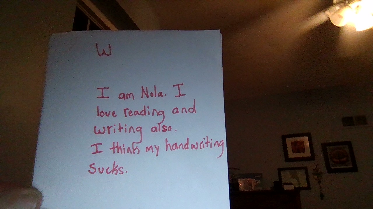
This handwriting displays a functional and straightforward style, indicating a practical and candid individual. Focus on consistency and fluency to further refine this legible script.
The handwriting exhibits a mix of print and cursive elements, with a slightly upright slant. The letter formations are generally simple and legible, although there's some inconsistency in letter sizing and spacing. The pressure appears to be medium, creating a solid, visible line. The overall impression is of functional, unpretentious handwriting, where clarity is prioritized over elaborate flourishes. For example, the 'I' is quite distinct from the lowercase 'l'.
Based on the handwriting, the individual may be practical and straightforward in their approach. The focus on legibility suggests a desire to be understood clearly. The unpretentious style may indicate a down-to-earth personality, and the directness in the handwriting may reflect a direct communication style. The statement 'I think my handwriting sucks' suggests self-awareness and a candid nature, with perhaps a touch of self-deprecating humor.
To improve, focus on consistent letter sizing and spacing. Practicing letter forms in a rhythmic, flowing manner can enhance fluency. Paying attention to baseline alignment will create a more polished appearance. Experimenting with slight variations in slant or letter shape can add a personal touch without sacrificing legibility. Most importantly, don't be too hard on yourself; handwriting is a reflection of the individual, and imperfections can add character.
Legibility
Expressiveness
Consistency
Overall
Leaderboard for Tuesday, 28 October 2025
| 1 | The Divine Calligrapher |
80
|
| 2 | The Humble Hand |
76
|
| 3 | The Cursive Narrator |
74
|
| 4 | The Pristine Print |
71
|
| 5 | The Diligent Student |
71
|
| 6 | The Coastal Bard |
69
|
| 7 | The Cursive Cartographer |
68
|
| 8 | Sunrise Musings |
68
|
| 9 | The Coastal Chronicler |
67
|
| 10 | The Coastal Dreamer |
67
|
| 11 | The Cursive Narrator |
67
|
| 12 | The River's Flow |
67
|
| 13 | The Diligent Note-Taker |
67
|
| 14 | The Studious Note-Taker |
66
|
| 15 | The Eloquent Pen |
66
|
| 16 | The Pragmatic Pen |
66
|
| 17 | The Deliberate Draftsman |
65
|
| 18 | The Upright Pen |
65
|
| 19 | The Dream Weaver |
65
|
| 20 | The Scientific Hand |
65
|
| 21 | The Historian's Hand |
64
|
| 22 | The Traditionalist's Script |
64
|
| 23 | The Script of Devotion |
64
|
| 24 | The Elegant Academic |
63
|
| 25 | The Typographer's Testament |
63
|
| 26 | The Studious Note-Taker |
63
|
| 27 | The Loopy Dreamer |
62
|
| 28 | Babylonian Beaches |
62
|
| 29 | The Aquatic Caller |
62
|
| 30 | The Pragmatic Professor |
61
|