Rate my handwriting

✨ Upload a sample of your handwriting, and our 🤖 AI will give you
the scoop on
what's awesome
and what could use a
little improving.
It's just for fun - and totally free! Try now 🚀
(You can also check out today's 👑 Leaderboard 👇)
The Serene Calligrapher
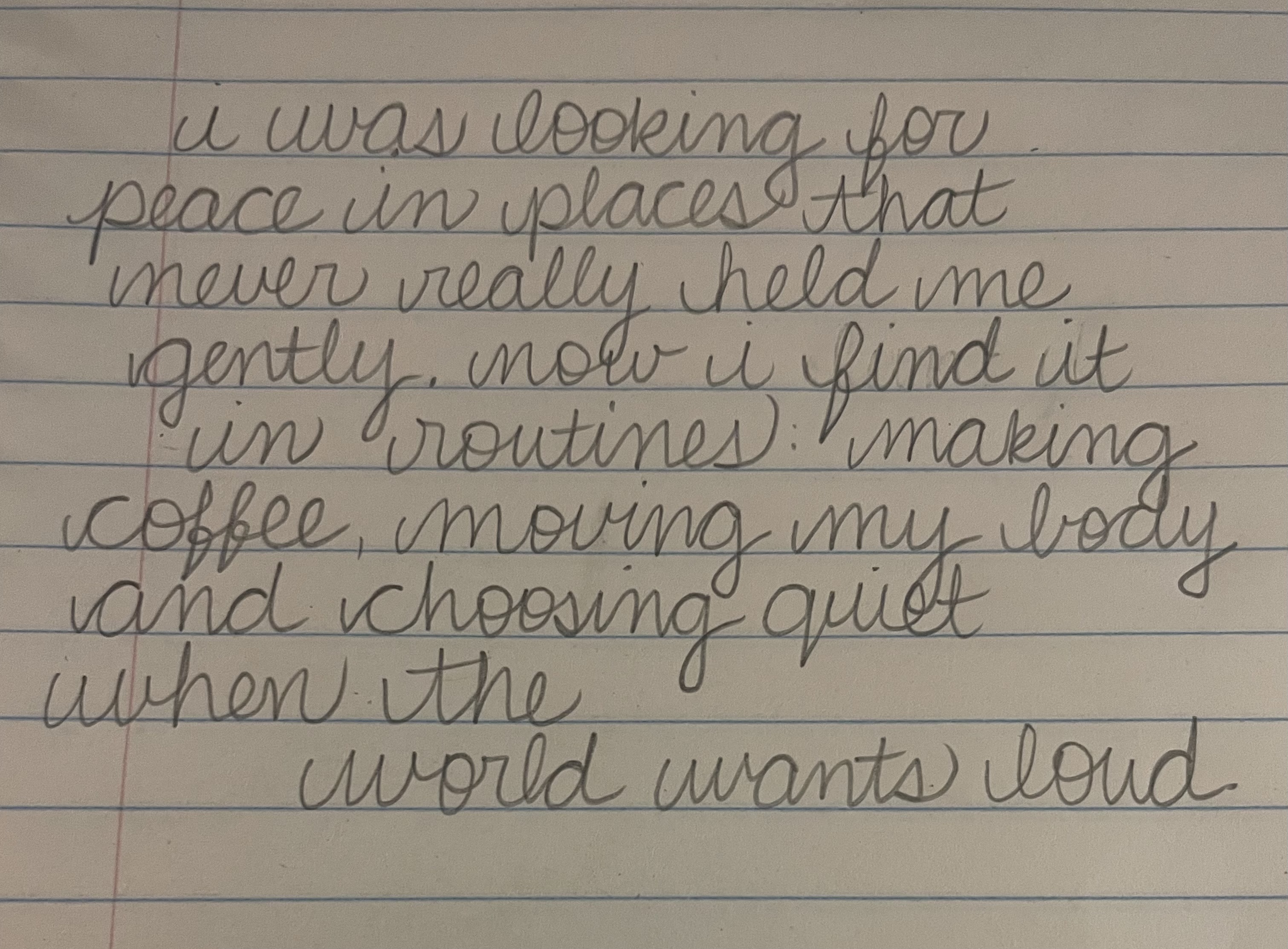
The handwriting is elegant and flowing, indicating a harmonious and creative personality. Consistency in spacing could further enhance the clarity and polish of the writing.
The handwriting sample presents a cursive style with a graceful, flowing quality. The loops in letters like 'l', 'g', and 'y' are elongated, creating a sense of movement and rhythm across the page. There is a gentle slant to the right, indicating a forward-moving energy. The connections between letters are generally smooth, contributing to the overall fluidity of the writing. However, the spacing between words is somewhat inconsistent, with some areas feeling more compressed than others. The size of the letters is relatively uniform, though there is a slight variation in the height of ascenders and descenders. The pressure applied to the pen appears to be light and even, resulting in a delicate and airy appearance.
Based on the handwriting, it suggests the writer is someone who values harmony and aesthetics. The flowing cursive and gentle slant indicate a person who is adaptable, open to new experiences, and possesses a natural inclination towards beauty and creativity. The even pressure suggests emotional stability and a calm demeanor. The slightly inconsistent spacing between words may hint at moments of internal conflict or indecisiveness, but overall, the handwriting reflects a personality that is thoughtful, empathetic, and seeks to create a sense of balance and peace in their environment.
To enhance your handwriting, focus on maintaining consistent spacing between words to improve clarity and readability. Practicing consistent letter forms, especially the height of ascenders and descenders, will contribute to a more polished appearance. Consider experimenting with different pen pressures to add depth and character to your writing, but be mindful of maintaining overall legibility. Embracing these subtle adjustments can further refine your already elegant handwriting style.
Legibility
Expressiveness
Consistency
Overall
Leaderboard for Tuesday, 28 October 2025
| 1 | The Divine Calligrapher |
80
|
| 2 | The Humble Hand |
76
|
| 3 | The Cursive Narrator |
74
|
| 4 | The Pristine Print |
71
|
| 5 | The Diligent Student |
71
|
| 6 | The Coastal Bard |
69
|
| 7 | The Cursive Cartographer |
68
|
| 8 | Sunrise Musings |
68
|
| 9 | The Coastal Chronicler |
67
|
| 10 | The Coastal Dreamer |
67
|
| 11 | The Cursive Narrator |
67
|
| 12 | The River's Flow |
67
|
| 13 | The Diligent Note-Taker |
67
|
| 14 | The Studious Note-Taker |
66
|
| 15 | The Eloquent Pen |
66
|
| 16 | The Pragmatic Pen |
66
|
| 17 | The Deliberate Draftsman |
65
|
| 18 | The Upright Pen |
65
|
| 19 | The Dream Weaver |
65
|
| 20 | The Scientific Hand |
65
|
| 21 | The Historian's Hand |
64
|
| 22 | The Traditionalist's Script |
64
|
| 23 | The Script of Devotion |
64
|
| 24 | The Elegant Academic |
63
|
| 25 | The Typographer's Testament |
63
|
| 26 | The Studious Note-Taker |
63
|
| 27 | The Loopy Dreamer |
62
|
| 28 | Babylonian Beaches |
62
|
| 29 | The Aquatic Caller |
62
|
| 30 | The Pragmatic Professor |
61
|