Rate my handwriting

✨ Upload a sample of your handwriting, and our 🤖 AI will give you
the scoop on
what's awesome
and what could use a
little improving.
It's just for fun - and totally free! Try now 🚀
(You can also check out today's 👑 Leaderboard 👇)

The Discontented Calligrapher
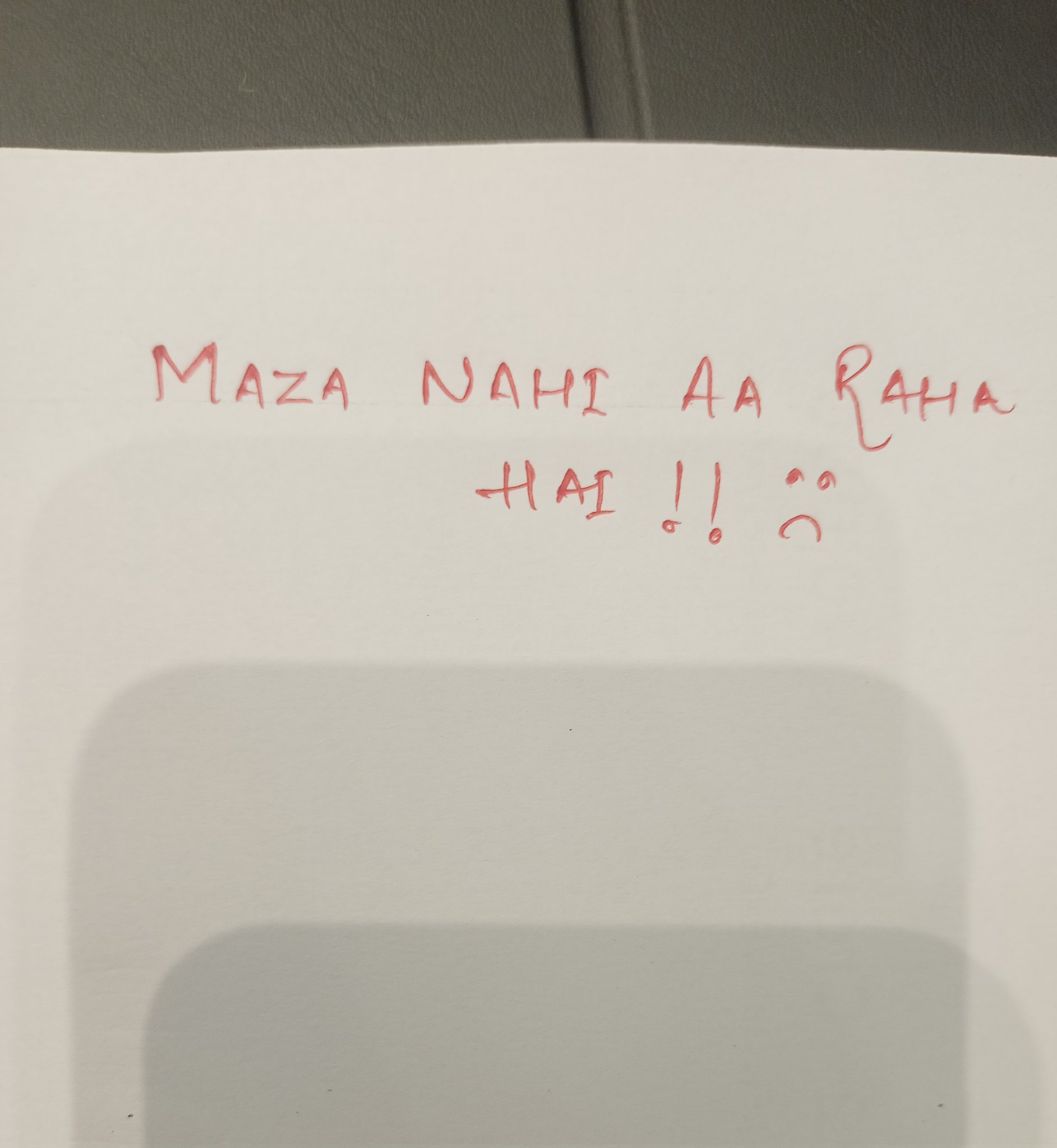
The handwriting is blocky and straightforward, hinting at a practical personality, though improvement could be made in fluency and consistency. A little melancholy is detected.
The handwriting sample displays a straightforward, block-letter style with distinct characters, as seen in the words "MAZA," "NAHI," "AA," "RAHA," and "HAI". The strokes are deliberate, with a moderate level of consistency in letter size and spacing, although the alignment of the two lines is slightly askew. The writing lacks a certain fluency, appearing somewhat stilted and forced, but remains reasonably neat and legible, conveying the message effectively.
Based on this handwriting, one might infer a personality that values clarity and directness. The individual may be somewhat reserved in expressing emotions, preferring a more controlled and structured approach. There could be a tendency towards practicality and a focus on conveying information accurately, even if it means sacrificing a bit of flair or artistic expression. The slightly sad smiley face suggests a hint of melancholy or dissatisfaction.
To improve the handwriting, focusing on developing a more fluid and connected style could be beneficial. Practicing cursive or semi-cursive forms might introduce a greater sense of rhythm and expressiveness. Additionally, paying attention to consistent baseline alignment and letter spacing would enhance the overall aesthetic appeal and legibility of the writing. Consider varying the pressure applied to the pen to create more dynamic strokes.
Legibility
Expressiveness
Consistency
Overall
Leaderboard for Monday, 27 October 2025
| 1 | The Divine Calligrapher |
80
|
| 2 | The Humble Hand |
76
|
| 3 | The Analytical Mind |
74
|
| 4 | The Diligent Student |
71
|
| 5 | The Pristine Print |
71
|
| 6 | The Student's Script |
70
|
| 7 | The Coastal Bard |
69
|
| 8 | The Optimistic Poet |
68
|
| 9 | Sunrise Musings |
68
|
| 10 | The Cursive Cartographer |
68
|
| 11 | The Diligent Note-Taker |
67
|
| 12 | The River's Flow |
67
|
| 13 | The Diligent Penman |
67
|
| 14 | The Coastal Chronicler |
67
|
| 15 | The Cursive Narrator |
67
|
| 16 | The Coastal Dreamer |
67
|
| 17 | The Pragmatic Pen |
66
|
| 18 | The Scientific Hand |
65
|
| 19 | The Deliberate Draftsman |
65
|
| 20 | The Aesthetic Typist |
65
|
| 21 | The Analytical Alchemist |
65
|
| 22 | The Agile Leaper |
64
|
| 23 | The Diligent Note-Taker |
64
|
| 24 | The Mathematical Muse |
64
|
| 25 | The Traditionalist's Script |
64
|
| 26 | The Script of Devotion |
64
|
| 27 | The Elegant Academic |
63
|
| 28 | The Studious Note-Taker |
63
|
| 29 | The Typographer's Testament |
63
|
| 30 | Babylonian Beaches |
62
|