Rate my handwriting

✨ Upload a sample of your handwriting, and our 🤖 AI will give you
the scoop on
what's awesome
and what could use a
little improving.
It's just for fun - and totally free! Try now 🚀
(You can also check out today's 👑 Leaderboard 👇)
The Forthright Font
This handwriting suggests a clear, precise, and methodical individual with a strong sense of purpose, while improvements can be made by focusing on fluidity and variation in pressure.
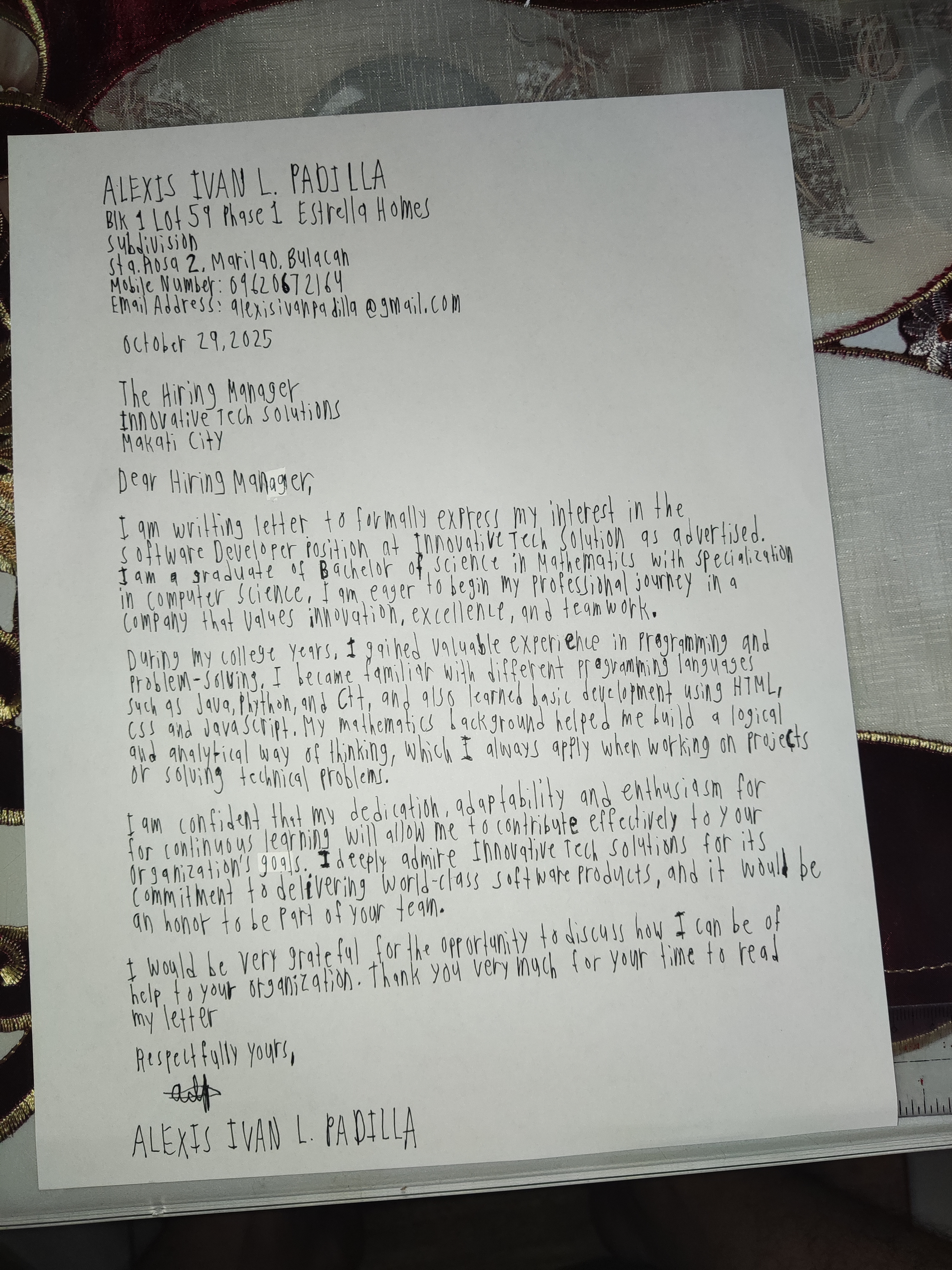
The handwriting is characterized by its blocky, upright letters and a noticeable lack of slant. The pressure appears consistent throughout, and the letter formations are relatively simple and clear. The spacing between words is generally adequate, although there are a few instances where words appear slightly crowded. The overall impression is one of carefulness and deliberate execution. For example, the writer prints their name clearly at the top and bottom of the letter.
This style suggests a personality that values clarity, precision, and straightforwardness. The writer likely possesses a practical and methodical approach to tasks, with a preference for clear communication and organization. The lack of slant might indicate a certain reserve or objectivity, while the consistent pressure suggests determination and a strong sense of purpose. The emphasis on legibility suggests consideration for others and a desire to be understood.
To improve the handwriting, consider practicing more fluid strokes and experimenting with a slight slant to add a touch of dynamism. Varying the pressure slightly can also add depth and character to the writing. Focusing on connecting letters more smoothly could enhance the overall flow and rhythm of the script, and therefore the character of the person writing.
Legibility
Expressiveness
Consistency
Overall
Leaderboard for Monday, 27 October 2025
| 1 | The Divine Calligrapher |
80
|
| 2 | The Humble Hand |
76
|
| 3 | The Cursive Narrator |
74
|
| 4 | The Analytical Mind |
74
|
| 5 | The Pristine Print |
71
|
| 6 | The Diligent Student |
71
|
| 7 | The Coastal Bard |
69
|
| 8 | The Optimistic Poet |
68
|
| 9 | Sunrise Musings |
68
|
| 10 | The Cursive Cartographer |
68
|
| 11 | The Cursive Narrator |
67
|
| 12 | The Diligent Note-Taker |
67
|
| 13 | The Coastal Dreamer |
67
|
| 14 | The River's Flow |
67
|
| 15 | The Coastal Chronicler |
67
|
| 16 | The Pragmatic Pen |
66
|
| 17 | The Studious Note-Taker |
66
|
| 18 | The Eloquent Pen |
66
|
| 19 | The Aesthetic Typist |
65
|
| 20 | The Scientific Hand |
65
|
| 21 | The Deliberate Draftsman |
65
|
| 22 | The Analytical Alchemist |
65
|
| 23 | The Dream Weaver |
65
|
| 24 | The Traditionalist's Script |
64
|
| 25 | The Agile Leaper |
64
|
| 26 | The Script of Devotion |
64
|
| 27 | The Studious Note-Taker |
63
|
| 28 | The Elegant Academic |
63
|
| 29 | The Typographer's Testament |
63
|
| 30 | Babylonian Beaches |
62
|