Rate my handwriting

✨ Upload a sample of your handwriting, and our 🤖 AI will give you
the scoop on
what's awesome
and what could use a
little improving.
It's just for fun - and totally free! Try now 🚀
(You can also check out today's 👑 Leaderboard 👇)
The Scientist
This handwriting demonstrates a clear and generally consistent style, indicative of a thoughtful, detail-oriented, and forward-thinking personality. Minor improvements in baseline consistency and letter height would enhance readability.
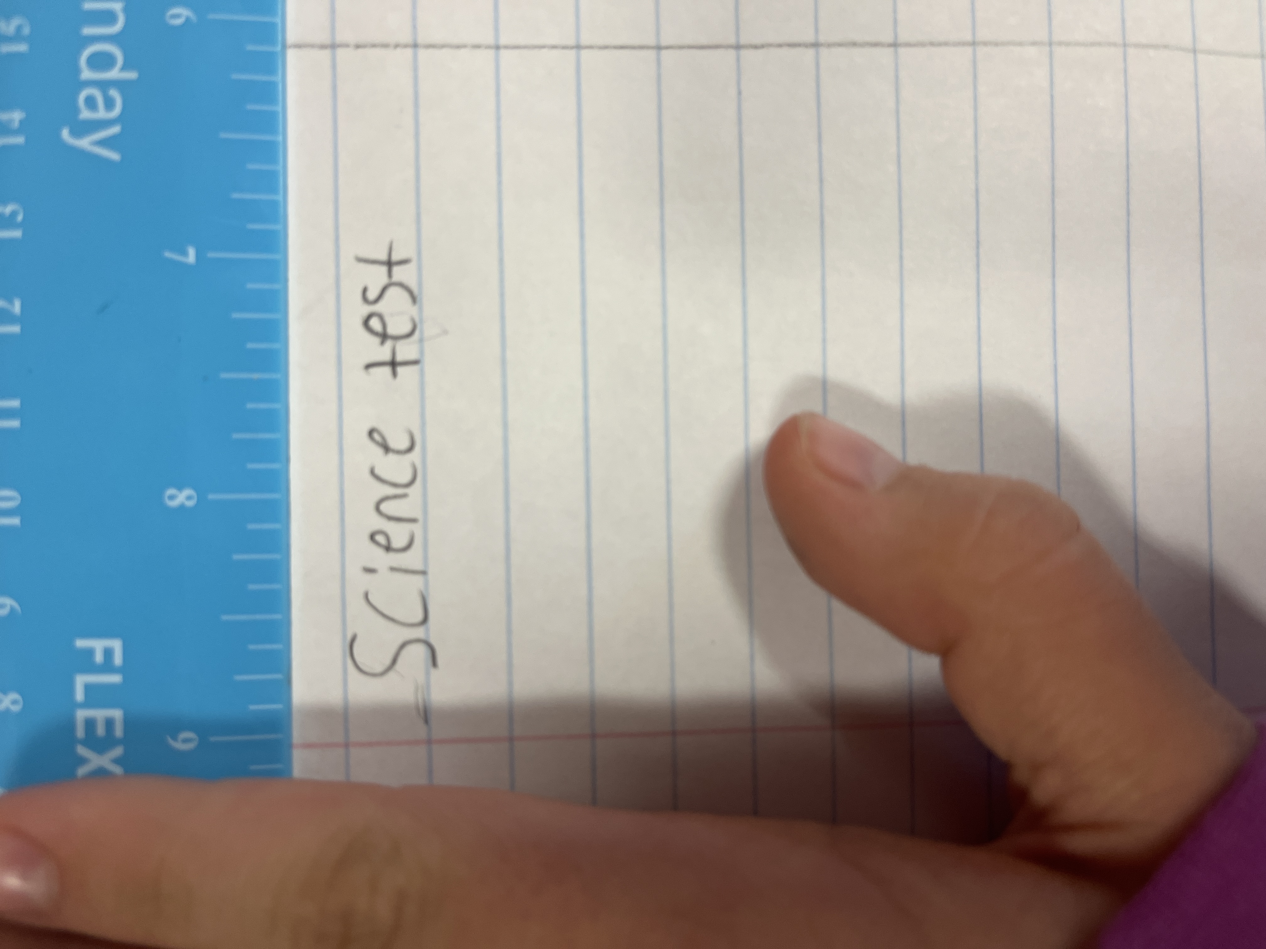
The handwriting sample showcases a style that is generally legible and consistent, with a slight rightward slant. The letters are of medium size and reasonably well-formed, although there's a noticeable variation in the height of some letters, such as the 'c' in 'Science' compared to the 'e'. The spacing between words is adequate, maintaining clarity, while the spacing between letters is also balanced. The baseline of the writing is fairly straight, although it tends to drift slightly upwards toward the end of the word 'test'. The 'S' in 'Science' is distinctive, with a stylish initial curve that sets it apart.
This handwriting style suggests a personality that is balanced and detail-oriented. The overall legibility points to a clear communicator, someone who values clarity and precision. The slight slant towards the right indicates a forward-thinking nature, coupled with a willingness to engage with others. The minor inconsistencies in letter heights hint at a touch of spontaneity and adaptability, suggesting someone who isn't afraid to embrace change or think outside the box. The upward baseline drift in 'test' may indicate optimism and a tendency to strive for higher goals. The initial curve in 'S' may be a sign of pride in one's presentation.
While the handwriting is already quite good, there are a few areas that could benefit from some refinement. Working on maintaining a consistent baseline throughout words could improve neatness. Paying closer attention to the height of letters, ensuring they align more consistently, would further enhance the overall appearance and readability. Practicing connecting letters more smoothly could also contribute to better flow and speed of writing. Finally, reducing the flourish on the initial 'S' might give the writing a more professional tone, although this depends on personal preference.
Legibility
Expressiveness
Consistency
Overall
Leaderboard for Monday, 27 October 2025
| 1 | The Constitutionalist |
74
|
| 2 | The Eloquent Educator |
71
|
| 3 | The Student's Script |
70
|
| 4 | The Dreamer's Quill |
70
|
| 5 | The Hopeful Heart's Script |
68
|
| 6 | The Constitutionalist |
68
|
| 7 | The Diligent Penman |
67
|
| 8 | The Agrarian Academic |
67
|
| 9 | The Analytical Alchemist |
65
|
| 10 | The Calculating Hand |
65
|
| 11 | The Contemplative Soul |
64
|
| 12 | The Agile Leaper |
64
|
| 13 | The Mathematical Muse |
64
|
| 14 | The Diligent Note-Taker |
64
|
| 15 | The Gentle Flow |
63
|
| 16 | The Looping Legend |
62
|
| 17 | The Agile Artisan |
61
|
| 18 | The Contemplative Calligrapher |
60
|
| 19 | The Democratic Dreamer |
59
|
| 20 | The Devout Note-Taker |
58
|
| 21 | The Practical Notetaker |
58
|
| 22 | The Considerate Confidant |
56
|
| 23 | The Orderly Typewriter |
56
|
| 24 | The Forward Leaning Letterer |
54
|
| 25 | The Steadfast Student |
53
|
| 26 | The Diligent Student |
53
|
| 27 | The Diligent Note-Taker |
53
|
| 28 | The Flowing River |
53
|
| 29 | The Architect of Letters |
53
|
| 30 | The Pragmatic Hand |
52
|