Rate my handwriting

✨ Upload a sample of your handwriting, and our 🤖 AI will give you
the scoop on
what's awesome
and what could use a
little improving.
It's just for fun - and totally free! Try now 🚀
(You can also check out today's 👑 Leaderboard 👇)
The Devotee's Quill
This handwriting suggests a thoughtful and conscientious individual who values clarity and friendliness in their communication, but could benefit from varying pressure and focusing on a consistent slant to improve expressiveness.
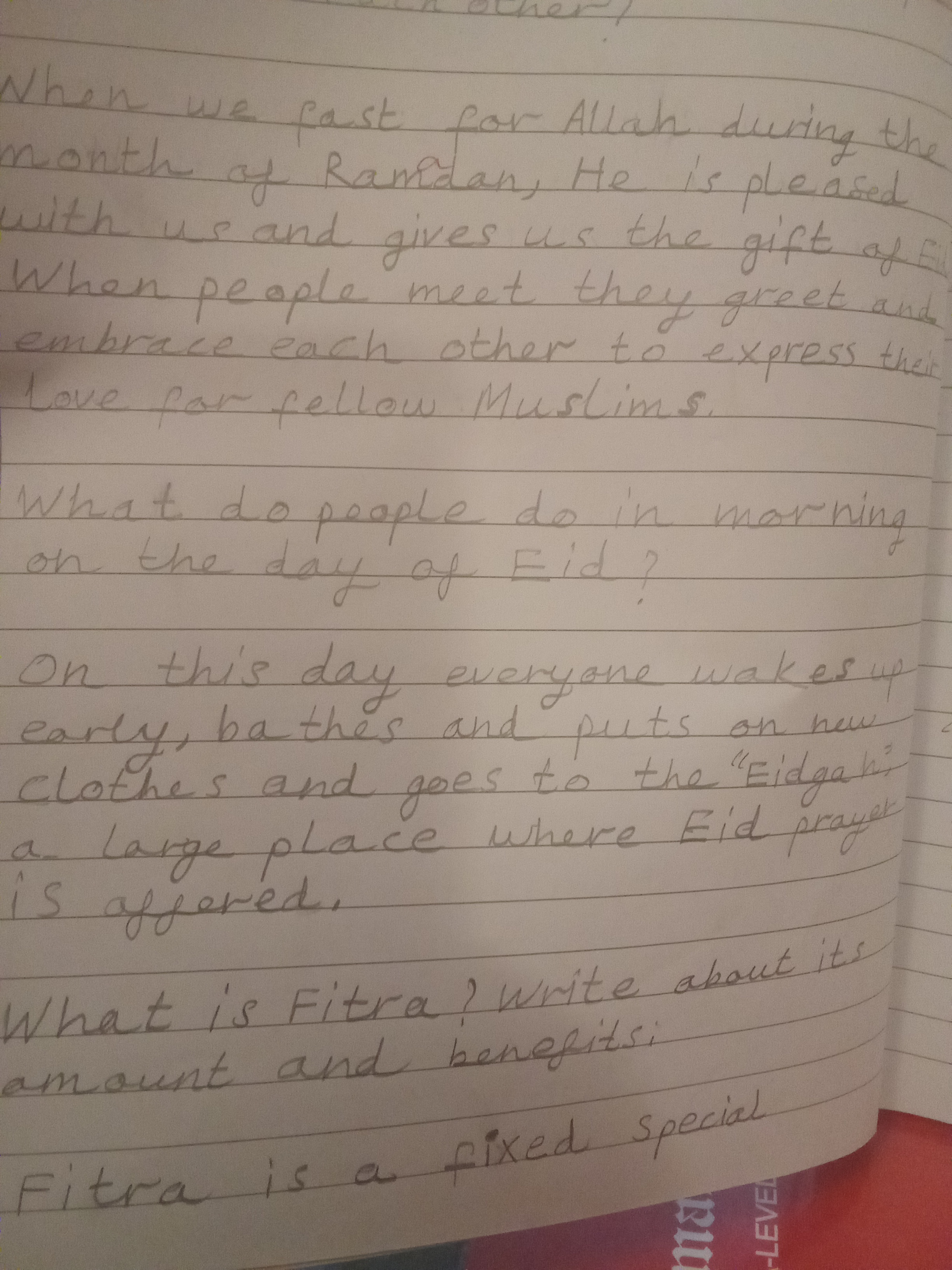
The handwriting exhibits a careful, upright style with rounded letter formations, as seen in words like "Ramdan" and "pleased." The spacing between words is generally consistent, contributing to overall legibility. The letter size is fairly uniform, although there is some slight variation. The pressure applied appears to be light, resulting in thin strokes, but the handwriting does not seem rushed, indicating a deliberate approach.
Based on this handwriting, one might infer traits such as conscientiousness and a desire for clarity. The rounded forms suggest a friendly and approachable nature. The writer seems thoughtful and values being understood. There's an indication of a balanced temperament, seeking harmony in expression and presentation.
To improve, try varying the pressure to add more dimension to the writing. Practicing consistent slant could also enhance its aesthetic appeal. Focus on refining the baseline to give the writing a more grounded appearance. While legibility is good, consciously focusing on consistent letter height can further improve clarity.
Legibility
Expressiveness
Consistency
Overall
Leaderboard for Wednesday, 15 October 2025
| 31 | The Idealist's Italic |
53
|
| 32 | The Idealist's Italic |
53
|
| 33 | The Environmentalist's Cursive |
53
|
| 34 | The Pragmatic Author |
53
|
| 35 | The Pragmatic Penman |
53
|
| 36 | The Pragmatic Penman |
52
|
| 37 | The Devotee's Quill |
52
|
| 38 | The Verdant Voyager's Quill |
51
|
| 39 | The Statistician's Quill |
51
|
| 40 | The Anguished Pen |
50
|
| 41 | The Energetic Note-Taker |
49
|
| 42 | The Pragmatic Dreamer |
49
|
| 43 | The Pragmatic Projector |
48
|
| 44 | The Pragmatic Pen |
46
|