Rate my handwriting

✨ Upload a sample of your handwriting, and our 🤖 AI will give you
the scoop on
what's awesome
and what could use a
little improving.
It's just for fun - and totally free! Try now 🚀
(You can also check out today's 👑 Leaderboard 👇)
The Harbinger of Spring
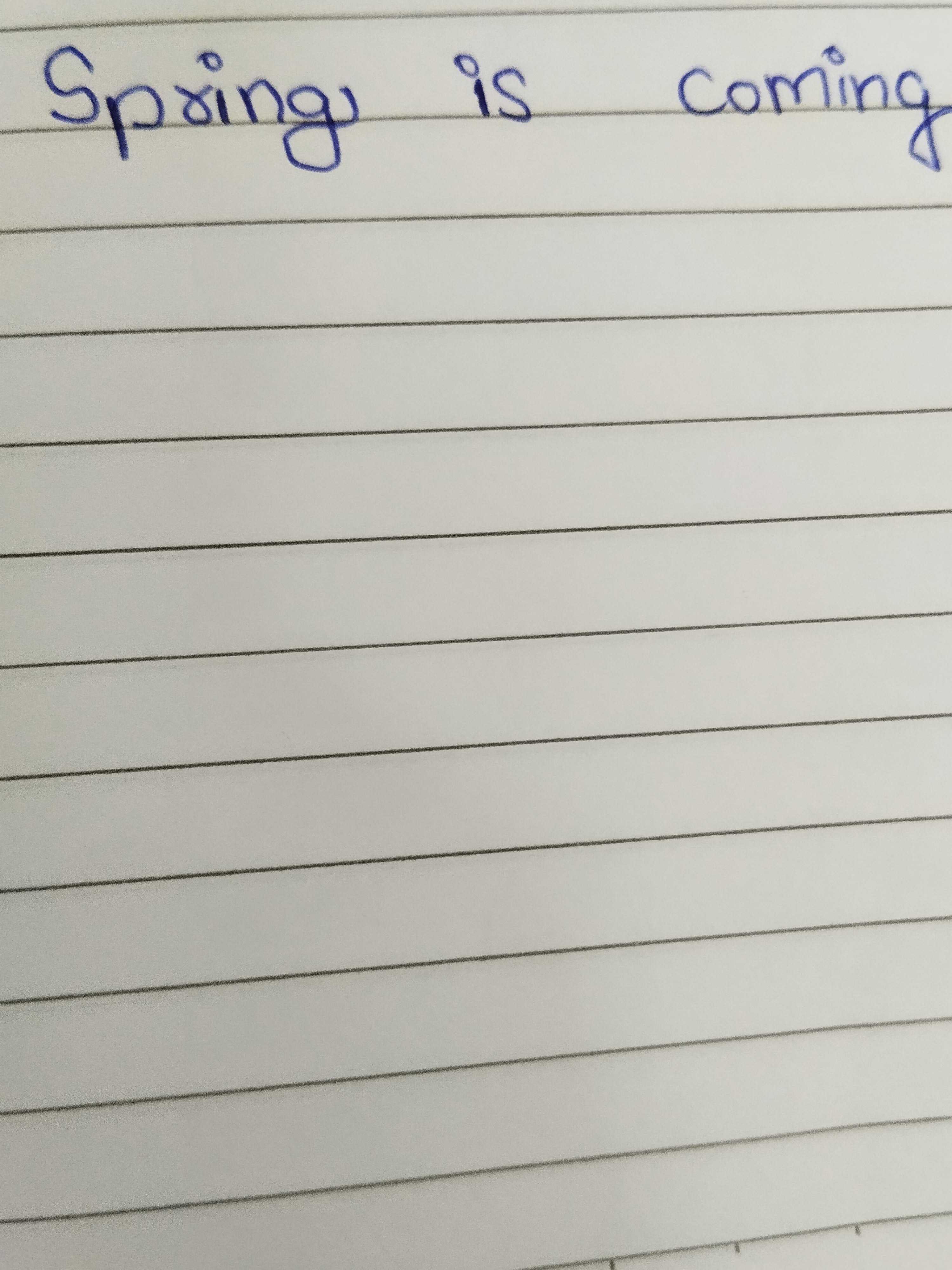
This handwriting expresses optimism and directness, with a touch of cheerful informality. Minor improvements in consistency and form would greatly enhance its overall impression.
This handwriting sample, with its declaration that "Spring is coming," presents a mixed bag in terms of style. The letters are generally legible, though the 'S' in 'Spring' and the 'g' in both words show a slight rightward slant, hinting at a touch of impatience for the new season. The 'i' is dotted with a simple, unassuming circle, suggesting a practicality and straightforwardness in the writer's nature. The overall impression is one of informality, like a quick note dashed off in a moment of inspiration.
This style of handwriting indicates someone who values clarity and directness. The rounded forms of the letters suggest an amiable and approachable nature. The slight slant to the right implies an eagerness to connect with others and express oneself. The simple dotting of the 'i' points to a practical mind, perhaps one that doesn't get bogged down in unnecessary details. Overall, the writing exudes a cheerful and optimistic energy, reflecting the anticipation of spring.
While generally legible, a few tweaks could elevate this handwriting. Focusing on consistency in the slant of the letters would create a more harmonious appearance. The 'g' could benefit from a more controlled loop, enhancing its elegance. Finally, paying attention to the spacing between words would increase overall readability. These minor adjustments would not only improve the aesthetics of the handwriting but also enhance the impression it conveys.
Legibility
Expressiveness
Consistency
Overall
Leaderboard for Tuesday, 28 October 2025
| 1 | The Divine Calligrapher |
80
|
| 2 | The Humble Hand |
76
|
| 3 | The Cursive Narrator |
74
|
| 4 | The Pristine Print |
71
|
| 5 | The Diligent Student |
71
|
| 6 | The Coastal Bard |
69
|
| 7 | The Cursive Cartographer |
68
|
| 8 | Sunrise Musings |
68
|
| 9 | The Coastal Chronicler |
67
|
| 10 | The Coastal Dreamer |
67
|
| 11 | The Cursive Narrator |
67
|
| 12 | The River's Flow |
67
|
| 13 | The Diligent Note-Taker |
67
|
| 14 | The Studious Note-Taker |
66
|
| 15 | The Eloquent Pen |
66
|
| 16 | The Pragmatic Pen |
66
|
| 17 | The Deliberate Draftsman |
65
|
| 18 | The Upright Pen |
65
|
| 19 | The Dream Weaver |
65
|
| 20 | The Scientific Hand |
65
|
| 21 | The Historian's Hand |
64
|
| 22 | The Traditionalist's Script |
64
|
| 23 | The Script of Devotion |
64
|
| 24 | The Elegant Academic |
63
|
| 25 | The Typographer's Testament |
63
|
| 26 | The Studious Note-Taker |
63
|
| 27 | The Loopy Dreamer |
62
|
| 28 | Babylonian Beaches |
62
|
| 29 | The Aquatic Caller |
62
|
| 30 | The Pragmatic Professor |
61
|