Rate my handwriting

✨ Upload a sample of your handwriting, and our 🤖 AI will give you
the scoop on
what's awesome
and what could use a
little improving.
It's just for fun - and totally free! Try now 🚀
(You can also check out today's 👑 Leaderboard 👇)

The Idealist's Italic
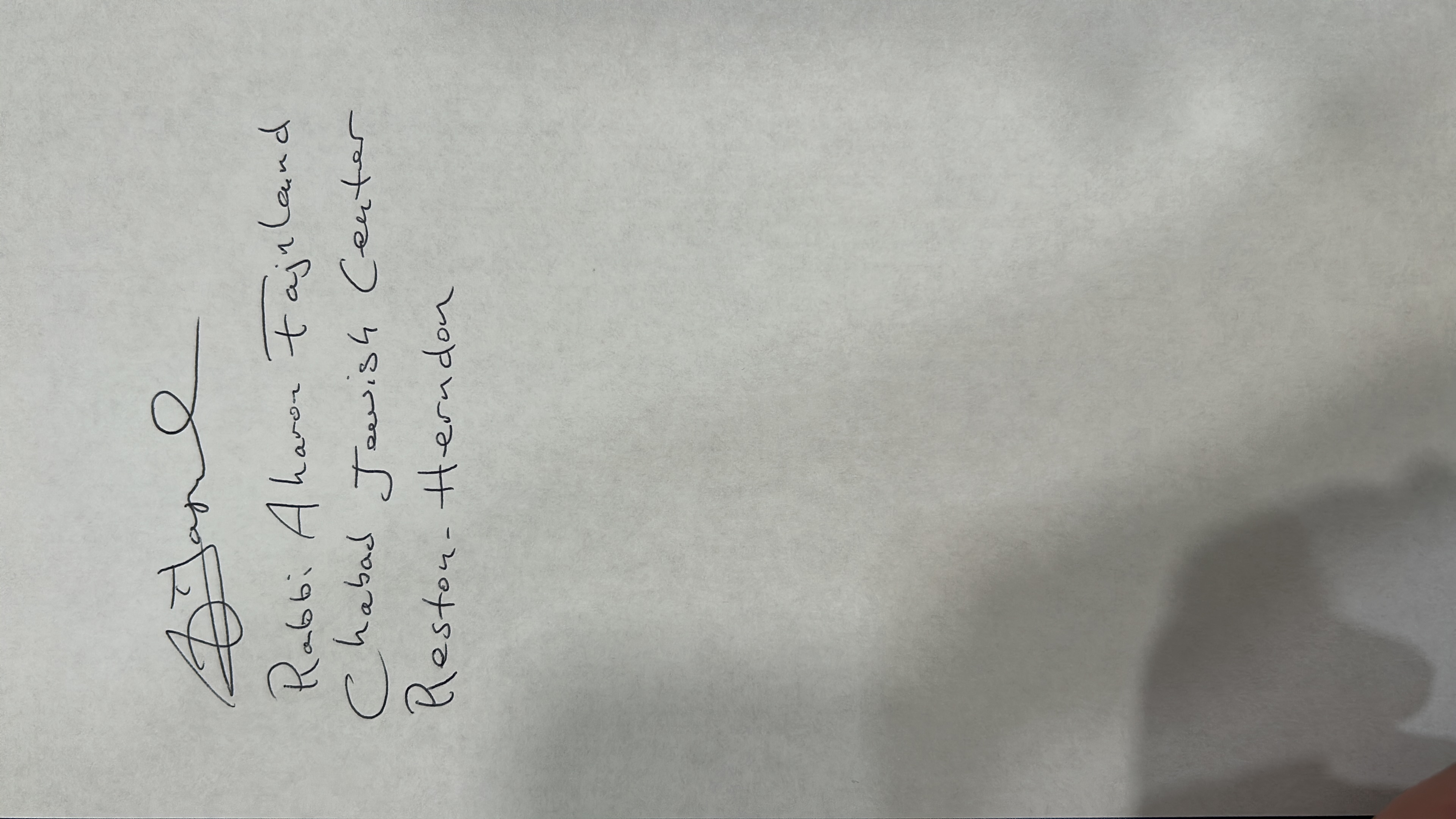
The handwriting suggests an open and conscientious individual with a creative flair, who could benefit from practicing a more consistent slant and pressure.
This handwriting presents a clear, rounded style with a slight rightward slant, suggesting a generally forward-thinking and approachable nature. The letters are well-formed and consistent, though the slant varies, hinting at a flexible personality. The 'A' in 'Aharon' and the 'C' in 'Center' have a distinct shape, indicating some individuality. The overall impression is one of neatness and legibility, though the capital letters have more flourishes.
The handwriting suggests a person who is open to new experiences and ideas, given the forward slant. The roundness of the letters might point to a desire for harmony and connection with others. The neatness suggests a degree of conscientiousness and attention to detail, while the occasional flourish indicates a creative spark. There is an element of idealism implied by the slightly extravagant loops in the capital letters.
To improve the handwriting, focus on maintaining a more consistent slant to enhance the overall flow and rhythm. Practice forming the letters with equal pressure to avoid inconsistencies in line thickness. Try simplifying the flourishes in the capital letters to create a more streamlined and modern appearance. Overall, it's a legible and pleasant style, but these minor adjustments could refine it further.
Legibility
Expressiveness
Consistency
Overall
Leaderboard for Tuesday, 04 November 2025
| 1 | The Devout One |
76
|
| 2 | The Proud Calligrapher |
76
|
| 3 | The Flowing Hand |
71
|
| 4 | The Empathetic Soul |
69
|
| 5 | The Philosopher's Flow |
68
|
| 6 | The Leaping Luminary |
68
|
| 7 | Mozart's Quill |
68
|
| 8 | The Idealist |
67
|
| 9 | The Geometric Hand |
66
|
| 10 | The Diligent Idealist |
66
|
| 11 | The Proud Nepali |
66
|
| 12 | The Optimistic Connector |
66
|
| 13 | The Meticulous Minimalist |
65
|
| 14 | The Blue Alchemist |
65
|
| 15 | The Calculating Creative |
64
|
| 16 | The Legal Eagle's Quill |
63
|
| 17 | The Loopy Lefty |
63
|
| 18 | The Idealist's Italic |
61
|
| 19 | The Pragmatic Student |
61
|
| 20 | The Studious Historian |
61
|
| 21 | The Romantic Idealist |
61
|
| 22 | The Approachable Pen |
61
|
| 23 | The Flowing Fox |
59
|
| 24 | The Neat Newsperson |
58
|
| 25 | The Neural Network Narrator |
58
|
| 26 | The Typographic Theologian |
58
|
| 27 | The Precise Printer |
58
|
| 28 | The Confident Calligrapher |
58
|
| 29 | The Pragmatic Penman |
58
|
| 30 | The Flowing Stream |
58
|