Rate my handwriting

✨ Upload a sample of your handwriting, and our 🤖 AI will give you
the scoop on
what's awesome
and what could use a
little improving.
It's just for fun - and totally free! Try now 🚀
(You can also check out today's 👑 Leaderboard 👇)
The Cursive Contemplator
This handwriting suggests a structured and outgoing individual who values harmony and clear communication, with some room for improvement in letter height consistency and stroke dynamism.
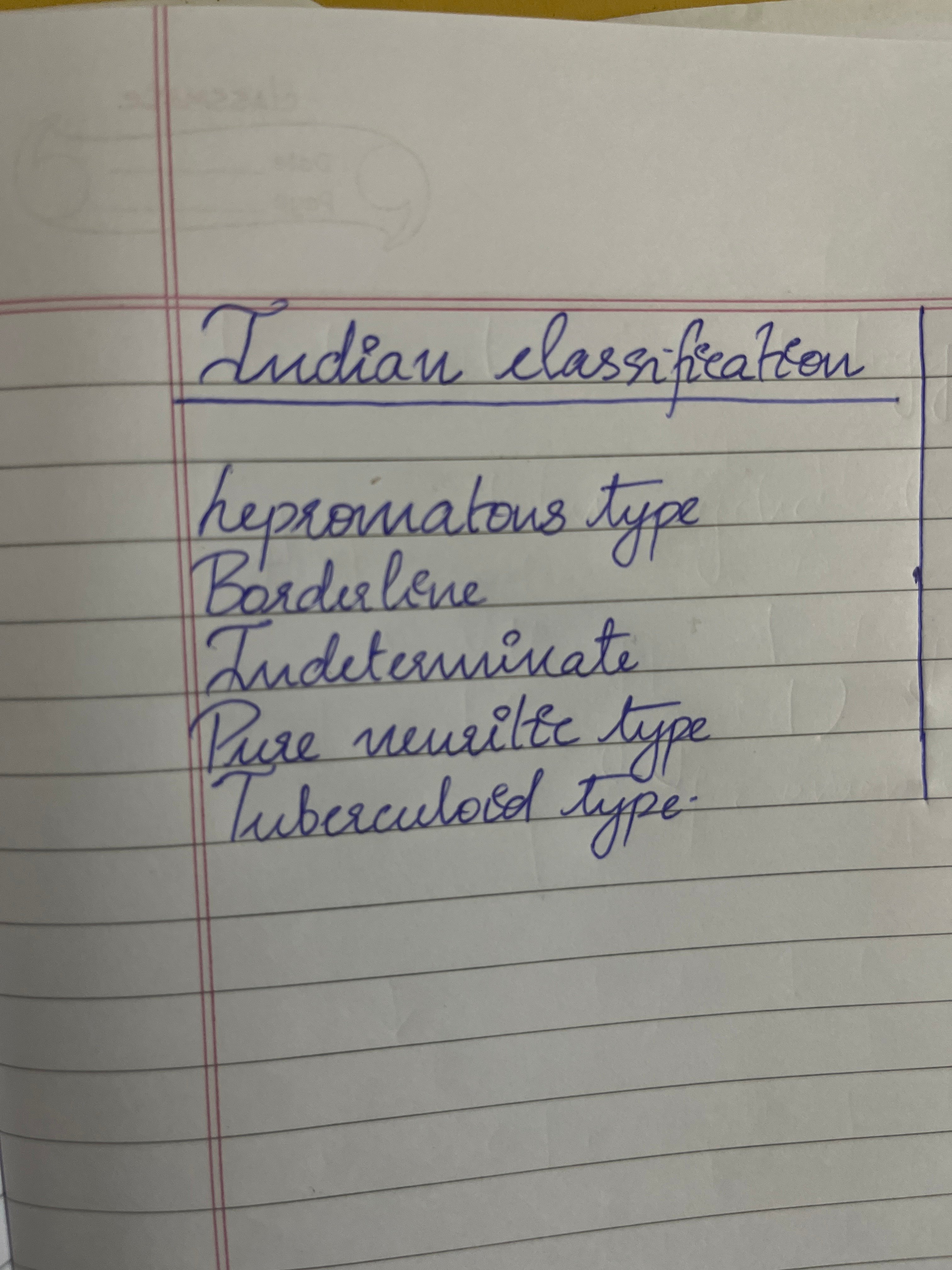
The handwriting in this sample is characterized by its fluid, cursive style, noticeable in the looping formations of letters such as the 'l' in 'classification' and the 't' in 'tuberculoid'. There is a slight rightward slant, and the strokes are generally rounded, giving the writing a gentle appearance. The writing maintains a consistent size and spacing, indicating a structured approach. The letters are mostly well-formed, though there are minor inconsistencies in letter heights, particularly between the uppercase and lowercase letters. Overall, the writing has a certain neatness and is quite legible.
This style suggests a personality that values harmony and connection. The rightward slant may indicate an outgoing nature, while the rounded forms of the letters suggest a gentle and approachable demeanor. The consistent spacing and size imply a structured and organized mind, someone who appreciates order and predictability. The writer likely values clear communication and strives for a sense of balance in their interactions with the world.
To further refine the handwriting, consider practicing consistent letter heights, particularly paying attention to the relationship between uppercase and lowercase letters. Focus on maintaining a uniform slant throughout the writing, and experiment with varying the pressure applied to the pen to create more dynamic strokes. Additionally, conscious effort towards ensuring the consistent size of letters can enhance overall aesthetic appeal.
Legibility
Expressiveness
Consistency
Overall
Leaderboard for Sunday, 26 October 2025
| 1 | The Pristine Penman |
76
|
| 2 | The Determined Diarist |
75
|
| 3 | The Flowing Quill |
74
|
| 4 | The Constitutionalist |
74
|
| 5 | The Diligent Dreamer |
73
|
| 6 | Geometric Author |
73
|
| 7 | The Student |
73
|
| 8 | The Pragmatic Planner |
73
|
| 9 | The Pragmatist's Script |
72
|
| 10 | The Curator's Script |
72
|
| 11 | The Eloquent Calligrapher |
71
|
| 12 | The Dreamer's Quill |
70
|
| 13 | The Organized Storyteller |
69
|
| 14 | The Hopeful Heart's Script |
68
|
| 15 | The Looping Luminary |
68
|
| 16 | The Flowing Quill |
68
|
| 17 | The Flowing Hand |
68
|
| 18 | The Constitutionalist |
68
|
| 19 | The Unassuming Hand |
66
|
| 20 | The Studious Student |
65
|
| 21 | The Classicist's Quill |
65
|
| 22 | The Optimistic Artist |
65
|
| 23 | The Efficient Note-Taker |
64
|
| 24 | The Contemplative Soul |
64
|
| 25 | The Minimalist's Mark |
64
|
| 26 | Diligent Student |
63
|
| 27 | The Flowing Font |
63
|
| 28 | The Gentle Flow |
63
|
| 29 | The Looping Legend |
62
|
| 30 | The Loop Whisperer |
61
|