Rate my handwriting

✨ Upload a sample of your handwriting, and our 🤖 AI will give you
the scoop on
what's awesome
and what could use a
little improving.
It's just for fun - and totally free! Try now 🚀
(You can also check out today's 👑 Leaderboard 👇)
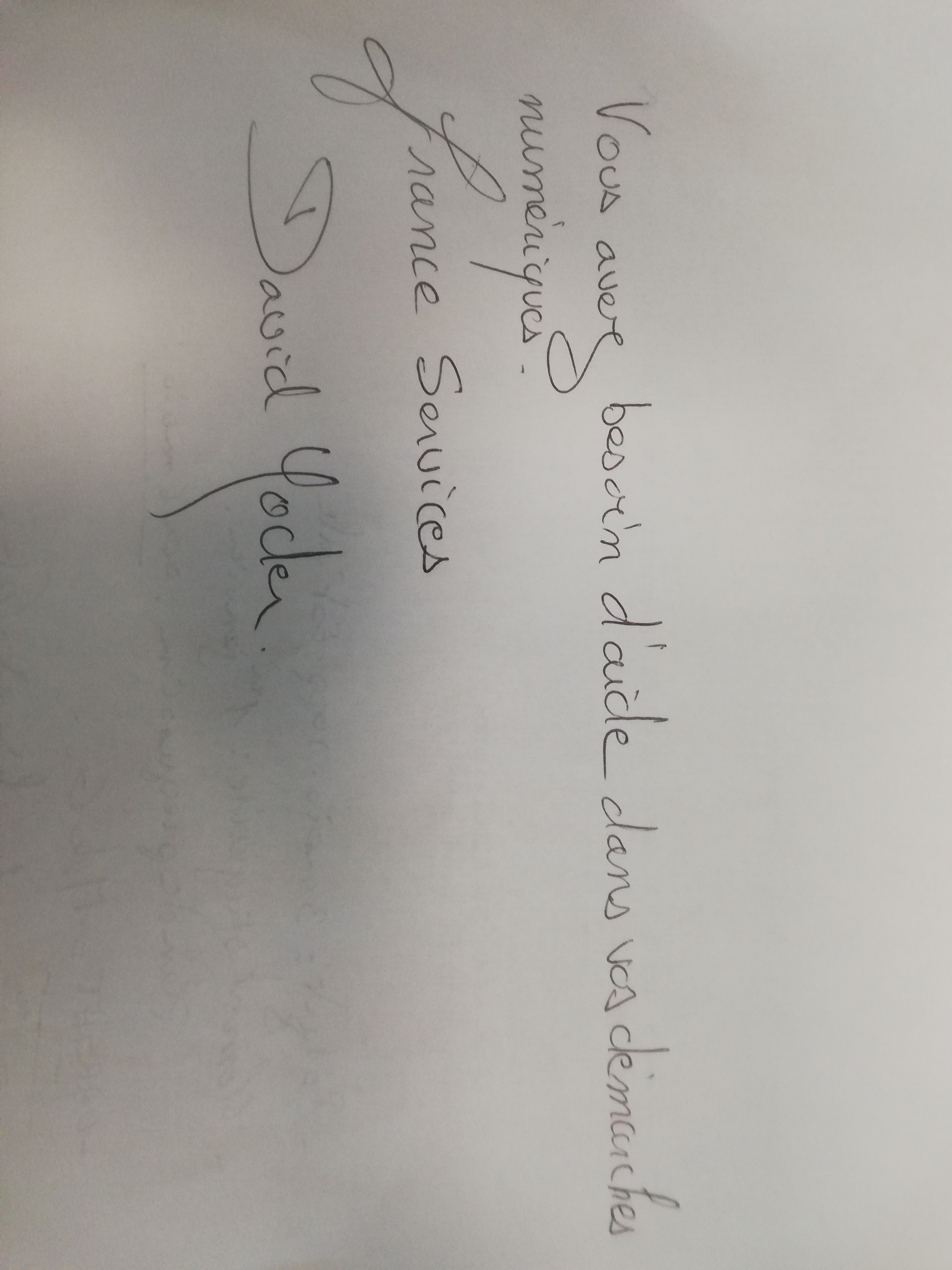
The Elegant Calligrapher
This handwriting demonstrates a graceful and deliberate style, indicating a personality that values aesthetics and attention to detail, while legibility could be improved through spacing and letter form consistency.
The handwriting in this sample displays a flowing, cursive style, evident in the connected letters and rounded forms. The script exhibits a consistent slant, lending a sense of rhythm and grace. The letter 'S' in "Services" and "besoin" showcases an elegant loop, while the ascenders and descenders, as seen in the 'd' and 'p', are moderate and well-proportioned. The overall impression is one of careful execution and attention to detail, although some words are less legible than others, for example the name 'Yoder'.
Based on this handwriting, the writer is likely someone who values aesthetics and takes pride in their presentation. The consistent slant and rounded forms suggest a harmonious and agreeable nature, while the attention to detail indicates conscientiousness and a desire for accuracy. The graceful loops in the 'S' suggest creativity and a flair for artistic expression. This person is likely to be empathetic, as well as organised.
To improve legibility, focus on increasing the spacing between words and ensuring that each letter is clearly formed. Practice maintaining a consistent letter size and baseline, which can enhance readability. Also, while the loops in the 'S' are aesthetically pleasing, ensure they don't obscure the letter's form. A slight adjustment to reduce the loop's size could enhance clarity without sacrificing the script's elegance.
Legibility
Expressiveness
Consistency
Overall
Leaderboard for Monday, 27 October 2025
| 1 | The Divine Calligrapher |
80
|
| 2 | The Humble Hand |
76
|
| 3 | The Analytical Mind |
74
|
| 4 | The Diligent Student |
71
|
| 5 | The Pristine Print |
71
|
| 6 | The Student's Script |
70
|
| 7 | The Coastal Bard |
69
|
| 8 | The Optimistic Poet |
68
|
| 9 | Sunrise Musings |
68
|
| 10 | The Cursive Cartographer |
68
|
| 11 | The River's Flow |
67
|
| 12 | The Diligent Penman |
67
|
| 13 | The Coastal Chronicler |
67
|
| 14 | The Diligent Note-Taker |
67
|
| 15 | The Coastal Dreamer |
67
|
| 16 | The Cursive Narrator |
67
|
| 17 | The Pragmatic Pen |
66
|
| 18 | The Eloquent Pen |
66
|
| 19 | The Scientific Hand |
65
|
| 20 | The Analytical Alchemist |
65
|
| 21 | The Deliberate Draftsman |
65
|
| 22 | The Aesthetic Typist |
65
|
| 23 | The Agile Leaper |
64
|
| 24 | The Script of Devotion |
64
|
| 25 | The Mathematical Muse |
64
|
| 26 | The Traditionalist's Script |
64
|
| 27 | The Diligent Note-Taker |
64
|
| 28 | The Typographer's Testament |
63
|
| 29 | The Elegant Academic |
63
|
| 30 | The Studious Note-Taker |
63
|