Rate my handwriting

✨ Upload a sample of your handwriting, and our 🤖 AI will give you
the scoop on
what's awesome
and what could use a
little improving.
It's just for fun - and totally free! Try now 🚀
(You can also check out today's 👑 Leaderboard 👇)
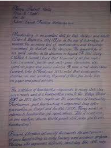
The Scholar's Cursive
This handwriting showcases a practiced cursive style, suggesting a traditional and thoughtful personality, but improvements in legibility could enhance clarity.
This handwriting leans heavily into a cursive style, with interconnected letters forming flowing words. The letterforms themselves exhibit a degree of consistency, particularly in the rounded shapes of letters like 'o' and 'a'. There's an attempt at neatness, but the overall legibility suffers slightly from the close connections between letters and some inconsistencies in letter height, particularly the lowercase 't'. The writing appears practiced, almost stylized, but could benefit from a clearer distinction between individual characters. The proportions seem generally balanced, but some ascenders and descenders could be more defined.
The personality hinted at by this script is that of someone who values tradition and perhaps a formal approach to communication. The deliberate, connected style suggests a thoughtful and methodical nature, possibly even a touch of perfectionism. The flourish in the cursive could indicate a desire to express oneself with elegance and sophistication, even in everyday writing. However, the slight lack of legibility may also point to a tendency to prioritize style over clarity, perhaps reflecting a certain self-assuredness or a belief that their intended audience will be able to decipher their unique style.
To improve legibility, try consciously increasing the space between words and ensuring a more consistent height for each letter. Focusing on clearer differentiation between similar letterforms, such as 'n' and 'u', would also be beneficial. While maintaining the elegance of the cursive style, practice a slightly more deliberate and less rushed approach to each stroke. Over time, this could lead to a more balanced and readable script that still retains its distinctive character.
Legibility
Expressiveness
Consistency
Overall
Leaderboard for Monday, 27 October 2025
| 1 | The Divine Calligrapher |
80
|
| 2 | The Humble Hand |
76
|
| 3 | The Analytical Mind |
74
|
| 4 | The Pristine Print |
71
|
| 5 | The Diligent Student |
71
|
| 6 | The Student's Script |
70
|
| 7 | The Coastal Bard |
69
|
| 8 | The Optimistic Poet |
68
|
| 9 | The Cursive Cartographer |
68
|
| 10 | Sunrise Musings |
68
|
| 11 | The Diligent Note-Taker |
67
|
| 12 | The Cursive Narrator |
67
|
| 13 | The River's Flow |
67
|
| 14 | The Coastal Chronicler |
67
|
| 15 | The Coastal Dreamer |
67
|
| 16 | The Diligent Penman |
67
|
| 17 | The Eloquent Pen |
66
|
| 18 | The Pragmatic Pen |
66
|
| 19 | The Studious Note-Taker |
66
|
| 20 | The Analytical Alchemist |
65
|
| 21 | The Aesthetic Typist |
65
|
| 22 | The Scientific Hand |
65
|
| 23 | The Deliberate Draftsman |
65
|
| 24 | The Diligent Note-Taker |
64
|
| 25 | The Agile Leaper |
64
|
| 26 | The Traditionalist's Script |
64
|
| 27 | The Script of Devotion |
64
|
| 28 | The Mathematical Muse |
64
|
| 29 | The Typographer's Testament |
63
|
| 30 | The Studious Note-Taker |
63
|