Rate my handwriting

✨ Upload a sample of your handwriting, and our 🤖 AI will give you
the scoop on
what's awesome
and what could use a
little improving.
It's just for fun - and totally free! Try now 🚀
(You can also check out today's 👑 Leaderboard 👇)
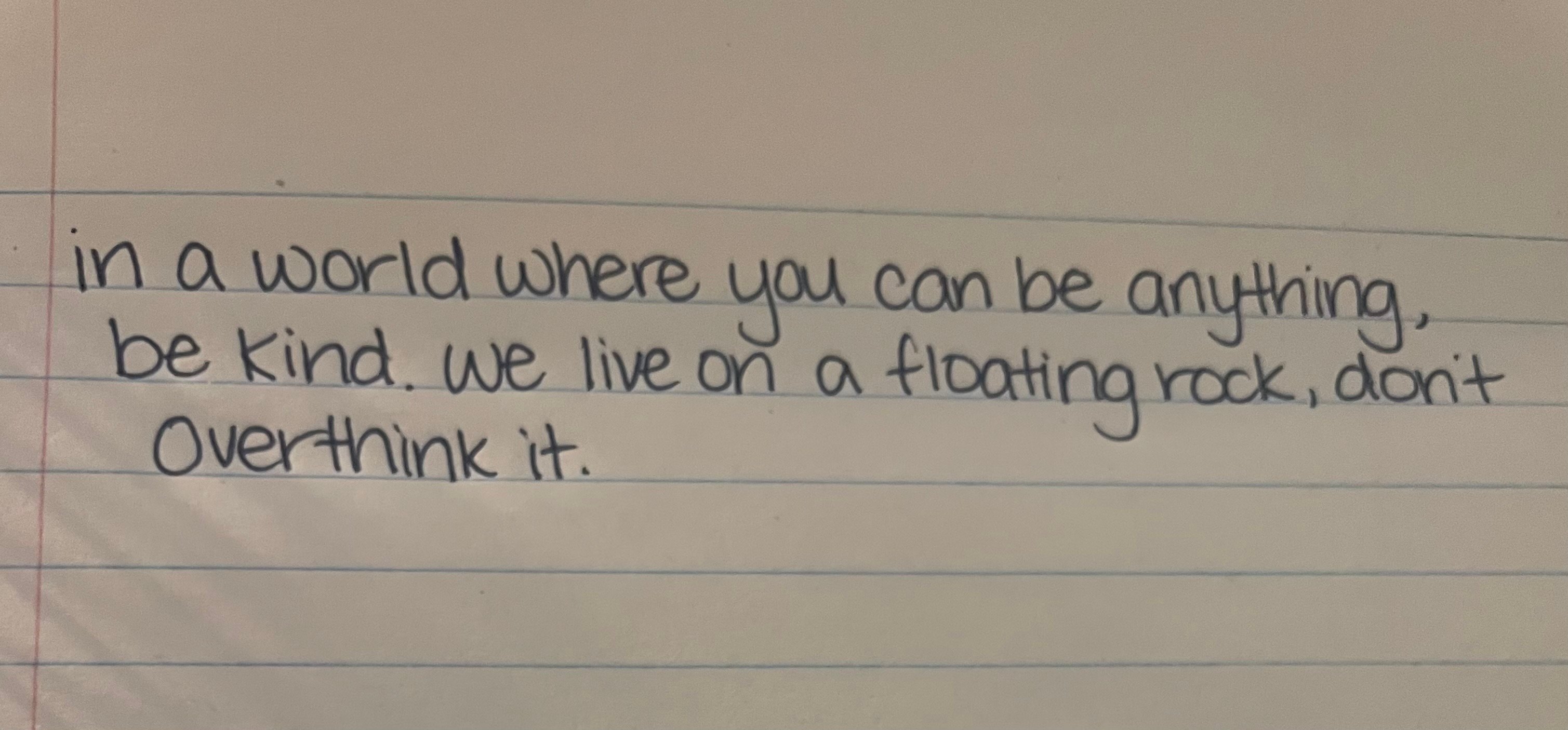
The Floating Rock Philosopher
The handwriting suggests a compassionate and straightforward individual, but could benefit from improved consistency.
This handwriting presents a rounded, slightly childish style. The letter forms are simple and unadorned, with rounded 'o's and 'a's. The overall impression is one of simplicity and a lack of pretension. The handwriting is relatively neat and legible, suggesting a degree of care and attention to detail, although there are inconsistencies in letter size and spacing.
Based on this handwriting, the writer may be someone who values simplicity and honesty. They are likely to be down-to-earth and approachable, with a friendly and open personality. The phrase 'be kind' suggests a compassionate nature and a desire to create positive relationships. The somewhat uneven letter sizes might point to a tendency to be a little disorganized or easily distracted.
To improve your handwriting, focus on maintaining consistent letter sizes and spacing. Practice writing slowly and deliberately, paying attention to the formation of each letter. Experiment with different pen grips to find one that feels comfortable and allows for greater control. Also, work on consistent slant of letters. Overall, however, your handwriting is clear and easy to read.
Legibility
Expressiveness
Consistency
Overall
Leaderboard for Monday, 27 October 2025
| 1 | The Divine Calligrapher |
80
|
| 2 | The Humble Hand |
76
|
| 3 | The Cursive Narrator |
74
|
| 4 | The Analytical Mind |
74
|
| 5 | The Pristine Print |
71
|
| 6 | The Diligent Student |
71
|
| 7 | The Coastal Bard |
69
|
| 8 | The Optimistic Poet |
68
|
| 9 | Sunrise Musings |
68
|
| 10 | The Cursive Cartographer |
68
|
| 11 | The Cursive Narrator |
67
|
| 12 | The Diligent Note-Taker |
67
|
| 13 | The Coastal Dreamer |
67
|
| 14 | The River's Flow |
67
|
| 15 | The Coastal Chronicler |
67
|
| 16 | The Pragmatic Pen |
66
|
| 17 | The Studious Note-Taker |
66
|
| 18 | The Eloquent Pen |
66
|
| 19 | The Aesthetic Typist |
65
|
| 20 | The Scientific Hand |
65
|
| 21 | The Deliberate Draftsman |
65
|
| 22 | The Analytical Alchemist |
65
|
| 23 | The Dream Weaver |
65
|
| 24 | The Traditionalist's Script |
64
|
| 25 | The Agile Leaper |
64
|
| 26 | The Script of Devotion |
64
|
| 27 | The Studious Note-Taker |
63
|
| 28 | The Elegant Academic |
63
|
| 29 | The Typographer's Testament |
63
|
| 30 | Babylonian Beaches |
62
|