Rate my handwriting

✨ Upload a sample of your handwriting, and our 🤖 AI will give you
the scoop on
what's awesome
and what could use a
little improving.
It's just for fun - and totally free! Try now 🚀
(You can also check out today's 👑 Leaderboard 👇)
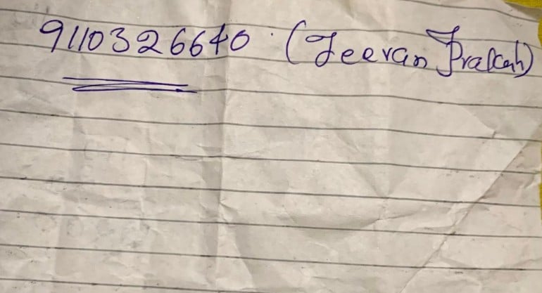
The Practical Penman
This handwriting suggests a practical and organized individual with a touch of creative flair. Enhancing baseline consistency and reducing slant would further improve legibility.
The handwriting sample presents a blend of practicality and personal flair. The numbers are written with consistent height and spacing, as seen in "9110326640," indicating a systematic approach. The phone number is clearly legible, underscoring a focus on effective communication. However, the name "Jeevan Prakash" exhibits more expressive strokes, particularly in the extended 'J' and 'P', suggesting a desire to stand out. The overall impression is one of efficiency tempered with individuality.
This handwriting suggests a personality that values both order and self-expression. The neatness of the numbers hints at a methodical and organized mind, someone who appreciates clarity and precision. The more flamboyant script used for the name, however, reveals a playful side, a willingness to embrace creativity and make a personal statement. This combination of traits suggests an individual who is both reliable and engaging, able to balance practicality with a touch of panache.
While the handwriting is generally legible, a few minor improvements could enhance its overall impact. Paying closer attention to the baseline, ensuring that all letters rest firmly on the line, would further enhance the neatness. Additionally, slightly reducing the slant in the cursive letters could improve readability, especially for those unfamiliar with the writer's style. These adjustments would help project an even more polished and professional image, while still retaining the unique personal touch.
Legibility
Expressiveness
Consistency
Overall
Leaderboard for Monday, 27 October 2025
| 1 | The Divine Calligrapher |
80
|
| 2 | The Humble Hand |
76
|
| 3 | The Analytical Mind |
74
|
| 4 | The Diligent Student |
71
|
| 5 | The Pristine Print |
71
|
| 6 | The Student's Script |
70
|
| 7 | The Coastal Bard |
69
|
| 8 | The Optimistic Poet |
68
|
| 9 | Sunrise Musings |
68
|
| 10 | The Cursive Cartographer |
68
|
| 11 | The River's Flow |
67
|
| 12 | The Diligent Penman |
67
|
| 13 | The Coastal Chronicler |
67
|
| 14 | The Diligent Note-Taker |
67
|
| 15 | The Coastal Dreamer |
67
|
| 16 | The Cursive Narrator |
67
|
| 17 | The Pragmatic Pen |
66
|
| 18 | The Eloquent Pen |
66
|
| 19 | The Scientific Hand |
65
|
| 20 | The Analytical Alchemist |
65
|
| 21 | The Deliberate Draftsman |
65
|
| 22 | The Aesthetic Typist |
65
|
| 23 | The Agile Leaper |
64
|
| 24 | The Script of Devotion |
64
|
| 25 | The Mathematical Muse |
64
|
| 26 | The Traditionalist's Script |
64
|
| 27 | The Diligent Note-Taker |
64
|
| 28 | The Typographer's Testament |
63
|
| 29 | The Elegant Academic |
63
|
| 30 | The Studious Note-Taker |
63
|